| Image |
Comment |
| 10/17/2005 01:06:40 AM |
|
 Photographer found comment helpful. Photographer found comment helpful. |
| 10/17/2005 01:06:07 AM |
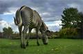
Stripedby Joey LawrenceComment: hahaha. You sure you shot the right end of this zebra? Love the way the tail is just shy of touching the body... |
| Photographer found comment helpful. |
| 10/17/2005 01:05:12 AM |
The Chaseby xlr8tnComment: Geeze, this looks like extreme telephoto to me... Everything is compacted, no receding of size of elements at all... |
| 10/17/2005 01:03:43 AM |
Sunriseby docurrieComment: There's a lot to like here, but trhe picture suffers from geing split into two halves almost precisely, with the bottom half holding little visual ineterst at all. |
| Photographer found comment helpful. |
| 10/17/2005 01:02:32 AM |
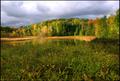
Golden Muskokaby timmiComment: Lovely onset-of-autumn colors. I wish you'd rotated ccw half a degree, it's a little off-kilter. |
| Photographer found comment helpful. |
| 10/11/2005 01:15:42 PM |
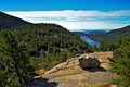
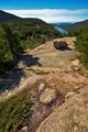
Bubbles Vistaby NeilComment: Of your alternate framings, I far prefer this one. It balances the elements much more sweetly, and makes better use of the rock. |
| Photographer found comment helpful. |
| 10/11/2005 01:14:52 PM |
Bubbles Vista (alt)by NeilComment: I don't think the foreground here has enough ihnterest to sustain this framing of the view. |
| Photographer found comment helpful. |
| 10/11/2005 01:13:12 PM |
Beauty Restby NeilComment: The light here is way too flat for this to interest me. |
| Photographer found comment helpful. |
| 10/11/2005 01:11:14 PM |
Acadia New Dayby NeilComment: I feel like this would work better if the foreground separation was jacked up a little... otherwise excellent, especially colors. Note that if you see the foreground dark areas as "one mass" the picture is divided into two halves (weak) while if you get more separation the foreground half will be subdivided and it will be more complex & satisfying compositonally (I think). |
| Photographer found comment helpful. |
| 10/11/2005 01:08:50 PM |
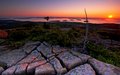
Cadillac Rockby NeilComment: Beautiful colors. At this resolution it appears "soft" but I'm sure it's better full sized. The skewed horizon bugs me a lot. To a lessere xtent, I think it's very unfortunate that the vertical of the dead tree bisects one of the islands; a little care in setup would have avoided that. |
| Photographer found comment helpful. |
Home -
Challenges -
Community -
League -
Photos -
Cameras -
Lenses -
Learn -
Help -
Terms of Use -
Privacy -
Top ^
DPChallenge, and website content and design, Copyright © 2001-2026 Challenging Technologies, LLC.
All digital photo copyrights belong to the photographers and may not be used without permission.
Current Server Time: 07/23/2026 03:44:49 AM EDT.