| Image |
Comment |
| 11/14/2005 12:51:43 AM |
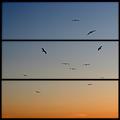
Seagulls at Sunset Cliffsby ecdillonComment: A pity about the haloing artifacts. If this is Sunset Cliffs in OB, San Diego, you're right over the hill from my old house... |
 Photographer found comment helpful. Photographer found comment helpful. |
| 11/14/2005 12:50:13 AM |
|
| Photographer found comment helpful. |
| 11/14/2005 12:45:43 AM |
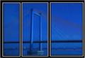
powerby ursulaComment: Ummm... That's certainly a completely different approach. It's sort of hard to take the "tri" component of this in, visually... Hell of a creative effort, regardless. |
| Photographer found comment helpful. |
| 11/14/2005 12:40:58 AM |
|
| Photographer found comment helpful. |
| 11/14/2005 12:37:15 AM |
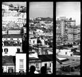
Touch Downby samanwarComment: The central image is lovely indeed, but the three images don't integrate well for me as a triptych |
| Photographer found comment helpful. |
| 11/14/2005 12:26:03 AM |
|
| Photographer found comment helpful. |
| 11/14/2005 12:23:38 AM |
|
| Photographer found comment helpful. |
| 11/14/2005 12:22:32 AM |
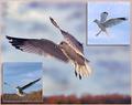
End of the Road in Oz by scalvertComment: Fun story and great shot. We are SUCH opposites; I can't imagine "constructing" a shot that way anymore... Congrats on red! |
| Photographer found comment helpful. |
| 11/14/2005 12:19:41 AM |
|
| Photographer found comment helpful. |
| 11/13/2005 11:19:53 PM |
Golden Gate Bridgeby RikkiComment: That's a very nice view, rikki. Lovely processing. But let's try using skew or perspective adjustment to clean up the verticals? Since this is a 20D shot, I'm assuming you have enough cropped off right and left that youc an do this from the original. |
| Photographer found comment helpful. |
Home -
Challenges -
Community -
League -
Photos -
Cameras -
Lenses -
Learn -
Help -
Terms of Use -
Privacy -
Top ^
DPChallenge, and website content and design, Copyright © 2001-2026 Challenging Technologies, LLC.
All digital photo copyrights belong to the photographers and may not be used without permission.
Current Server Time: 07/24/2026 09:24:51 AM EDT.