| Image |
Comment |
| 11/21/2005 12:10:22 AM |
Breakthroughby owenComment: I cannot believe this didn't ribbon... I was sure it would. Congrats on your 4th place! |
 Photographer found comment helpful. Photographer found comment helpful. |
| 11/21/2005 12:08:04 AM |
|
| Photographer found comment helpful. |
| 11/20/2005 12:20:39 PM |
wasplook.jpgby kenskidComment: I basically like him. I'd have to see the whole frame to advise on cropping/framing here. Certainly, given what we can see of wasp & silhouette in the posted image, it is framed up more or less optimally. I'm not thrilled with the head being right smack in the middle horizontally, but at least it is in the top 1/3 nicely. You can't crop any off here to move the head off center without losing wing or foot or some of the silhouette. It is possible the more image on the left and below might work a little better if that's an option.
I'd consider working with hue/sat to enhance the red component a little and pop the wasp off the BG a bit. If you look closely, you'll see an overall greenish tint creeping into the wasp itself. You basically have semi-complementary colors (greenish and reddish) if you work on defining them a bit.
Overall it's very nice. You've come a long ways.
Please include image data in the information field, lens/aperture/shutter speed etc. Message edited by author 2005-11-20 12:21:19. |
| Photographer found comment helpful. |
| 11/20/2005 11:58:12 AM |
|
| Photographer found comment helpful. |
| 11/20/2005 02:36:14 AM |
banded-nauset-tele-IMG_1712.jpgby Bear_MusicComment: Nordlys, What caught my eye in the first place was the juxtaposition of the filigreed, shadowed trees upon the mirror-like water, and the much greater warmth further out. I'll stick with the trees.
Madman, they're NOT reflections. They're bare, autumn trees in shadow, silhouetted against the water. |
| 11/19/2005 04:51:03 PM |
Sunset, Wellfleet — November 2005by Bear_MusicComment: I appreciate the kind words, but personally I don't think this image is all that great. It lacks a little something, especially in the background. I'm, happy with where it placed, I expected at BEST a top 20 and realistically hoped for top 30, which is what I got. There were a LOT of really nice images in this challenge. |
| 11/19/2005 12:10:15 AM |
test_009.jpgby nomad469Comment: In the main, I quite like it. In seems to me it could be more luminous, glowing. Not a lot is needed, but a bit IMO. The floating brass band abogve her elbow is a major distraction for me. I like the shadows, there is a graphic quality they augment, a sort of stylization. I like the seriousness. But then, I hung out with dancers for many years. |
| Photographer found comment helpful. |
| 11/18/2005 05:13:46 AM |
Just a Flash in the Panby talmyComment: Id this were a single light source, with the light INSIDE the pan, how can the pan be throwing a shadow? |
| Photographer found comment helpful. |
| 11/18/2005 04:04:57 AM |
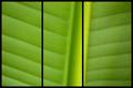
Gentle Greenby tonyvComment: This is a very gentle green, indeed. The image itself is extremely appealing, sich and gauzy and soothing. But the overlaying of the triptych seems to me very much at war with the image itself. What I find especially odd is that the three panels are NOT the same size, so clearly you were putting thought into exactly where the panels should break.
In other words, you consciously used the rightmost panel-break to split the raised stem of the leaf. And I don't know why you made that choice. I am presuming you had a very specific reason to do it, but it seems to me to be the wrong choice here. I'd be interested in hearing why you did it this way, what you were after. Feel free to PM me if you wish. |
| Photographer found comment helpful. |
| 11/18/2005 03:56:54 AM |
Names Without Facesby JPRComment: I have come back to this one. It is very strong. Powerful and graphic, good strong weight to it visually. Bumping you up a notch. |
| Photographer found comment helpful. |
Home -
Challenges -
Community -
League -
Photos -
Cameras -
Lenses -
Learn -
Help -
Terms of Use -
Privacy -
Top ^
DPChallenge, and website content and design, Copyright © 2001-2026 Challenging Technologies, LLC.
All digital photo copyrights belong to the photographers and may not be used without permission.
Current Server Time: 07/25/2026 03:37:28 AM EDT.