| Image |
Comment |
| 11/23/2005 02:01:45 AM |
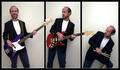
Three by TerramarComment: now HERE'S an effective example of neat image or other smoothing. Very nicely done! |
 Photographer found comment helpful. Photographer found comment helpful. |
| 11/23/2005 02:00:41 AM |
That's odd.I must've captured a ghost because no one is sitting there.by TatiComment: I rarely comment on titles, but I wanted to say that this title is actively detracting from your image by trying to force it down our throats. I think we can be trusted to figure out how strange this image is without such an explanation. I'm not voting it down, but I'm afraid others will. As for the image, I like it very much and it's going in my high-sort group for now :-) |
| 11/21/2005 03:21:48 AM |
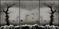
Errant Headstocksby NordlysComment: Surprisingly low finish for such a well-wrought piece of work, IMO. I like it very much. |
| Photographer found comment helpful. |
| 11/21/2005 02:40:35 AM |
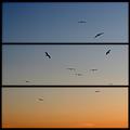
Seagulls at Sunset Cliffsby ecdillonComment: Yup! You're in San Diego! Say hi to the cliffs for me, willya? I'm surprised this scored so low, except I guess the PP artifacts were just too much for the voters. |
| Photographer found comment helpful. |
| 11/21/2005 02:37:34 AM |
|
| Photographer found comment helpful. |
| 11/21/2005 02:35:50 AM |
|
| Photographer found comment helpful. |
| 11/21/2005 02:33:44 AM |
|
| Photographer found comment helpful. |
| 11/21/2005 02:29:36 AM |
|
| Photographer found comment helpful. |
| 11/21/2005 02:28:55 AM |
Autumnby ShaneBlakeComment: Congrats on top 10. Really nice work, very much to my taste. |
| Photographer found comment helpful. |
| 11/21/2005 02:28:05 AM |
|
| Photographer found comment helpful. |
Home -
Challenges -
Community -
League -
Photos -
Cameras -
Lenses -
Learn -
Help -
Terms of Use -
Privacy -
Top ^
DPChallenge, and website content and design, Copyright © 2001-2026 Challenging Technologies, LLC.
All digital photo copyrights belong to the photographers and may not be used without permission.
Current Server Time: 07/24/2026 06:26:27 PM EDT.