| Image |
Comment |
| 12/19/2005 01:40:26 AM |
|
 Photographer found comment helpful. Photographer found comment helpful. |
| 12/19/2005 01:39:49 AM |
|
| Photographer found comment helpful. |
| 12/19/2005 12:24:07 AM |
|
| Photographer found comment helpful. |
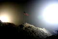
| 12/18/2005 04:53:02 AM |
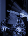
Here's your goodnight kissby graphicfunkComment: hahaha! I just saw this! Very nice, Daniel! I especially love this particular "cyanotype" tone. Care to share with me your settings to attain it? I've never gotten one quite this pure... |
| Photographer found comment helpful. |
| 12/16/2005 02:03:25 AM |
|
| 12/16/2005 02:02:38 AM |
|
| Photographer found comment helpful. |
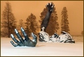
| 12/16/2005 02:01:45 AM |
A Little Fight Against Coldby PERCOMComment: Very skillfully done.Unfortunate juxtaposition of stones against head is hurting a little. I'm wondering if this is Lesley? Anyway, nice job :-) |
| 12/16/2005 02:00:21 AM |
night terrorsby mesmerajComment: This works very well for me. You're gonna get murdered on grain, but of courtse you knew that :-) I like the off-note of the eerie, bluish cast in the bright areas. |
| Photographer found comment helpful. |
| 12/16/2005 01:59:18 AM |
lemme up!by coolharComment: What a strange image! I wish you would have moved POV a tad to the right so the reaching arm was not precisely overlapping the biggest tree. It would be better is the foreground, especially lower left, were not so bright, but I suspect you had no control of the light and of course this is basic editing so youc an't burn. |
| Photographer found comment helpful. |
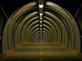
| 12/16/2005 01:57:16 AM |
empty foot bridgeby AzCKellyComment: Clean and compelling. Probably too static/symmetrical to do well in DPC, but I like it :-) |
| Photographer found comment helpful. |
Home -
Challenges -
Community -
League -
Photos -
Cameras -
Lenses -
Learn -
Help -
Terms of Use -
Privacy -
Top ^
DPChallenge, and website content and design, Copyright © 2001-2026 Challenging Technologies, LLC.
All digital photo copyrights belong to the photographers and may not be used without permission.
Current Server Time: 07/25/2026 08:11:55 AM EDT.