| Image |
Comment |
| 06/16/2003 02:41:59 PM |
Heart's glueby giampoComment: *Critique Club*
I'm not really sure what I think about this. I think that the little pieces of confetti floating around (or stuck in it, either way) are very neat.
It's all about the colors and shapes though. It doesn't LOOK liquid I guess is what I'm saying. Had not been for the bubbles in the top of the cup, it might have been very difficult to tell.
The colors are nice, and focus and clarity are right on. Nice sharp lines in the heart, and lots of clear confetti.
The smudged area on the red side near where it meets the yellow is a bit distracting. I don't know if I like that part at all.
The crop does seem a little strange too. I wonder if this should either be all in the frame, or more out of the frame. one extremem or the other.
Overall, it's a calming photo to look at.
~Heather~ |
| 06/16/2003 02:25:54 PM |
Guns & Ammoby JB707Comment: I was going to do this too, but never got around to shooting. The gun or the camera. This is a good shot to be on a mag. cover. My only suggestion would be to have a little more space to the left of the tip of the gun. Cut it a little too close there in my opinion. |
 Photographer found comment helpful. Photographer found comment helpful. |
| 06/16/2003 01:15:28 PM |
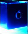
Mac Addictby daverx7Comment: Looks like something that could be on a magazine. Good dramatic lighting. Like the colors. This looks like a Kleenex box though. See how the Kleenex pops up through the hole in the top? lol Anyway, not sure exactly what it is, but there's my impression. lol
Focus and clarity look good as well. |
| 06/16/2003 01:02:14 PM |
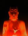
ARCHAEOLOGY MAGAZINEby BitzComment: I'm not sure I like how this is divided in the background by that pot. The pattern is a bit distracting from the main subject in the front. The angle and framing/cropping of the statue is good. and I could see this on the front cover, with a different background. maybe just a plain one. continue the right side all the way to the left edge of the frame, and I think that would appeal to me more.
|
| Photographer found comment helpful. |
| 06/16/2003 01:00:15 PM |
Kindred Spirit Magazineby BobsterLobsterComment: Good lighting, but the chin looks to be a little TOO lit. It's bright and bothers my eyes. Also there looks to be a shadow right above his belly behind that flower looking thing. Other than the overpowering light near the bottom, I think that this is lit nicely. I like the effect it has on the background. Black at the top, and in the two bottom corners, colored slightly. |
| Photographer found comment helpful. |
| 06/16/2003 12:58:23 PM |
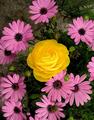
Better Gardensby pitsamanComment: This is picky, but I'd like to see the yellow flower more off center. I think that if you were to crop off the top right below the top most flower, this would bring the yellow flower up toward the top a bit, and would also remove the green tangle in the upper right corner that I find to be a bit distracting. Colors are good, as is focus and clarity. |
| Photographer found comment helpful. |
| 06/16/2003 12:55:29 PM |
Crafts 'n Things: Soapmakingby qachykComment: I think I'd prefer a lower angle on this so that we are not looking at the tops of the bottles, but rather looking straight on at them (or close) so that we can see what it even is. Also, maybe better had the labels been turned our way. Focus seems a bit soft. not really as crisp as I'd like to see for a magazine cover. Good products though. The shot is a little unballanced by the large block on the right sticking so far out of the photo, and for the most part, the left is mostly in the frame of the photo. |
| Photographer found comment helpful. |
| 06/16/2003 12:52:21 PM |
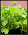
Home Gardenerby AlexanderComment: Light is getting a little bright on the tops of the leaves. I like the angle and the background isn't distracting, but pink doesn't really look right against the green. Good for a gardening shot, but this looks like it's in a pot? yes? should it be in a garden? either way, your focus and clarity are good. might have been a little more interesting with a few bits of color within the green, but doesn't really matter. |
| Photographer found comment helpful. |
| 06/16/2003 01:20:00 AM |
Slightly Cross-Eyed Charlieby ruthiekComment: Focus is quite soft here. Also, the lighting is really harsh on Charlies chest. The cat's eyes are really not that far off to notice that there is anything wrong with them, and your subject is smack dab in the center of the photo vertically. However, his head is slightly above the horizontal 'center' so this fits the challenge. The background is really distracting. It looks really tilted and the strong diagonals do not go well at all with the vertical cat. I wonder if the harsh lighting was responsible for the bad focus. Sometimes that's what happens. |
| 06/15/2003 11:01:13 PM |
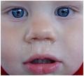
SNOT!by smellyfish1002Comment: *Critique Club*
My first impression is that this is not appealing at all. Not pleasant to look at, and makes me wrinkle up my face with discust.
However, technically, this shot is great.
The focus and clarity are unfortunately perfect. Great detail in everything. The kids eyes are stunning.
The closeness is great. And actually, I Tried this with a crop right above his upper lip, and I think that works even more. His eyes are really powerful, and you could use that to your advantage here. I'd like to see this with just the eyes and nose. And snot of course, or it wouldn't meet the challenge. lol
I think that the lighting is just fine. Not to bright, not too dark. If I HAD to make a suggestion, I'd suggest trying a little more lighting, but totally not absolutely needed.
Overall technically well done, just not something I'd like to look at for a long time.
~Heather~ |
| Photographer found comment helpful. |
Home -
Challenges -
Community -
League -
Photos -
Cameras -
Lenses -
Learn -
Help -
Terms of Use -
Privacy -
Top ^
DPChallenge, and website content and design, Copyright © 2001-2026 Challenging Technologies, LLC.
All digital photo copyrights belong to the photographers and may not be used without permission.
Current Server Time: 07/23/2026 04:12:44 PM EDT.