|
|
|
Showing 941 - 950 of ~2785 |
| Image |
Comment |
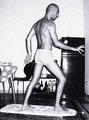
| 06/21/2003 12:12:52 AM | Caught Meby rickhd13Comment: I am totally not impressed by the row of port-o-potties in the background. This looks like it was taken at a fair or something. Maybe if you had taken it with a better background, it would have been more appealing. Also, the glasses look like the have some smudges on them that are a bit distracting as well. I can see you, and definately get a sense of what you look like. The shot also shows personality as well. my only real complaint is the background.
~Heather~ |  Photographer found comment helpful. Photographer found comment helpful. |
| 06/21/2003 12:09:49 AM | Mr. Greenby snowleopard10101Comment: Definately different. Actually, I was surprised to see the ammount of green people here, but I still think it's original. The purple eye bothers me a bit. And looking stright up your nose isn't the view I would prefer. However, I do think it's nicely framed. Focus also seems good. ~Heather~ | | Photographer found comment helpful. |
| 06/21/2003 12:04:29 AM | Trappedby OneSweetSinComment: Should I comment, or just wait till I pull it in CC? lol
I'll say that I know you have some beautiful eyes, and they color of your eyes is mezmorizing. Why you chose to hide them, I'll never know. There are 2 strands of hair that looked like they were placed over the eyes to hide it. That bothers me a lot, especially since I know how bright they are.
the angle and framing/cropping are good. Lighting is also good. Nice skin tones.
~Heather~ | | Photographer found comment helpful. |
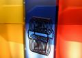
| 06/20/2003 11:33:40 PM | Rack Reflectionby dan_pendletonComment: *Critique Club*
I like the black thing, and the reflection from the black thing.
The background is good, but I think that the holes in the folders(?) are a bit distracting, also, it looks like there are pockets on the folders, which create a bit of a distraction also. The reflection is nice, however, there is a lighting problem on the reflections. See how there is a glare on them? I can't see enough of the background to see if the same glare is on the background too, but it is definately on the reflection of the background.
I do wish that the yellow, blue and red all merged together, and not have those 2 dark lines on each side of the blue folder.
Maybe it would have worked better had there been a bit better focus on the folders and reflection of the folders.
Lighting on the black subject is good, and focus is also.
Actually, I like this with a vertical crop showing only the blue folder, blue reflectin and black object with reflection. This was interesting to me.
Overall, definately fits the office art category, and is appealing to look at.
~Heather~ | | Photographer found comment helpful. |
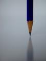
| 06/19/2003 10:58:02 PM | Exclamation pointby pinbackComment: *Critique Club*
What stands out to me first here, is the shadows on the white background near the bottom of the photo. On my moniter, it seems to be seperating itself into sections, and creating kind of a banding look. Not really sure what causes this, or how to fix it.
the next thing I see is the right side of the pencil looks fuzzy. When I looked harder at this, it appears to be from the light reflection on the right flat side of the pencil.
The angle and framing/cropping are good in my opinion. I like how you didn't center the pencil, but rather put it off to the side.
I like how the reflection extends the pencil all the way through the photo, but I wish that the tip of the pencil weren't so much in the vertical center of the photo.
The color is nice, but wonder if it could be a bit brighter? it seems to be a bit dark on the pencil itself.
It looks like there is more light on the other side of the pencil. I am given this impression by the dark front side of the pencil, and the bright background, where in front of the pencil, it goes into shadow near the bottom of the photo.
Overall, I like the idea, and think that with a few minor adjustments, this could have really been great.
~Heather~ | | Photographer found comment helpful. |
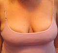
| 06/19/2003 07:21:46 PM | All the Guys See Anywayby shareinncComment: They are probably looking cause you're boiling over the sides of your shirt. I can honestly say that this (as a photo) doesn't appeal much at all to me. The shadow from your chin really creates a distraction. The focus is soft. You can see this mainly on the shirt, the shirt straps, and in your cleavage. the light also looks like it's getting a bit bright on the tops of your boobs, and distracting shadow under your boobs. I think had this been done in some kind of artistic way at all, it could have been interesting. Just looks like a quick snap of your boobs and nothing more. |
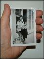
| 06/18/2003 10:08:41 PM | Taking myself in hand!by RobroComment: It's a different take on the challenge. I can appreciate that. I do with that we could see this a bit better though. it's a little small. Focus is good though from what I can tell, on both pics. I do not like the shadow created by your hand. You can help reduce that by moving a bit away from the wall, and not using harsh lighting. Probably flash? Anyway, nice to meet you. | | Photographer found comment helpful. |
| 06/18/2003 10:05:58 PM | Domestic Silver Surferby deadbrainComment: Too much noise for my personal liking. Realizing you were trying to make this cartoonish, but i'd probably prefer just a regular "un noisy" version. Also, the background doesn't help much. Nice rendition of silver surfer though. Love the board. :) | | Photographer found comment helpful. |
| 06/18/2003 07:08:31 PM | Lo-fi Self Portrait in Sepiaby SharQComment: nice dramatic angle. reminds me of the 4th place winner in the first portrait challenge. I liked that one too. Had the focus been just a bit sharper on the face, this would have been a 10 from me. shadows normally bother me, but I like them in this case. good shot. 9 | | Photographer found comment helpful. |
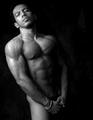
| 06/18/2003 07:06:37 PM | braceletby imagesloyolaComment: I have to laugh because this shot is right next to the shot titled "takimg myself in hand". I think that...oh nevermind. There are some light areas in the backgroung that I find just a bit distracting. nice pose, and I'll admit, nice body. I like the lighting, but it gets just a bit bright on your right shoulder. overall though, quite impressive. 10 for the body, 8 for the photo. :) | | Photographer found comment helpful. |
|
Showing 941 - 950 of ~2785 |
Home -
Challenges -
Community -
League -
Photos -
Cameras -
Lenses -
Learn -
Help -
Terms of Use -
Privacy -
Top ^
DPChallenge, and website content and design, Copyright © 2001-2026 Challenging Technologies, LLC.
All digital photo copyrights belong to the photographers and may not be used without permission.
Current Server Time: 07/23/2026 10:54:30 AM EDT.
|