| Image |
Comment |
| 06/21/2003 07:44:39 PM |
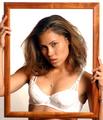
Bad Hair Dayby MystiComment: The lighting on your bra is WAY too bright. It also creates hot spots on your cheek, nose and chest. I like the idea a lot. I think it looks good. But the lighting is spoiling it for me. Focus seems a bit soft as well. sometimes soft focus works, but here I would like to see some crisp details of your face. neat idea. |
 Photographer found comment helpful. Photographer found comment helpful. |
| 06/21/2003 07:39:45 PM |
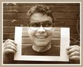
Me & myselfby pikytoComment: Excellent job lining up the photo with the real deal. The background does't line up well, but your glasses line up perfectly. Creative for sure. And VERY well done. Focus and clarity are good as well. Only thing I notice, and this is me being very picky is that the photo is tilted. has a bit of a right lean. might have been quite difficult though to get this perfect. |
| Photographer found comment helpful. |
| 06/21/2003 07:35:55 PM |
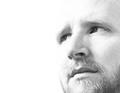
Dreamingby mbardeenComment: Very nice. Different to see a high key shot in here among all the low key ones. I think this is very well done. You didnt over do it, and you were still able to keep recognizable features. I like the angle and framing/cropping you chose very much. good use of negative space. Nice to meet you. ~Heather~ |
| Photographer found comment helpful. |
| 06/21/2003 07:34:12 PM |
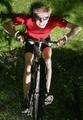
Keep the rubber side downby magnusComment: boy does this make you think. lol Interesting take. I think though that the lighting is a bit harsh. it's quite bright on your legs, and then also the shadow from your head and bike are a little distracting as well. Really neat though. nice to meet you. |
| Photographer found comment helpful. |
| 06/21/2003 07:32:44 PM |
Illuminato dal latoby orussellComment: You seem to have a bit of magenta tint to your face. I think it's probably reflecting off your shirt. It seems unnatural to me. Your focus and clarity are really good, and I like the angle as well. The border just doesn't work for me. I see that it matches the hat, but with so much of the magenta tint, it looks quite odd. Nice to meet you! |
| Photographer found comment helpful. |
| 06/21/2003 07:28:15 PM |
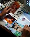
Through the yearsby zerocusaComment: I think a better background would do this justice. It is a nice idea for a self portrait, and shows lots about you. I'm just not fond of the cluttered background. I think it would have been a bit better maybe on a flat solid colored background. There is also quite a bit of glare on the large pic over near the right of the photo. I am glad you have your hands in the photo to give it some personal touch. |
| Photographer found comment helpful. |
| 06/21/2003 04:48:15 PM |
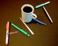
Office paraphernalia or is it ....?by hughletherenComment: *Critique Club*
Very creative. Definately original and even humorous.
The one thing that I notice here that I think could be improved upon is the lighting. Look at especially the green writing utencils, and the orange one to the left. They are quite too bright, and have some light glare on them. I wonder if putting something between your subjects and your light source could have cut down on this glare.
The focus seems good. I think that the detail shown is really nice especially in the bubbles in the coffee.
The angle and framing/cropping are perfect in my opinion. I really like how it goes from bottom left to upper right. The large coffee in the middle also makes for something nice to look at.
The shadows from the items are a bit distracting, and the background color doesn't really appeal to me. It does make sense in an office setting though. Brown desk. While I do think it fits the theme, still doesn't make it too appealing.
Overall really neat.
~Heather~ |
| Photographer found comment helpful. |
| 06/21/2003 12:25:37 AM |
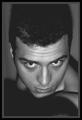
Seeby olegComment: It looks like you are looking in a mirror, trying to see if you have a bald spot. The answer? it's all there. :)
Looks good. I like the angle and the framing/cropping are good too. Your chin looks like it's squished on something, or it's covered in shadow. Looks a little strange. Otherwise, a very nice shot. Nice to meet you. ~Heather~ |
| 06/21/2003 12:18:46 AM |
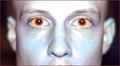
Red-Eyeby bgmorrisComment: Not really the most appealing of effects, but definately different. I can't really find a sharp focus in here. Looks like maybe on your nose, but the effect kills any focus that might be here. I think the angle and framing/cropping are ok. Just doesn't really appeal much to me. You're forhead looks like it's trying to direct airplane traffic or something. really way too bright. |
| 06/21/2003 12:16:20 AM |
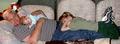
Me and the boys.by vtruanComment: Definately makes me smile. Good shot, and focus is good as well. I wish that fuzzy animal wasn't right near your head. I find that a bit bothersome. Smooth pulling it off without waking the baby. :)
Lighting is really good for this shot. No distracting shadows or bright spots. We can see your face really well, and even the precious babys face.
~Heather~ |
| Photographer found comment helpful. |
Home -
Challenges -
Community -
League -
Photos -
Cameras -
Lenses -
Learn -
Help -
Terms of Use -
Privacy -
Top ^
DPChallenge, and website content and design, Copyright © 2001-2026 Challenging Technologies, LLC.
All digital photo copyrights belong to the photographers and may not be used without permission.
Current Server Time: 07/23/2026 05:28:04 PM EDT.