| Image |
Comment |
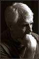
| 06/22/2003 06:25:15 PM |
Contemplativeby DennisFComment: The lighting on your hair and hand is just slightly bright. Other than that, I think this is a great self portrait. Shows you, personality, and good focus and clarity. The angle and framing/cropping are also good. Nice to meet you. ~Heather~ |
 Photographer found comment helpful. Photographer found comment helpful. |
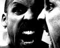
| 06/22/2003 06:23:52 PM |
Anger Managementby ozdickComment: I realize that this is suposed to have dramatic lighting, but it doesn't really work for me in this case. I think that the lighting is way too harsh on the right image of you. Also, on the left images shoulder to the left of the photo.
I do think though that it works to have your eyes darkened like this. It fits the theme of the photo. The black gums are kind of disturbing though. Nice to meet you. ~Heather~ |
| Photographer found comment helpful. |
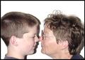
| 06/22/2003 06:21:31 PM |
My grandson is taller than me.by cathysappComment: The really harsh shadow on the back wall is quite distracting. You can fix this by either using some extra lighting or by moving away from the wall some. Looks like you maybe used flash? If so, just try regular lighting and no flash. Focus and clarity are good, and I like the angle and framing/cropping. I wonder if you could have focused on just one person. Cause without the title, we really wouldn't have known which one was you. Nice to meet you. ~Heather~ |
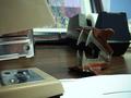
| 06/22/2003 04:42:31 PM |
Turf Warby GeneralEComment: *Critique Club*
This is very cute. I like the concept very much.
The angle and framing/cropping seem to me to be just fine. I think having the stapler coming out of the bottom left is good.
What is bothering me here is the background. Mostly the tape dispenser. It is right in the middle of the 'action'. I wonder how this would work sitting on a desk with just the wall being the background. That way it is still in a natural looking environment, but not too busy as with this background.
The white paper in the bottom right is a little bright. The rest of the shot is dark, so adjusting brightness would hurt this shot. The only 'fix' I see would be to adjust the actual lighting around the subjects.
Focus and clarity seem good to me. I think that the detail in both subjects is good to show the competition. You captured the pointy prongs on the remover very nicely.
Overall nice.
~Heather~ |
| Photographer found comment helpful. |
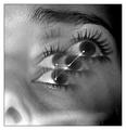
| 06/22/2003 12:15:20 AM |
My Galaxyby GalyNetComment: Interesting, but it doesn't really appeal much to me. Your focus is good on the main eye. I've never been a fan of up your nose kind of shots. I think "Blair witch project" ruined that for me. lol. Definately different, just not really my cup of tea.
~Heather~ |
| Photographer found comment helpful. |
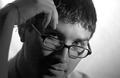
| 06/22/2003 12:13:31 AM |
On the Outsideby oldwisemonkComment: This is a very nice portrait. I think that the angle and framing/cropping are good, and the focus is good as well. The only thing that bothers me a bit are the horizontal lines going through the dark areas on the left of the photo. You did an excellent job photographing glasses without glares or reflections. Very nice. ~Heather~ |
| Photographer found comment helpful. |
| 06/22/2003 12:10:46 AM |
Bright Eyedby juliapersonComment: Nice eyes. The lighting on your nose is a little harsh though. Also, I find the ring of hair to the left of the photo to be a bit distracting. I'm not sure about the crop. I don't think it should go right through your mouth. i'm wondering if showing your mouth would have been better? Either that or cropping closer to your eyes. The shadows are also a little distracting. I like the closeness though. Nice to meet you. ~Heather~ |
| Photographer found comment helpful. |
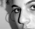
| 06/22/2003 12:06:29 AM |
Angerby hawkidaComment: Why would you be angry for a self portrait? This isn't the most flattering pose. I think I would like to see your eyes in a bit better focus. They seem soft to me here. it looks like you have your eye brow pierced, but we can't really see it enough for it to enhance the photo any, I find it to be a bit of a distraction here. Nice to meet you. ~Heather~ |
| Photographer found comment helpful. |
| 06/21/2003 07:53:45 PM |
my selfby ackerComment: the lighting on your face is a little harsh here, making you look a bit yellow. just doesn't look natural. Focus and clarity are really awesome though. I like the angle. Although I looked at it for a long time with my head tilted, I think it adds character. you have really nice eyes. nice to meet you. ~Heather~ |
| Photographer found comment helpful. |
| 06/21/2003 07:52:05 PM |
They call me - The Fish -by kosmikkreeperComment: I wish that the left side of the shot wasn't so dark. it is ok on the goggles, but your eye is totally in darkness. the focus seems a bit soft as well. The sharpest focus seems to be on the black part of the mouthpiece, where it meets the light colored snorkel. Nice desaturation though. and definately interesting. |
| Photographer found comment helpful. |
Home -
Challenges -
Community -
League -
Photos -
Cameras -
Lenses -
Learn -
Help -
Terms of Use -
Privacy -
Top ^
DPChallenge, and website content and design, Copyright © 2001-2026 Challenging Technologies, LLC.
All digital photo copyrights belong to the photographers and may not be used without permission.
Current Server Time: 07/23/2026 09:31:01 AM EDT.