|
|
|
Showing 901 - 910 of ~2785 |
| Image |
Comment |
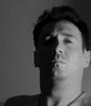
| 06/24/2003 11:47:21 PM | My - Self - Portraitby frozensunComment: Very nice clean shot. Focus and clarity are really good, and the background is great. Only complaint is that the sky is just a slight bit too bright, but the lighting on the rest of the shot is perfect. good angle and cropping. I like this a lot. Nice to meet you. ~Heather~ |  Photographer found comment helpful. Photographer found comment helpful. |
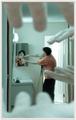
| 06/24/2003 11:45:30 PM | In My Handsby JPRComment: This is utterly confusing, but if I looked at it long enough, i...well who am I kidding I'd never figure it out. lol I do think it's really cool, but find the blurry hands a bit distracting from you. Overall nice concept though. Nice to meet you. ~Heather~ |
| 06/24/2003 11:43:13 PM | It is I! L'clerk - gaja_tzby gaja_tzComment: Beautiful black and white. I like how the 'white' is just the little twinkle in your eye. I like the lighting very much and think that the angle and framing/cropping are good as well. There is a small object in the background near your shoulder that could be a little distracting, but nothing serious. Nice to meet you. | | Photographer found comment helpful. |
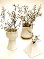
| 06/24/2003 08:11:52 PM | Real Simpleby basia03Comment: *Critique Club*
The very first thing that draws my attention in this shot is the fact that you have cropped the left of the photo way too tightly. I think that the left of the photo outweighs the right because a)there are more of the plants going up that side of the photo and b)our attention is drawn there by the cropped tips.
The lighting in my opinion is really good. I like the white on white with very little other 'color'. Also good for the focus.
The focus is nice, and I like how we get detail in both the plants and the pots. My favorite is the triangle.
I am not familiar with your magazine title, however, I think that it sounds like it would work on the cover of a magazine with that title.
Overall a nice job.
~Heather~
*Final Hours Critique*
If my comment is brief, it's because the Magazine Cover shots are going to be taken off the CC list tonight at midnight, and I can get to more of them, using less words. Figured even a brief comment is better than no comment at all. | | Photographer found comment helpful. |
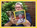
| 06/24/2003 08:03:44 PM | National Geographicby pikytoComment: *Critique Club*
Hey, you're the guy with the 1/2 face, 1/2 photo self portrait. If I'm wrong, just ignore me. lol
This shot is nice. I don't think that this photo would ever be on the front cover of NG though. Probably not the one IN the photo either, but hey, it does have humor value, and is very nicely done. And since i'm not voting, who cares what i say anyway. lol
Your focus and clarity are good. I think that the reflections in your glasses are a bit distracting due to the fact that the expression on your face draws my attention there right away.
The angle and framing/cropping are good, but wonder if this could be vertical crop rather than a short stumpy horizontal crop.
The lighting is good overall, but wouldn't want it any brighter on your hat.
Definately made me smile.
~Heather~
*Final Hours Critique*
If my comment is brief, it's because the Magazine Cover shots are going to be taken off the CC list tonight at midnight, and I can get to more of them, using less words. Figured even a brief comment is better than no comment at all. | | Photographer found comment helpful. |
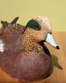
| 06/24/2003 07:53:50 PM | Wildfowl Carving Magazineby camelotnorthComment: *Critique Club*
What stands out to me most is the shadow. I think it's a bit distracting. I think that with different lighting, not only would it help fix the shadow, but also help to bring out the colors a bit more in your image.
The horizontal line in your background isn't horizontal, which is also distracting.
I think I would have placed the subject on something other than a wooden table. Having it on wood, distracts from it being wood. Just too much wood to focus on just one of the wooden subjects. Table or Duck.
I also wonder how this would be as a close up. Maybe of just the head. I think it would show the detail a lot better and accentuate the fact that it's carved.
Your focus and clarity are good, but because of the lighting, we lose some of the detail on the top of his head.
Overall, the subject could definately be on the front cover, and with some minor adjustments, the photo as well.
~Heather~ | | Photographer found comment helpful. |
| 06/24/2003 07:39:54 PM | Strawberry smileby MikuComment: *Critique Club*
The background for this image is Quite pixellated. The focus and quality of the strawberry is good, but the quality of the background is really really poor. See all the little identifiable squares in it? Especially on the face.
There are a few hot spots of lighting. On the nose, hair and shirt. I think that the shadow on the strawberry is making it look like it's a little old. Maybe starting to go soft.
Overall angle and framing/cropping are good. I like the DOF, and think that it's used realy well here.
If I had a suggestion, for the challenge, it would be to have moved the strawberry nearer to the person, and get a vertical crop, so it would be more formatted for the front of a magazine.
Nice idea.
~Heather~
*Final Hours Critique*
If my comment is brief, it's because the Magazine Cover shots are going to be taken off the CC list tonight at midnight, and I can get to more of them, using less words. Figured even a brief comment is better than no comment at all.
|
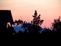
| 06/24/2003 06:53:10 PM | In between somewhere..by Michael_Comment: *Critique Club*
This shot is way too out of focus for my personal taste. I'm not really sure what magazine would put a shot which is so blurry on the front cover. I can't say that I've ever heard of your title as the name of a magazine, but anything is possible.
I think that the angle and framing/cropping are ok. I'm not really sure what that white dot near the left of the photo is, but it is quite distracting to the image as a whole.
I like the color, although it seems a bit muted, like it was foggy or something.
Your sillhouettes are good. I like how they are black, and the background mountain and clouds are blueish. That makes them stand out nicely and not blend in with everything.
Overall composition is good, but too blurry for me.
~Heather~
*Final Hours Critique*
If my comment is brief, it's because the Magazine Cover shots are going to be taken off the CC list tonight at midnight, and I can get to more of them, using less words. Figured even a brief comment is better than no comment at all. |
| 06/23/2003 10:13:47 PM | BodyScapeby photogooComment: Nice to meet your butt. I guess I was hoping for a little more face. However, this does qualify for self portrait. I am not sure I like the grain and soft focus though. I would like to see this more real. The lighting is good however. ~Heather~ |
| 06/23/2003 10:11:31 PM | My Self before a Flash MX teaching sessionby pcManComment: Holy harsh lighting Batman! The lighting on your shirt is aweful. Really way too bright. on your face it's bright, but not quite as bright as on your shirt. Definately puts you in an environment, and shows not only a physical you, but an inside you as well. Focus and clarity are good. Nice to meet you. ~Heather~ |
|
Showing 901 - 910 of ~2785 |
Home -
Challenges -
Community -
League -
Photos -
Cameras -
Lenses -
Learn -
Help -
Terms of Use -
Privacy -
Top ^
DPChallenge, and website content and design, Copyright © 2001-2026 Challenging Technologies, LLC.
All digital photo copyrights belong to the photographers and may not be used without permission.
Current Server Time: 07/23/2026 12:15:29 PM EDT.
|