|
|
|
Showing 891 - 900 of ~2785 |
| Image |
Comment |
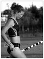
| 06/27/2003 06:14:19 PM | Vaulterby jimmythefishComment: *Critique Club*
This is a very crisp, clean photo. I think your focus and clarity are really what make this shot for me. The detail is great. Right down to what looks like a belly button ring. Although I can't imagine vaulting and getting that thing caught on something. ouch.
I do really like the angle and framing/cropping you chose for this. I like how she is over to the left of the photo, and how her pole is angled at the bottom as well.
It doesn't look like a photographer fault, but the background is angled to the left, which is generally a taboo thing for me. But since your vaulter is upright just fine, I can only imagine that the land in the back actually IS angled.
I like this in black and white. That way our attention is all on the front subject and not distracted by colors in the background. You have a nice tonal range. Nice whites in the pole and also nice darks in the clothes.
Definately a great shot. I think it would work for photojournalism also. Something I could see in a sporting magazine. Good find!
~Heather~ |  Photographer found comment helpful. Photographer found comment helpful. |
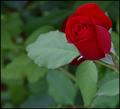
| 06/26/2003 07:22:31 PM | Softby rll07Comment: *Critique Club*
My first thought when I saw this, is exactly what inspzil mentioned. That I wished that the flower itsself were a bit bigger.
I think that if you were to get in a bit closer on the flower that it woudl appeal to me personally a bit better. Someone mentioned that they liked it farther away, to show the environment it was in, and this is true too. Everyone sees things differently, and it's not a suggestoin to change it, but rather my own personal preference.
I do think that the focus is supurb. Great detail is shown in this flower, right down to the veins in the petals.
This looks like a rose bush we have in our yard, that produces these velvety feeling roses. Kind of really soft velvety feel to them.
The color is really good. I wonder though if it had just a tiny touch more lighting if it would have brought the red out even more.
I do like the angle and framing are good. I like how this is in the upper right of the photo. This does make for a visually appealing shot.
Lighting I think could be just a little bit brighter to help bring out some more color in the rose itself.
A really great shot overall.
~Heather~ |
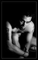
| 06/26/2003 09:09:13 AM | Ink For Lifeby byetkoComment: *Critique Club*
Wow. Amazing that I get this image, when just 2 minutes ago I added it to my shopping cart at DPCPrints. Can't buy it though cause I don't have a credit card though, so I have to pick out a bunch of images then I can send it a money order. Anyway, this is the first shot I've ever added to my cart to buy.
About the shot. I really like it. It's got personality and attitude.
The angle and framing/cropping are perfect. I really like the closeness of the cropping, and you have cropped in all the right places. Usually cropped hands, feet, knees bothers me, but here you have cropped your knee and hand, but I like it this way. I think it works because you have 'cropped' in a way other parts of the shot with the lighting.
I just love the mood of this shot.
Black and white really works here because not only do you have white on black, but you also have black on white. The tattoos really add to this shot for me.
Overall it's really appealing. Not just cause you're a good looking guy, but the personality, lighting, and focus and clarity are all really great.
And you work at a pet store like me, so maybe I'm just partial. lol They're making me shift manager on the 5th..woohoo.
Great shot!
~Heather~ | | Photographer found comment helpful. |
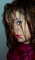
| 06/25/2003 08:02:36 AM | Trappedby OneSweetSinComment: *Critique Club*
Well, I supose it was meant to be. I even waited to do CC's this time.
I did get your response to my original critique, and I will say that for that purpose, I think you did a great job with this shot.
I do still wish that we could see your face a bit better, but this does give a bit of mystery to you.
Your shirt is a little busy in combination with your hair, which I didn't notice until now, so it must not be that terribly busy, but your hair creates stripes, and your shirt is floral looking, so it does class a bit.
I do like the lighting, I think that it brings out skin tones very well. Focus and clarity are also good.
Overall, I think that the shot shows a lot of 'you'. Personality wise. It has character, and that's one of the most important parts of a self portrait.
I think that the background works well, nothing distracting there.
Still wish I could see those eyes though.
~Heather~ |
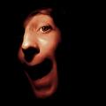
| 06/24/2003 11:57:41 PM | Caricatureby KonadorComment: I really like the lighting on this. I think that the angle and framing/cropping are good as well. Really adds some personality. focus on your eye is great, and detail is wonderful. definately unique. Great shot! ~Heather~ | | Photographer found comment helpful. |
| 06/24/2003 11:56:22 PM | "Dizzy"by sfarrell23Comment: Dizzy because of the soft focus? I think it's a nice portrait, however I do wish that the focus were crisp. I like detail, and I think it's hindered here due to my eyes trying to focus on this shot. Good color and lighting. I like the closeness. nice to meet you. ~Heather~ | | Photographer found comment helpful. |
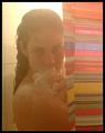
| 06/24/2003 11:55:02 PM | Steamed Upby RiderGalComment: Nice shot. I think though that the lighting above your head is a distraction and a bit too bright. Overall though, I like the foggyness and the orange cast over the photo. Original and definately shows you. I like your shower curtain too, adds a nice bit of color to the shot. nice to meet you. ~Heather~ | | Photographer found comment helpful. |
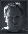
| 06/24/2003 11:53:40 PM | Shades of Grayby crabappl3Comment: Every time I go to comment on this, I get distracted and end up not doing it. It's popped up like 5 times now, so I HAVE to get this in. lol The only thing that I notice is that the focus on your eyes looks a bit soft, where the left of the photo (your right) seems to be the crispest. Probably lighting? Overall though, I think it's an excellent self portrait and shows personality as well as detail. Nice to meet you. ~Heather~ | | Photographer found comment helpful. |
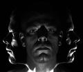
| 06/24/2003 11:51:10 PM | Rule of Thirdsby robsmithComment: JEB did a shot similar to this for the illusions challenge, I think it was. I saw it on photo know how on photosig. I'm totally sure that's not the first place it ever showed up, but I still think it's an interesting effect. I think you did an excellent job getting the center face centered and clear. And also getting the side faces symetrical. I like it. Good lighting as well. Nice to meet you. ~Heather~ |
| 06/24/2003 11:49:08 PM | Swirlyby brentpaughComment: light on your face and shirt is almost a little bright. Can't say this is the most appealing shot in the bunch, but it does show a lot of personality, and that's important. I don't like your lenolium though. Nice to meet you. ~Heather~ | | Photographer found comment helpful. |
|
Showing 891 - 900 of ~2785 |
Home -
Challenges -
Community -
League -
Photos -
Cameras -
Lenses -
Learn -
Help -
Terms of Use -
Privacy -
Top ^
DPChallenge, and website content and design, Copyright © 2001-2026 Challenging Technologies, LLC.
All digital photo copyrights belong to the photographers and may not be used without permission.
Current Server Time: 07/23/2026 08:20:47 AM EDT.
|