|
|
|
Showing 871 - 880 of ~2785 |
| Image |
Comment |
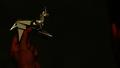
| 08/04/2003 08:06:18 PM | Blade Runner - The Directors Cutby robsmithComment: This is really grainy in the hands. I think that the redness bothers me a bit, and the grainyness makes it look like it's low quality. I havn't seen this movie, so don't know the meaning of the oragami, but I'll take your word for it. I think that the lighting on the oragami is ok, but not on the hands. It looks to me like a unicorn. The hand on the right is distracting as we can't really see much of it at all. I do like how you put your subject to the left of the photo though. Definately better than dead center for this subject. |  Photographer found comment helpful. Photographer found comment helpful. |
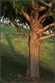
| 08/04/2003 08:03:40 PM | The Lord of the Rings - Treebeard of Entwoodby DennisFComment: This is really cool. I love the lighting here. I wouldn't know what your 'scene' was but last week I went to a ren faire and took some pics of this really cool tree person and was told that the thing I took pictures of was called an ent.
Anyway, the only thing that I can see that I think could use improvement here, and it's only a pet peeve is that the background horizon line is REALLY angled. This, however isn't your fault, as we can clearly see that the tree is straight, but it is still quite distracting to the image. i like how the lighting is a bit orange, and the shadow of the tree looks human like. i like the addition of the shadow in the shot. The patterns on the tree are really neat too. Just for kicks, here are the pics I got of the 'Ent' //www.dpchallenge.com/image.php?IMAGE_ID=31959 and //images.dpchallenge.com/images_portfolio/3080/orig/31960.jpg Enjoy! | | Photographer found comment helpful. |
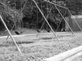
| 07/22/2003 11:28:04 AM | Swingsetby DavidLevinComment: My eyes are wandering all over this shot. I'm made to think that the strong diagonals (legs) are suposed to be leading my eyes somewhere, but they don't. They lead out of the top of the photo and lead into the grass. If the swings are suposed to be the main focus, than the legs are quite distracting. If the legs are suposed to be the main focus, than I think that the swings add too much noise for them to be really very interesting. The building in the back is incomplete and doesn't really add anything to this shot either.
I do like how you have put the little fence in the bottom right corner, I think it gives me something solid to look at, but still it doesn't lead anywhere, and doesn't seem to have a major purpose.
Your focus and clarity are ok. And the lighting seems to have no major flaws. Just doesn't really peak my interest much. It feels really incomplete, as there isn't really anything that is totally in the photo.
Hope this helps.
~Heather~ | | Photographer found comment helpful. |
| 07/21/2003 11:14:06 PM | Flirtingby heidaComment: *Critique Club*
This photo seems a bit unbalanced to me. What I see is the glasses taking up the left side of the photo, and she is taking up the right side of the photo, however, her face is way up in the photo toward the top and her eyes are dangerously close to the top frame of the photo.
The soft focus actually works for me here. Kind of gives us a dreamy feeling about the whole shot.
The way you have blurred the background is great. I think it gets the background out of the way and lets us focus on the subject a lot. The lighting is a little dark, but I think it's ok that way, as we can see her face just fine. Kind of gives a mysterious feeling as well as dreamy feeling.
Overall, I think that it's a wonderful shot, and there isn't much that I'd like to see differently other than the eyes a little farther away from the frame of the photo. I would like to see it more of the main subject, and with them so close to being out of the photo, it takes the focus off her face, and that's where I'd really like to see it.
Great shot none the less.
~Heather~ | | Photographer found comment helpful. |
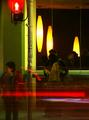
| 07/21/2003 10:19:23 PM | And so the night beginsby JaxsonComment: I saw you confused on your comment that says "can hardly distinquish anything", so I thought I'd stop in and make a few comments. I actually kind of agree with this in a way.
By the placement of the people, they are lead to be the main subject of the photo. The person on the left isn't in focus (cause they were moving lots, probably) and so that kind of makes that person less of the main subject, kind of a mistake in the photo. The other 2 people right in the middle are covered by the movement of the car in the front of the photo. this is quite distracting if they are to be the main subject. Also, I can't really tell if this is a resteraunt, or night club or what. It looks like the 2 people are outside the building, and we can see in the window, but I'm not really sure cause those large yellow lights seem strange. Kind of like they MIGHT be inside the building, or they MIGHT be reflected in the glass of the building.
It is a rather confusing shot if you have never seen this before or know what this is. You have the 'heads up' on what this is, cause you've seen it as a whole.
I think what that comment means, is that we haven't seen it, and probably need to see a bit more of the 'scene' to fully understand exactly what was going on.
Hope this helps.
~Heather~ | | Photographer found comment helpful. |
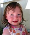
| 07/13/2003 02:53:47 PM | Blue-Eyed Babyby CreativeFlyPhotoComment: *Critique Club*
I think this is adorable. The blue in her eyes doesn't really stand out much though. I think it does look like she was crying, and the reflection in the liquid in her eyes makes it so that the color is kind of blocked by the white of the reflection.
I like the angle, and she is a really cute kid.
The background has a few really bright spots from sun and I find those to be a little distracting, especially since they are near her head. The focus and clarity are really good. Wonderful detail. We can see individual eye lashes.
Her skin tones seem a bit red. Either she's had a little too much sun, her face is red from crying. Sometimes though it's caused by the settings on the camera. I think it's fixable with color adjustments in an editing program either way.
I think it's a good B shot even without the blue eyes. Still says Baby.
Good shot.
~Heather~ | | Photographer found comment helpful. |
| 07/07/2003 07:49:31 AM | Don't Try This at Homeby LanSnakeComment: Is the question as to what kind of snake this is? Or why you have christmas lights up in July? lol. I think I'd prefer to see the interesting side of the snake. We can't really see his head or the lovely pattern on his back. The underside of him is kind of dark as well, taking away some detail. Lighting conditions look a little harsh, as can be seen around the edges of the fingers that are on the sky. DOF is good to get the house out of the way and make it non distracting, but your house is leaning, so it makes it distracting anyway. Big snake though. Definately interesting subject, just not displayed in the most interesting way. ~Heather~ |
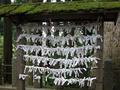
| 07/07/2003 07:46:05 AM | What are those white stuff and what for?by kenboComment: I can't really see them well to tell if they are tubes or paper, or cloth. I wonder if we got a closer up shot if it might draw us in a bit more. Maybe make it a little more interesting. Your focus and clarity seem ok, I can get a lot of detail in the bark of the tree to the right, just not ont the subject. I haven't a clue what it is, which does create the mystery here, but would like to still see it a bit closer up. ~Heather~ | | Photographer found comment helpful. |
| 07/07/2003 07:42:53 AM | Evidenceby Chilly0999Comment: Very nice. Love the focus and clarity here. I actually think that the DOF works well too. Don't need to see the whole print, but you have the main loop in the print nicely focused. I can't tell what the print is on, so that adds to the mystery. I like the addition of the shiny blue surface. Adds enough color to make it interesting, but not too much to distract. Great shot. ~Heather~ | | Photographer found comment helpful. |
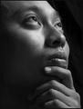
| 07/07/2003 07:38:58 AM | unanswered questionsby grigrigirlComment: On my monitor, the shadowy areas are kind of blotchy. I don't count off for that, cause it could just as easily be my monitor as it could be yours, but just thought I"d mention it. Focus and clarity are really good. I like the dramatic lighting, and this definately portrays someone who appears to need some answers. I think you did a good job with this. Angle and framing/cropping are also good. Like how you have some blank space in the area the person is looking toward. ~Heather~ | | Photographer found comment helpful. |
|
Showing 871 - 880 of ~2785 |
Home -
Challenges -
Community -
League -
Photos -
Cameras -
Lenses -
Learn -
Help -
Terms of Use -
Privacy -
Top ^
DPChallenge, and website content and design, Copyright © 2001-2026 Challenging Technologies, LLC.
All digital photo copyrights belong to the photographers and may not be used without permission.
Current Server Time: 07/23/2026 05:27:33 PM EDT.
|