|
|
|
Showing 831 - 840 of ~2785 |
| Image |
Comment |
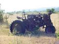
| 08/26/2003 10:38:16 AM | Ye Olde Tractorby channeledComment: My first issue with this photo is the very obviously tilted horizon. It does help to keep an eye on your background during actually taking the photo. I realize this is easily correctable with editing software, but for this challenge, it's all in the eye. Second, the colors seem really muted. Kind of muddy. Looks like it was just too bright of a day for your camera to handle it. The sky is totally whited out, and the colors of the tractor and surroundings are dulled quite a bit. Focus seems ok. I might have liked to have seen a different angle on the tractor as well. Side on, dead center of the photo doesn't really draw me in and hold me there. I think maybe a different time of day, or different day all together would have made a dramatic difference with this shot. ~Heather~ |
| 08/26/2003 10:33:46 AM | A Picture from the Pastby giseleComment: I'm very glad that the bottom left corner of this is curved like it is. Otherwise, this would lack that something that draws us in. Your photo OF the photo is very nice. No lighting issues, I like the shadow under the curled part of the photo. The background works nicely and the focus is good from what I can tell. Definately something from the past. ~Heather~ |
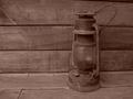
| 08/26/2003 10:31:03 AM | Windmillby SonifoComment: my first impression when looking at this photo is not 'windmill'. However, it does look like something from the past. I do really like the tones, and the pink overcast works for this shot in my opinion. The angle and framing/cropping at first, I thought were a little off, but I actually like the slight left tilt of the strong horizontal lines in this. And I also like how the lamp is not dead center, but slightly off centered. Focus and clarity are also really good. Overall a wonderful shot. ~Heather~ |  Photographer found comment helpful. Photographer found comment helpful. |
| 08/23/2003 10:32:50 PM | In The Beginningby togtogComment: Been done before. Unfortunately, not really my thing. It's a bit dark. lol. I do like how you filled the frame with the subject, the closeness is really nice, but I think it lacks much detail. Maybe a wider tonal range would help this shot a bit. Overall doesn't really draw me in and hold my attention. My eyes are finding it hard to rest on one single focal point. *rolls eyes* LOL What can I say? Definately different. | | Photographer found comment helpful. |
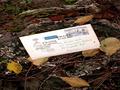
| 08/23/2003 10:29:11 PM | old letter on an old stumpby kenboComment: I'm not really sure why there is an old letter on an old stump. You would think had the old letter been there for any amount of time, that the letter would be all wet and moldy and not white at all. Honestly, the letter and the stump don't really go well together at all. They just dont fit. Kind of like seeing a shoe sitting on a piece of bread. Very unusual. The focus on the stump is a little soft, but the focus on the letter is ok. The lighting on the letter though is a little bright for my taste. I think it's a little too white and almost strains the eyes trying to look at it against the stump. Overall though, I think that it definately shows something from the past, but just not really my thing. ~Heather~ | | Photographer found comment helpful. |
| 08/23/2003 12:04:55 PM | gather round the chuckwagonby magnetic9999Comment: The colors here are stunning. This has a bit of a "not real" feel to it. Kind of like it was a little model or something. I can tell it's not, but it just seems kind of dreamy. Not quite sure I explained that right, but not really sure how to explain it.
Anyway, your focus and clarity are awesome for being straight out of the camera with no adjustments. Definately shows a time from the past, and the angle and framing/cropping are really nice. I like how you have put the wagon off to the right a bit. ~Heather~ | | Photographer found comment helpful. |
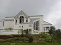
| 08/23/2003 02:20:59 AM | The Church On The Hillby surfr10132Comment: I think that a few steps to the left would improve this a lot for me. The angle and framing seem a bit off. You have chopped the left side of the photo (right side of the church) and that's generally a no-no. The horizontal line of the roof is not horizontal. This is due to your funky angle. Your sky is pretty bland. Looks like an overcast day, not a lot of lighting, and it hurts the shot in my opinion. If the lighting were a bit stronger, I think it would bring out the gardening in the front of the building a bit. See how there seem to be some interesting things in there? They all kind of merge into each other because the detail is hindered by the lighting. Try a different day, or different time of day. Who knows, sometimes you can get a really cool effect when the sun is really low to the horizon. I'd try it with the sun in front of the building, really low in the sky. Hopefully, it's facing the right way for that to work. lol. I think that the building has interest, and definately photo worthy. Also, your focus and clarity are really good here despite the lighting conditions. Definately doesn't look hand held, and if it is, you did a wonderful job with that. ~heather~ | | Photographer found comment helpful. |
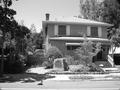
| 08/23/2003 01:56:28 AM | Birthplace of Silicon Valleyby JPRComment: I supose anything that's not the present is in fact "the past" but this doesn't appear to me as being very much in the past. I mean, I can see the plaque which I assume says something about being a historical monument of some sort, but the building its self doesn't look very old at all. What ever that is on the steps is distracting, as my eyes are drawn to it's brightness and I sit here trying to figure out what the heck would be sitting on the steps like this. Your focus and clarity are good, and for the most part lighting is alright as well. Some shadows, but none bad on the building itself. The angle is odd, like you are looking at it from the side, but not enough to be dramatic. Kind of looks like you were only a step or 2 off from being in front of it. Also, the darkness on the left of the photo doesn't add anything to me. I think that it's not really important and could be cropped out without losing anything from your image. Overall, I think it's good though. ~Heather~ | | Photographer found comment helpful. |
| 08/23/2003 01:50:49 AM | Abandoned Homeby Chilly0999Comment: I'm not usually fond of IR photography and this is no exception. I don't think it really works here. The building lacks detail. I think it's just too dark to really see much. Maybe it's not even that it's 'dark' but it's cloudy. Something is making the building dull. The main focus seems to be on the tree, and that really doesn't screem 'the past' to me. The building looks old, but it's not really the most 'interesting' part of the photo, as the eyes are drawn to the unusual muddy brown sky and white tree. ~Heather~ | | Photographer found comment helpful. |
| 08/23/2003 01:46:46 AM | Back to the age of black and whiteby johnmkComment: I think the title would work better had this photo actually been black and white. I realize that not all camera's have that feature, so maybe not possible, but just curious about the title. These definately look like old boats, and your focus is good in my opinion. I think the colors seem a bit muted. Mabye it's just the shadow from the white boat on the green one that bothers me a bit. Also, I wish you could have gotten the back end of the white boat in the shot, it seems a bit off balance with the white boat standing out so well, and the green boat is almost invisible as it blends in with the background. It's kind of weighed down on the left of the photo. Definately old though. ~Heather~ | | Photographer found comment helpful. |
|
Showing 831 - 840 of ~2785 |
Home -
Challenges -
Community -
League -
Photos -
Cameras -
Lenses -
Learn -
Help -
Terms of Use -
Privacy -
Top ^
DPChallenge, and website content and design, Copyright © 2001-2026 Challenging Technologies, LLC.
All digital photo copyrights belong to the photographers and may not be used without permission.
Current Server Time: 07/23/2026 02:55:43 AM EDT.
|