|
|
|
Showing 821 - 830 of ~2785 |
| Image |
Comment |
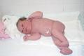
| 09/30/2003 12:36:01 PM | New lifeby onniComment: *Critique Club*
Definately Life. I think this represents the subject very well.
The photo itself though is a little bright. As stated, I belive it's a little overexposed. The skin color looks good. Even for a newborn. It's the surroundings that seem too bright to me. Like the towels and the wall. Seems to lose a bit of the details, and it's just white.
I might have prefered this at a lower angle. Also, the angeled lines of the tiles in the wall behind the baby are a bit distracting. I wonder if it would be less so if they were leveled out a bit.
Overall a nice shot of a beautiful new baby.
~Heather~
|
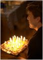
| 09/30/2003 12:29:30 PM | Wishby jimmythefishComment: *Critique Club*
I like this. I think that it does portray the subject of life nicely. Birthdays are a very important part of life, and if we didn't have birthdays, we wouldn't be living, so good choice there.
I really love the lighting, as stated a couple of other times. I think it's because it casts an orange tint on the man and face.
I think that the focus on the man is great. Wonderful detail shown in his face and clothing. I wish though that the focus on the cake could have been more crisp, but then again, maybe if it were more crisp, it could take away from the mans face. So that would be something I'd have to see to make a decision on weather or not it enhanced the photo, or distracted from the man.
You did a wonderful job of blurring the background so that it is not a distraction at all to the overall photo.
It has a very nice warm feeling to it. It's a happy photo, and that invites me in.
Great job in my opinion. ~Heather~ |  Photographer found comment helpful. Photographer found comment helpful. |
| 09/30/2003 12:23:01 PM | sunliteby lightningComment: *Critique Club*
This is an interesting abstract kind of photo. I'm not really sure what it has to do with Life, but maybe if you look at it like maybe it's another galaxy or solar system or something, than maybe it could be.
I like the color a lot and I think that having it centered it nice. I can't really tell, but it looks like it might be tilting to the left just slightly. Either that, or the pattern inside makes it look like it's tilting. Most likely just a optical illusion kind of thing.
The focus you chose for this is perfect. I like seeing all the little bubbles (?) inside. I also like the way the orange swirls look near the middle.
The blue part near the bottom doesn't seem to quite fit in with the rest of the shot, but it's not real bothersome at all.
Overall, it's interesting, maybe not my first pick for the topic of life, but definatly makes you think.
~Heather~ |
| 08/30/2003 02:55:38 AM | Brother 1by RefractedComment: You're brother looks a lot like you. Comparing your profile pic to this one anyway. This is a good pic of your brother, but the skin tones on his arms doesn't seem right. Seems like the white balance is off just slightly. They seem to be brighter than they should be. Otherwise, the focus and clarity are great, and I think this is a good candid. ~Heather~ | | Photographer found comment helpful. |
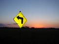
| 08/30/2003 02:50:39 AM | Going to Nowhere by sonicblisComment: This is a very nice image. I like the color of the sign against the color of the background. I think though that maybe I would like to have the black a bit blacker. As is, I can see the sign post, but I can also see that the horizon line is tilted slightly. Overall very nice though. Worthy of at least one comment. :) |
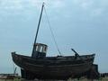
| 08/26/2003 11:19:42 PM | End of Daysby Geo_GriffinComment: Definately looks like an old boat. My only complaint would be that it almost looks like a silhouette, but not quite. It's not quite bright enough to get a lot of detail from it, however, not dark enough to be a silhouette. I would like it if there were just a bit more light on the boat so we could really get a good look at it. Seems strange to see the boat not in water, but I think that makes it much more interesting. And also increases the 'oldness' of the boat. Focus and clarity look to be ok. I wonder how it would look from an angle just a few more steps to the left? Would have to see it to make a judgement, but maybe give it a little 'drama' with a more 'not side on' angle. ~Heather~ | | Photographer found comment helpful. |
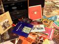
| 08/26/2003 11:05:49 AM | LP Hi Fi Stereoby drydocComment: Defiinately shows something from the past. It looks a little cluttered for my taste though. I might have liked to see only a few records in the image. I can't really find a resting place for my eyes. Lighting is good, no shadows or spots that are too bright. I think it helps the focus when lighting is good, and your focus is really good here, as we can read all these album covers. I am glad you included the record player in the photo. I don't think it would have worked as nicely without it. ~Heather~ | | Photographer found comment helpful. |
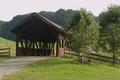
| 08/26/2003 11:02:08 AM | Bridge to the Pastby alanfreedComment: This is a good subject. My only wish though is that the sky weren't so blah. It's actually got kind of a pinkish tint to it. Maybe this would have worked better at a different time of day, or on a different day. The sky just really takes away from this in my opinion. The focus works for this really well. It seems like a tad bit of soft focus, which I like for this subject. The color of everything else but the sky is really good. It's a pretty view. ~Heather~ | | Photographer found comment helpful. |
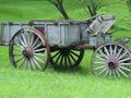
| 08/26/2003 10:45:56 AM | Transportby amsmythComment: This is a good subject for the challenge. I am not fond of how you cropped the front of the cart though. Generally, I like to have some space in front of an object. It makes it not seem so cramped. I think that the crop here is way too close. I realize that you were trying to get in on the subject for detail, which I really like, but It seems so very forced. Lighting is great. No distracting shadows or hot spots. And focus is also nice. My only complaint is the crop, which you couldn't do much for for this challenge, however, framing it in camera differently would have helped for the challenge. | | Photographer found comment helpful. |
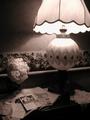
| 08/26/2003 10:42:44 AM | At my Grandmother's Deskby fleenkComment: OK, the first thing I notice is this ball that is hovering over the magazine in mid air. Second, I realize that it must be a flower in a vase that we just can't see. However, it is still bothering me a bit cause it just doesn't look like it belongs at all. The overall appearance of the photo is good. Nice set up and meets the challenge well. Focus looks good, I can even read some of the ads on the desk. The lighting is nice to show well the parts that we can see, but maybe we could be able to see a bit more, as the bottom of the lamp, the vase, and looks like there is even a dark bottle on the table that we can't see well may have added even more to the shot. Maybe some soft side lighting coming from the right could have helped? Still a great shot for the challenge. ~Heather~ | | Photographer found comment helpful. |
|
Showing 821 - 830 of ~2785 |
Home -
Challenges -
Community -
League -
Photos -
Cameras -
Lenses -
Learn -
Help -
Terms of Use -
Privacy -
Top ^
DPChallenge, and website content and design, Copyright © 2001-2026 Challenging Technologies, LLC.
All digital photo copyrights belong to the photographers and may not be used without permission.
Current Server Time: 07/23/2026 12:15:08 PM EDT.
|