| Image |
Comment |
| 07/01/2004 11:16:08 PM |
Nice Rumpby redmoonComment: Mini Cooper! My husband wants one of these SO bad. It's all he talks about. Only problem is that my hubby is 300+ lbs. Oh well. They ARE pretty roomy. lol. Anyway, I love the color. Is it natural color like that? Would have been alright for the desat challenge too, I think. Focus and clarity are really good, and the angle is nice. background adds some interest without being distracting. Very nice job! ~Heather~ |
 Photographer found comment helpful. Photographer found comment helpful. |
| 07/01/2004 11:13:09 PM |
The Brideby albeckComment: Buy this girl a cheeseburger or something! she looks very ill. I think that this pose is very unflattering to her. The dark shadow in her armpit is also unatractive. Focus and clarity are really good, and I like the angle, and pose of the head, but the pose of her arm makes her look deformed. The background is not distracting, pretty blue. ~Heather~ |
| Photographer found comment helpful. |
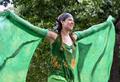
| 07/01/2004 11:09:18 PM |
Girl in Greenby indianzfanComment: I wish she didn't blend in with the background so well. Focus is good, and I like the subject. Quite interesting. I like the movement in her arms. I really do like the arms. I guess my only real complaint would be that she blends in too well with the background. ~Heather~ |
| 07/01/2004 11:04:35 PM |
Walking from the sunsetby eirasiComment: I wish that the person walking were a little more obvious. more predominant. had not been for the title, I might have overlooked the little person. beautiful sun set! I like the reflection and how you have the sun to the right of the photo with the bridge leading to the left. nice placement of items in the photo, and very nice color. ~Heather~ |
| Photographer found comment helpful. |
| 07/01/2004 11:02:26 PM |
Happy Birthdayby StaralfurComment: I have to wonder if this was submitted for 'shock' value, cause it's not that great of a photo. Focus is way off. I can't find a crisp area in the entire photo. The lights behind the girls are distracting, and the lighting is dark and creates distracting shadows on the girls. The subject doesn't affect me in any way, but it's not interesting to me personally. I'm sure it's a nice shot for a family album or something, but just not hitting me on a personal level. ~Heather~ |
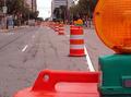
| 06/25/2004 11:39:10 AM |
CONSTRUCTION TIME AGAIN -- "ORANGE BARRELS" INVADE DOWNTOWN LANSINGby taterbugComment: Lansing, Kalamazoo, Detroit, Battle Creek...Michigan's state color should be orange, I think. Frusterating if you have to go anywhere these days. I like how you have placed the front cone nearest the camera in the bottom right. Makes for an interesting comp. focus and clarity are ok, lighting condititions seem kind of blah, but being in MI, I understand that lighting conditions are always blah. lol ~Heather~ |
| Photographer found comment helpful. |
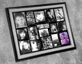
| 06/24/2004 12:19:04 AM |
thebigpictureby binkyat3Comment: I feel like I should be grading the photos IN the photo rather than the photo itself, so I will try hard not to do that. The photo OF the photos is ok. Focus seems ok, lighting seems ok, other than the small shadow behind the upper left of the picture frame. The desat is nice. I like the purple amid the black and white. All that being said...cute photos! :) ~Heather~ |
| Photographer found comment helpful. |
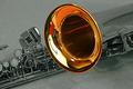
| 06/24/2004 12:14:42 AM |
Saxby graphicfunkComment: the reflections in the bell are a bit distracting. Also, I'm wondering if you might have found a more interesting crop. Focus and clarity are good, and the background contains no distracting elements. The lighting is making some shadows near the bottom right, that maybe could have been fixed with a bit of side light. Overall, I think you did a nice job. ~Heather~ |
| Photographer found comment helpful. |
| 06/24/2004 12:11:19 AM |
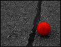
The Ballby newkdesignComment: Yup, it is. While I think you did a good job technically here, I'm not really drawn into the photo. It's a pic of a ball on the ground. Had it been in color, I'm afraid I wouldn't have found it exciting either. The focus and clarity are good, lighting appears to be good, and you have placed the ball near the bottom right, and that placement is good. You did everything right, but it's just not my cup of tea. ~Heather~ |
| 06/24/2004 12:07:55 AM |
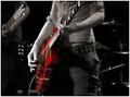
Red Devilby NazgulComment: Beautiful subject! I love guitar photos of all kinds. My brain wants to make this a vertical crop though, showing the head of the person. You decapitated him. Focus and clarity are good, and lighting really creates a mood. I think you did a nice job of keeping background elements subtle and out of the way. The desaturation helps that too. ~Heather~ |
| Photographer found comment helpful. |
Home -
Challenges -
Community -
League -
Photos -
Cameras -
Lenses -
Learn -
Help -
Terms of Use -
Privacy -
Top ^
DPChallenge, and website content and design, Copyright © 2001-2026 Challenging Technologies, LLC.
All digital photo copyrights belong to the photographers and may not be used without permission.
Current Server Time: 07/19/2026 10:47:13 PM EDT.