| Image |
Comment |
| 12/01/2004 10:47:56 PM |
Seven Snailsby PoobaComment: These are cute. I like the color of orange on black. Very nice focus and clarity and your set up is cute too. lighitng is good as well. I have nothing to complain about. my only reason for not scoring a 10, is the visual impact, while it is technically a great photo, it just isn't making me jump out of my seat. definately a nice photo though. ~Heather~ |
 Photographer found comment helpful. Photographer found comment helpful. |
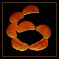
| 12/01/2004 10:39:48 PM |
Oxymorangeby glodaComment: Focus seems generally soft in this shot. I like it.. nice colors. I like the orange on black. I'm not sure the border helps at all, but oh well. Definately a creative take on the challenge. interesting choice of subject and nice layout. ~Heather~ |
| Photographer found comment helpful. |
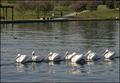
| 12/01/2004 10:36:16 PM |
Seven Pelicans a-swimming...by fulgentComment: this is cute. focus seems quite soft, and I think the crop is a bit close to the guy on the right, but probably to remove an 8th pelican? Lighitng on the pelican closest to the camera seems a bit harsh, but not much you can do about that. I wonder how this would have done with a crop to show just the pelicans. a panoramic type crop. I think that might have cut out some background noise and draw more attention to the birds. Cute. ~Heather~ |
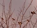
| 12/01/2004 10:30:39 PM |
Park Packby thejahnComment: Fitting for this challenge! Not the most exciting photo, but it works. I like the background color. not typical and that makes it interesting. focus and clarity seem ok, and although I wish there were a bit more light on the birdies themselves, I don't think that would be possible without hurting some other aspect of the photo. Overall nice. ~Heather~ |
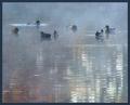
| 12/01/2004 10:29:13 PM |
Fall Morning Fogby BrenbComment: Definately 7. I like the crop and placement of the subjects within the photo. Very nice use of negative space. I realize this is in the fog, but the fog makes it look all out of focus to me, and I think I wish we could have sharper focus. Although the fog makes it interesting, so I'm not quite sure how to accomplish that. Overall nice find! ~Heather~ |
| Photographer found comment helpful. |
| 12/01/2004 10:27:40 PM |
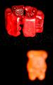
Not Red Enoughby theysayjumpComment: I don't think I like your choice of DOF here. The front guy is way too out of focus for my personal taste. The white specks all over the table around the group are distracting and so are the little light glares on the red gummies. I like the idea, it's cute, but I think that it needs a little tidy-ing up. ~Heather~ |
| Photographer found comment helpful. |
| 12/01/2004 10:25:41 PM |
Iron Guardsby rkligmanComment: You definatley have 7 of the subject. The background is disturbing to me though, not sure if you used a filter, or over sharpened or what, but I don't like the white/blue mess behind the subjects. The subjects are ok, but I'm not jumping out of my seat with excitement. focus and clarity are ok, and placement within the photo is alright too. ~Heather~ |
| Photographer found comment helpful. |
| 12/01/2004 10:23:30 PM |
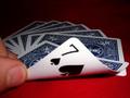
7 Card Drawby bigfishComment: Very soft focus. I think that with the 7 being the very first thing we look at...it should be in focus. The lighting is good. I like how the 7 is lit, but the rest is darkened. the red also looks good with the cards. angle and cropping are ok. good idea, just needs more focus. ~Heather~ |
| Photographer found comment helpful. |
| 12/01/2004 10:21:29 PM |
Breezy Dayby Mark of SRQComment: lol...7 lovely trees. the sky background is good, nothing distracting there. focus is ok despite the wind, maybe just a little soft. I like the green on blue. I wish the trees were all level with each other, but not your fault. lol. Overall interesting for the challenge. ~Heather~ |
| Photographer found comment helpful. |
| 12/01/2004 10:19:08 PM |
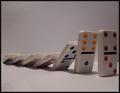
Fallingby mrwaffles989Comment: Lots of 7s here. I do like how there are 7 dominoes, but the first 3 also total up to 7. I think I would prefer there to be a bit more light on the fronts of the donimoes. I think that would make the color punch better. One thing I really admire about this shot, is that although we don't see much of the horizontal line in the back, it is perfectly level. Nothing bugs me more than non horizontal, horizontal lines. Creative interpretation of the challenge. ~Heather~ |
| Photographer found comment helpful. |
Home -
Challenges -
Community -
League -
Photos -
Cameras -
Lenses -
Learn -
Help -
Terms of Use -
Privacy -
Top ^
DPChallenge, and website content and design, Copyright © 2001-2026 Challenging Technologies, LLC.
All digital photo copyrights belong to the photographers and may not be used without permission.
Current Server Time: 07/18/2026 09:51:38 AM EDT.