|
|
|
Showing 381 - 390 of ~2785 |
| Image |
Comment |
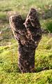
| 04/18/2005 12:36:20 AM | "Y"by LesleyNelsonComment: *Critique Club*
Wow, very odd that I would get 2 of your photos one right after the other.
Anyway, the lighting on this seems awefully harsh. There are hot spots on the rock to the left of the photo, and the grass seems too bright as well. You could experiment with different times of the day, or maybe find a way to block some of the bright sunlight without making the shot too dark.
I think focus and clarity are excellent in this shot. The DOF really helps to get background elements blurred and 'out of the way'. The thing I don't like though about the background, is that there seems to be a 'seperation' of 2 types of grassy areas. There is a longer grassy area in the way back and a shorter grassy area in the front. This seperation line is just about right in the middle of your photo. I think that maybe it would have a higher visual appeal had the seperation line been lower in the photo. I hope I explained that ok, kind of hard to explain without pointing to the photo and saying 'right here'. lol
This shot isn't really exciting to me. It's not drawing me in. It is definately in interesting rock, but just not something I care to look at for long periods of time.
The Y is very obvious and fits the challenge well in my opinion. Overall, an interesting shot that could benefit from different lighting, but not a photo I'd hang on my wall. ~Heather~ |  Photographer found comment helpful. Photographer found comment helpful. |
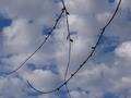
| 04/18/2005 12:15:56 AM | Nubladoby rbennyComment: *Critique Club*
Very elegant N. Kind of like it's in a fancy font. I like the N. I see a comment that says 'more close up to get the N'. I have to disagree with that comment. If you were any closer, you would be cutting off some of the N, so I think your distance is good.
I like that the N is dark, but do think that a little playing with brightness/contrast might enhance the background a bit to make the photo in general not seem so dark.
Focus on the N and the clouds seem really good. You have also captured a Y and X and a V. I'm sure there are others in there too, but those are the ones I see.
I like how the N takes up the entire image. It's a nice way to fill the frame with your entire subject.
The background is nice, but again, I think it could use a little brighness boost to really help bring out the color.
Not really much else to add. Good capture for the challenge.
~Heather~ | | Photographer found comment helpful. |
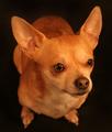
| 04/18/2005 12:00:58 AM | My Babyby LesleyNelsonComment: *Critique Club*
This is definately one cute pup.
The very first thing I notice when the pic came up is the background. while it contains no distracting elements what so ever, it seems odd still. There was a comment about how it made the dog look like he was floating, and that might be it. It looks like he's just hovering in space. That normally would be an ok thing, cause it's not distracting or cluttered. Solid backgrounds are nice, but I think that it does not work with this angle. I love the angle which you chose to photograph your cutie. Definately a step up from the straight on shots of the dogs head. It makes me wonder if his legs are really that tiny, or if the angle makes them look tinier than they really are...or a little bit of both.
Focus seems a tad soft. While I like the DOF very much, I think that his eyes, nose and ears are still a little too soft. Well, he probably IS soft, but I mean that I think the focus could be a little sharper around his eyes, nose and ears.
This photo shows personality. Actually, he looks a little angry that you were taking his pic. lol Like he's saying "um, excuse me, but did I ASK you to take my pic?"
Lighting is very nice. No aweful hot spots or distracting shadows. I do like how you can see the wiskers to the right (his left) even though the background is dark and the wiskers are dark also. That's touch to do.
Overall a very nice portrait of your beloved pet. One to keep and cherish forever.
~Heather~ | | Photographer found comment helpful. |
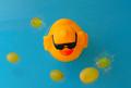
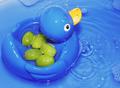
| 04/15/2005 12:30:08 PM | The Sky is Falling!by xtabintunComment: *Critique Club*
Duck, Grapes, water, blue background. Everything's there. This is a very simple shot and I like that.
I like the angle and framing/cropping you chose for this. The duckie being dead center doesn't bother me, but you could play with offcentering the duck a bit to see if that adds to the shot.
Focus and clarity appear good to me too. I like how the upper grapes are out of focus but the duckie is in focus. Nice DOF.
Lighting is good. There are some shadows from a couple of grapes, but that's nothing seroius.
I wonder about the background though. Could there be something to make it a more bright blue? This blue seems dull/flat. The color of the duck is great, nice bright yellow. I think I would like to see a nice bright blue to compliment that.
Overall a simple fun shot. I like it.
~Heather~ | | Photographer found comment helpful. |
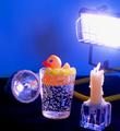
| 04/15/2005 12:18:33 PM | Ducky you light up my life!!!by HeavyComment: *Critique Club*
The first thing I see here is obviously the 3 light sources. I think it's a cute idea, but I'm not so sure it worked to your advantage to put the light sources so close. The work light is blown out. Way too bright. That same light then washes out parts of your duckie and grapes as well. See the back of his head and tail? Too Bright there.
Because the work light is so bright, it looks like the flashlight is not on.
Focus seems soft, and that might be because of the harsh lighting. I like the glass he's in. I am assuming that the bubbles are in the glass not in the water. I have glasses like that.
You definately have all the elements that you're suposed to have. Duck, water, grapes, blue background and light sources.
The arrangement of the lights doesn't seem to serve a purpose. Actually, the candle and the flashlight are probably not doing much at all, since the work light is so bright. While I like the arrangement of the duck,glass, and grapes...I'm not so sure about the lights.
I wonder what kind of shots you could have had with the lights OUT of the picture. Or at least the work like a little farther away from the duck.
Overall a cute setup, but suffers from too much light I think.
~Heather~ | | Photographer found comment helpful. |
| 04/15/2005 11:54:40 AM | Gratuitous Duck Shotby kevrobertsonComment: *Critique Club*
There is nothing that appeals to me in this photo. The subject is too small to even look at, and the surrounding elements definately do not add to the photo. What is that? a Tripod?
It doesn't even look like there is a real rubber duck in the photo.
By your description, it doesn't seem like you entered this seriously but rather as a joke, which makes it really hard to spend my time creating a serious critique for it. But I'm trying.
The lighting is aweful. The 'duck' is quite bright, it creates numerous shadows that don't add to the photo at all. There's a huge bright white spot on the plate from reflection of the light.
Focus is soft. My suggestion, and you already know this, is to get in on your subject. Even then, I'm not sure the subject matter is interesting/exciting enough to grab my attention.
I don't mean to sound harsh, but hope this helps to understand such a low ranking. ~Heather~ | | Photographer found comment helpful. |
| 04/14/2005 01:42:48 PM | drowning duckby DanSigComment: *Critique Club*
Duck, grapes, water, blue background. Everything is definately here.
Lighting appears to be just fine. No bright spots of annoying shadows to be found.
The top 1/2 of the photo is nice and bright with vivid color. I like how the color comes out in the duck and it mixes well with the background.
One suggestion to better the shot would be to do something about the water/glass. Either the glass is dirty, or the water is cloudy. Actually, it looks kind of like what hot water looks like when it comes out of the tap. The cloudyness of the bottom 1/2 is a distraction to the brightness of the top 1/2.
Focus and clarity are really good. I like how we can even see little specks on the grapes. Nice detail.
I wonder if you could have tried different cropping. The centered comp of this seems unexciting. Maybe offset is to one side or another or maybe in one corner? Something that could be played with anyway.
Overall, a cute image, nice color. ~Heather~ | | Photographer found comment helpful. |
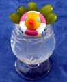
| 04/14/2005 12:00:24 PM | Ducktiniby KaDiComment: *Critique Club*
I'm sitting here trying to come up with a crit and I honestly can't see anything that I would have liked to have seen done differently.
Focus, angle, lighting, everything seems right on to me.
If I HAD to pick something that I would change, I might have gotten a different duck.
There are 2 things about the duck that if they were not there might have improved the shot, but to the overall shot, they are very minor details. First, the duck is yellow with a reddish beak, but what is the red on his chest? I cannot think of anything that would be red on a duckies chest. Is it a tie? Anyway, it's a slight distraction trying to figure out what it is. Second, there is a small bit of sailors hat sticking out from behind the glass. doesn't seem to be adding anything to the shot. It appears that it's not really suposed to be there, so the tiny piece sticking out is anothing tiny distraction. Again, these are 2 very tiny things that don't really take away from the shot at all, but might 'clean it up' a bit had they not been there.
Overall beautiful shot, love the bubbles, placement of the duck and grapes is great in my opinion. I like that he is behind the glass. I don't have anything else to add...congrats. ~Heather~ | | Photographer found comment helpful. |
| 04/14/2005 11:42:37 AM | Land of the prisoned duckyby EnnilComment: *Critique Club*
You didn't really get a lot of comments, so I'm glad this one came up for me on the Critique Club list.
There are quiet a few things that I see that I believe could use improvement.
The very first thing that I notice is the darkness. With 3 lightsources, surely areas of this photo could have been brighter. The grapes for example are quite dark and actually hard to recognize as grapes. Definately can't tell if they are green grapes.
I see the strings holding up the grapes and can't figure out the purpose of that. I mean, I realize that you wanted the grapes obviously above the duck, but the strings to me are a distraction. One thing you could try, would be to stick toothpicks into the background (of course you would have to find a background that you could do that with) and then stick the grapes on the ends of the toothpicks. This would give the grapes the look of being suspended in mid air, without the strings to distract from other elements of the shot.
Next, I see that the glass is tilted to the left. It is not only leaning to the left, but it is also closer to the left of the photo as well. I think that straightening that up would add to the shot, and we could then focus on other elements of the shot, rather than the crooked (dirty) glass.
Next, there is a strange reflection right in front of the duckies face. This makes me look at the reflection trying to figure out what it is, rather than looking through the glass at the duck. Another distraction.
He seems like a really tiny duck to fit in a glass like that. I like the idea, and the setup is nice. The shot looks quick. Looks like you didn't spend a lot of time on it. It could be greatly improved by cleaning the glass, straightening the glass and making the lighting more uniform throughout the shot.
Hope this helps. ~Heather~ | | Photographer found comment helpful. |
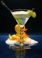
| 04/14/2005 11:24:06 AM | Duck a la grapeby om10Comment: *Critique Club*
Very nice clarity. The first thing I notice about this shot is the focus and clarity. Very crip and sharp. I like how it brings out the smooth texture of the duck against the texture of the water/bubbles.
Lighting is wonderful. I think it really brings out the color in the duck, the beak and the grapes. There is a bright spot on the ducks beak, but nothing that harms the overall photo.
I like the angle and framing/cropping you chose for this as well. Having the duck off to the side and not shot head on really adds a lot. Definately a lot of visual appeal in this shot, and I can find nothing that I would like to see changed.
Had you been allowed to spot edit for this challenge, I might have removed the small water drop that fell over top the white of his eye, but that is a very minor detail.
Congrats on a great shot. ~Heather~ | | Photographer found comment helpful. |
|
Showing 381 - 390 of ~2785 |
Home -
Challenges -
Community -
League -
Photos -
Cameras -
Lenses -
Learn -
Help -
Terms of Use -
Privacy -
Top ^
DPChallenge, and website content and design, Copyright © 2001-2026 Challenging Technologies, LLC.
All digital photo copyrights belong to the photographers and may not be used without permission.
Current Server Time: 07/18/2026 01:46:41 AM EDT.
|