|
|
|
Showing 341 - 350 of ~2785 |
| Image |
Comment |
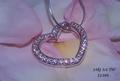
| 05/05/2005 12:11:05 PM | ... or exchange for 70-200mm F/2.8L IS lensby srdanzComment: *Critique Club*
Seems just a tad dark. I read your comments in the forums, so I know that you are fully aware of that, and what caused it, so I wont elaborate on that.
Focus is great. I like the little stars. (and they were added legally too. lol)
The background is nice. I like the use of roses as a background. Makes the photo seem soft and feminine, which is good for an ad that needs to appeal to women.
You did a very nice job of avoiding reflections in the smooth part of the heart. There is one reflection though from the petals on the inside of the heart near the upper point. It's a dark reflection compared to the rest of the photo and since it's the only reflection on the heart, it stands out to me.
I like the angle and crop. I think that was very nicely selected and works very well. The writing is simple and to the point.
The only real issue I see is the darkness, so I think you did an excellent job. Congrats on the finish.
~Heather~ |  Photographer found comment helpful. Photographer found comment helpful. |
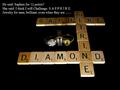
| 05/05/2005 11:45:26 AM | The Gameby mpembertonComment: *Critique Club*
Is this suposed to say "Brilliant even when they AREN'T"?? As it is, it doesn't reall make much sense.
Anyway, the jewelry is small and dark in comparrison to the rest of the photo. The tiles are lit ok, but the jewelry kind of dissapears into the background. I like that the tiles get darker as they go into the photo. This creates depth. The lighting is slightly too bright on the front side of the tiles toward the bottom of the photo.
Focus seems ok, but hard to tell on the jewelry since we can't really see much of the jewelry.
The writing does seem like a bit too much. If I were driving and saw this on a bilboard or something, I definately would not have time to read the words AND find the rings. In a magazine, you'd have a better chance of people being able to read it, but still I'd like to see something simpler.
Had the rings been easier to see in the photo, I'm not so sure I like them in the dead center of the shot. Seems too forced to me.
The idea is good, but would like to see this set up differently to better show the rings and maybe give a little visual appeal.
~Heather~ | | Photographer found comment helpful. |
| 05/05/2005 11:25:14 AM | Foreverby BobsterLobsterComment: *Critique Club*
The first thing I notice about this photo is the background. It's very bright compared to the rest of the photo. The bright shapes really stand out in the shot a lot. The background actually kind of begins to bleed into the ring a bit. See on the bottom ring on the far side of the ring, how it blends into the background? It also does this a bit on the top ring as well.
DOF seems to be very narrow. Maybe a little too narrow. The rings don't appear to be in focus. I think the combination of harsh lighting on the rings and the shallow DOF makes the rings look out of focus. Having a very small part of the rock be in such good focus, and the fact that that stands out so well, increases the appearance that the rings are out of focus.
I really like the shot. It's nicely set up and simple, yet effective. The general scene is visually appealing. The way you have the rings in the bottom right works.
Overall a nice shot that, in my opinion, would benefit from different lighting conditions and a little more DOF.
~Heather~ | | Photographer found comment helpful. |
| 05/03/2005 12:39:09 AM | Paper Art Portraitby pedahel7Comment: *Critique Club*
I think what you were trying to do here is put a pretty tree with a pretty sky behind this pretty girl. What happened was you made the illusion that a tree is growing out of her head. I think this could have worked had the tree been much bigger and filling most of the background behind the girl.
I like her pose, she looks very comfortable. I'm not sure if the makeup was done for the photo or not, but I personally think that the lipstick is too bright and distracts from her beauty. When people look at her, the first thing they should notice should not be her lipstick.
You definately got the rock paper scissors thing down. And creative too.
Having the background blurred was beneficial to the visual appeal here. I like that although you can tell there are houses back there, you can't really see them or any detail in them. Nice DOF.
Lighting seems ok. No distracting shadows or hot spots. Nice even lighting on the girl.
Overall I think the image is creative and fun, but next time watch for placement of the tree.
~Heather~ | | Photographer found comment helpful. |
| 05/03/2005 12:22:19 AM | Lonehill Koppieby KarGirlComment: *Critique Club*
I think this definately fits the challenge. The rocks are quite interesting. It's a shame we can't see them better.
The focus is a bit soft. The forground isn't too bad focus, but the forground isn't very interesting in comparison to the rocks. I wish the rocks were crisper so our attention were better drawn there.
The color seems a bit dull as well. The sky is a plain dull blue and the rocks seem to be in a fog. The color of the tree in the front is ok, but again, the forground is not the interesting part that I would like to see here.
I would like to see this without the forground elements. Don't know how possible that is, but possible or not, this image would be much stronger taken from a different location.
The vertical lines (poles?) going through the rocks are very distracting as well. They lead our eyes up and out of the photo.
Overall an interesting subject that would much benefit from a different location and lighting conditions.
~Heather~ | | Photographer found comment helpful. |
| 05/02/2005 01:37:40 PM | Fish' horizon: my sky is my (reflected) ground.by redpandaComment: *Critique Club*
I can honestly say that while this is definately different...it doesn't do much for me.
The only real area of interest is the rock in the bottom right and it's really not clear enough to focus on. The reflection of the rock is distorted and blurred as well, and that's really where I look first before looking in the bottom right.
The large black blob in the center does not add to the photo in my opinion at all either. It seems to have a pixeled area in the center of it and lacks any real purpose except to seperate the photo in 1/2.
Speaking of seperating the photo in 1/2, I think that it's seperated in a bad place. Dead center is a bad 'horizon' spot, and this is no exception despite not being a real horizon at all.
You've heard it before, the border is aweful. Why did you chose grey? And why so huge? I think a simple thin border would have worked much more effectively on this.
I think it may make an interesting abstract, but it's not really my kind of thing. Please take this as only one opinion, as I'm sure you and many others are more into abstract feeling photos.
~Heather~ | | Photographer found comment helpful. |
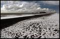
| 05/02/2005 11:47:01 AM | Down at the snowy black beachby GautiComment: *Critique Club*
This is a nice scene. I think the only thing that's bugging me here is that I can't tell what it is in the background. There are some silhouettes of buildings? or Rocks? or something and they are too tiny to tell exactly what they are, so they are distracting me from the rest of the photo cause I'm trying to figure out what they are.
The sky is beautiful. Love the clouds.
Had you not mentioned that it was snow, I thought it looked like a whole lot of 'sea foam'.
You did a wonderful job leveling out your horizon. Nothing irritates me more than a waterline that is tilting to one side or another and you got it perfect.
Focus and clarity are really good. We get to see some texture and even some patterns in the snow on the beach.
Overall a beautiful view.
~Heather~ | | Photographer found comment helpful. |
| 05/02/2005 11:14:58 AM | Clear Pointby LadeeMComment: *Critique Club*
I like the simplicity of this image. I wish you could have found a way to make a whiter background work though. I think it would go nicely with the clear tack. A whiter background would make the tip stand out a bit more I think, and that would be a good thing.
I like the focus and clarity here. I think that the detail in the tack is fine in my opinion.
The shadow is a slight bit distracting, I can really picture this as a high key kind of thing with no shadows and white background. I think it is the area along the bottom of the tack that makes me want to see it all this way. See how it is a little 'too bright' compared to the rest of the shot? I think instead of wishing that were darker, I wish the rest of the photo were lighter. Doesn't usually happen that way for me, but I think this could be good like that.
I like the angle and framing/cropping you chose. having the pin at a diagonal creates visual appeal and with the large part of the pin toward the upper left, it also offsets it enough to not appear 'dead center'.
Overall I think this is a really good shot, nice to look at and well done. ~Heather~ | | Photographer found comment helpful. |
| 05/02/2005 12:52:08 AM | Mountain Bikeby tyrkinnComment: *Critique Club*
Wow. I really like this. It has a really nice tonal range. From white whites to black blacks and a lot in between.
I love the way the bike is silhouetted. Simple yet very effective.
My brain wants to see more neg space in front of him than in back of him, but that could have affected the way the tones fall. I like how the light area is in the upper right and fades across the photo toward the biker, and I think that if you were to frame this differently, it would not have that effect and it would be a less powerful image, so I agree with your choice to crop with the extra space to the rear of the rider.
Focus is great. I love the detail in the wheels. We can see every little tread.
I really have no complaints about this photo at all. I hope I explained good enough why I think it's a wonderful image though. Would hve gotten a 10 from me in the challenge. Congrats on a great image. ~Heather~ | | Photographer found comment helpful. |
| 05/01/2005 03:06:32 PM | Iron Willby megryanComment: *Critique Club*
The first thing I notice here is that there really are no whites. The image is quite grey, even the whites of his eyes are grey. I played with this a little bit and adjusted contrast and brightness and it seemed like it came out a bit too bright, especially on his face. I bet that was the reason you chose to go greyish instead of 'too brightish'. The only solution I would see to that would be some selective editing to make some areas whiter, without making the already lighter areas too bright.
There is a diagonal line from the fence that goes directly through the center of Ryan's head. What looks like the rest of the fence then comes out the back of his head under his ear. It doesn't seem from your description that you had a lot of time to worry about background elements, but it does kind of create an odd visual of the head being 'chopped off' by background elements. What happens there, is that we look at the subject (the boys head) and then items 'coming out of his head' draw us away from his face. In this case, my eyes want to follow the diagonal in the background, and almost skip right over him.
Focus and clarity are really good in my opinion. I like the detail in his face and hair. I like how the background is blurred leaving more focus on the subject himself.
Without the explaination, it seems odd to cut his arms off like that, but I see why and it makes sense now and it's a funny story.
Overall I think it's a fine portrait of this cute young man. With a different angle on the background and brighter whites, I think this would be perfect. As is though, still a nice photo for the albums. :)
~Heather~ | | Photographer found comment helpful. |
|
Showing 341 - 350 of ~2785 |
Home -
Challenges -
Community -
League -
Photos -
Cameras -
Lenses -
Learn -
Help -
Terms of Use -
Privacy -
Top ^
DPChallenge, and website content and design, Copyright © 2001-2026 Challenging Technologies, LLC.
All digital photo copyrights belong to the photographers and may not be used without permission.
Current Server Time: 07/17/2026 03:38:37 PM EDT.
|