|
|
|
Showing 281 - 290 of ~2785 |
| Image |
Comment |
| 06/06/2005 01:28:25 AM | kids playby gtp1164Comment: *Critique Club*
Definately granular. Fits the challenge perfectly. It really doesn't get any more granular than this. The one issue that I may have with that though is that the sand itself is out of focus. The sand in the background is blurred with DOF and the sand coming out of the shovel is blurred by motion, so we don't really get to see the grains. It's kind of just assumed.
Focus is good on the shovel and I like the way the sand is flowing out of the shovel. Nice effect there. I do wish the label were not present on the shovel.
I like the angle and framing/cropping you chose. I like how the hand is mostly out of the frame.
Colors seem really good and like I said, it's a nice image minus the label and I wish there were more grains in focus.
~Heather~ |
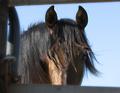
| 06/06/2005 12:10:34 AM | Evening Eyesby BaldurTComment: Can't really see his eyes well at all. I wish we could. I like the fact that it's a horse behind a fence. That is very clear and definately fits the challenge. Focus is good on his mane. Lighting seems just a bit dark to me. The bright area is the part of his nose by the fence and that isn't the most interesting part of the pic. I like the blue background, nothing distracting there. Something that catches my eye and I find a bit odd is right where his nose meets the fence to the right *his left* see where the fence kind of follows his nose for a bit and it's not straight across? Is this a lighting thing, some kind of optical illusion? Overall a nice shot for the challenge, just wish lighting conditions were better. ~Heather~ |  Photographer found comment helpful. Photographer found comment helpful. |
| 06/06/2005 12:06:48 AM | Squared Rigger by NovaTigerComment: Second image that came up for me in the voting. Wow. I like this a lot. very nice framing. Focus and clarity are wonderful. Great focus in all the right places. I love the slight hint of the orange in the boat among all the blues. Wonderfully horizontal horizon. Too often this gets overlooked and is tilted, yours is dead on. Wonderful job. Excellent eye to capture this great image. My only wish is that the boat could have somehow been a bit bigger, but non the less, a wonderful image. ~Heather~ | | Photographer found comment helpful. |
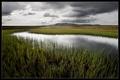
| 06/06/2005 12:04:17 AM | Mountain Creekby arnitComment: Very nice crisp photo. I like the focus and clarity a lot. The main subject is the creek? I wish it were more interesting looking. To me, the whole photo seems to be the main subject with the creek really only being a small part of it. I like the colors and the clouds formations really add interest to the photo. Overall a really beautiful scene, one I personally don't get to see every day. ~Heather~ | | Photographer found comment helpful. |
| 06/05/2005 11:57:34 PM | Hallwayby honkwokComment: *Critique Club*
I see you didn't find any of your comments helpful, so I'm not really sure If I'll be able to offer any helpful comments, since I seem to agree with some of them, but I'll try.
I'm not really into this pic. I think the reason is pure lack of interesting subject.
While I like the angle you took the pic at, there really isn't anything to focus on at the end of the hallway, and nothing really in the hallway to focus on.
There is the lighting, but what I notice is a blown out area to the left of the photo and a few lights down the hallway. The stripes the lighting makes could make for an interesting subject if they weren't way too bright and blown out.
I am glad there is a bit of texture in the wall. That at least gives us a bit of something to look at, although it isn't particularily interesting.
Focus and clarity appear to be ok. I don't think the suggested DOF would work here, as there really isn't anything to look at in the forground and with the background in focus, at least it leads our eyes through the photo. Like I said, I think the angle is the most interesting part, just wish there were something at the end of the angle.
~Heather~ |
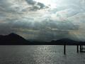
| 06/05/2005 11:27:23 PM | Dramatic lighting on the lakeby Luca66Comment: *Critique Club*
I see you didn't find any of the comments here helpful, and it looks to me like you got good comments, so not sure if I'll be of much help or not, but I'll try.
The thing that really stands out to me first in this shot is the dead pixel in the center of the photo. Right above the tiny hump to the left of the larger mountain on the right. There's another one near the upper right corner as well. The lighting challenge was an advanced editing challenge and those could definately have been edited to improve the shot. They may be tiny, but in this shot, for some reason they stand out like a sore thumb.
I like the rays of light. Definately don't get to see this every day. not around here at least. the color of the sky is nice, but I can't help but wonder what it would look like with a saturation adjustment. The colors seem slightly foggy, which I would not expect to see them. I wish they were more vibrant.
The poles in the water really seem to have no purpose. Especially since they are merging with the mountains. The silhouetted poles meet the silhouetted mountains and they seem incomplete or out of place since we cannot see all of them, nor see a reason for them to really be there.
Overall a very lovely scene that would benefit from some stronger color in my opinion.
~Heather~ | | Photographer found comment helpful. |
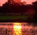
| 06/05/2005 07:52:38 PM | Reflective Lightby PhotoRynoComment: *Critique Club*
I think this is a really neat capture, however, the colors just seem really odd. One commenter said it looked unnatural. I think it's the pink colors. I don't like how the pink covers the weeds and trees as well. I think had it just been the sky that was pink, that might have been ok, but the 'silhouettes' are pink as well and that just doesn't work for me.
There is a strong horizontal green line that goes straight through the center of the photo which is a huge distraction and also divides the photo in 1/2 almost exactly, which is not visually appealing in this case to me.
The green with the pink reminds me of great grandma's house in the 70's. Really clashing colors that do not really go well together in my eyes. Someone had to have liked it once upon a time though. lol
I also wish the sun reflection was not directly in the center of the photo. The 2 strong lines kind of divide the photo into quarters.
Focus is good on the weeds in the front, but the background and weeds further up are out of focus. I wish the entire thing were in focus.
I think this almost borders along the lines of abstract rather than landscape.
~Heather~ |
| 06/05/2005 07:43:01 PM | Electric sparkby nico_blueComment: *Critique Club*
I think had you not hinted to the subject in your title I might have had a really difficult time trying to figure out exactly what this was. It is really neat looking and definately draws my attention and holds it.
Lighting works very well here. I love how it kind of sprays out from the bottom of the glass upward. I would love to know if the lighting was dodge/burned this way, or if it was naturally that way.
I personally love the negative space. I see you got a couple comments saying that it was not a good thing to have that much neg space, but I really like it that way.
The dark background works really well. I like the blue tones of the subject.
The water droplets are a nice touch, and had I not read in your comments that the circular thing at the bottom was the cord, I would not have knows, but it looks really neat anyway.
Focus is awesome. Really nice details in the glass and water.
I think this is a really great image that, in my opinion, doesn't need improvement. Congrats on a great image.
~Heather~ | | Photographer found comment helpful. |
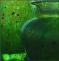
| 06/05/2005 01:22:41 PM | Light on Glassby trainComment: *Critique Club*
I see you didn't find any of the comments on this image helpful, and in my opinion you got quite a few good comments on this image, so I'm not really sure if I can add anything that you may find helpful or not, but I guess I can try.
First off, I'm not really sure that the lighting is adding anything to this image. The only real suggnifigant part where we can see the actual lighting is near the bottom left corner and there really isn't anything there to look at.
I like the green pot to the right, but I'm not really sure putting it on this background was a bonus. It seems to blend in too well. I think if it were on a different background it might have been more effective.
Focus seems a bit soft and the image is overrun by noise/grain. This could be because of the low lighting.
Speaking of low lighting, the pot in the front, which to me, is the most interesting feature in the whole photo is dark and we don't get any detail out of it what so ever.
My suggestions for this photo are to add some light on the subject, find a different background, reduce grain/noise. I am wondering if a back lighting migh accentuate the pot on the right a bit more?
~Heather~ |
| 06/05/2005 01:08:34 PM | Learning to Lightby ShutterPugComment: *Critique Club*
I think this is a neat image. I like the simplicity of it. The lighting on the book is neat. I can read the words "Learning to Light" However, can't read the othe words, which I am assuming is the author? I wish I could see them better, although I think that's just because they are smaller than the title.
I like the green color of the book.
The flame is a bit blown out, just a little too bright. Also I see some pixelation in the orange part of the flame. Not sure what caused that, or how to fix it. Actually, not even sure it shows up for anyone but me since no one else commented on it, but I do see it, and it does look a bit odd.
The dark area on the candle is a distraction since it blends in with the background so well. I would like to have seen the candle turned to a side where you couldn't see, or could barely see that black area.
The border is nice. Not overpowering. Curious as to why you picked the tan color as it doesn't appear to be in the photo. It does work though. As I said, it's not too strong and doesn't distract from the image at all.
This is a neat image for the challenge. It doesn't have a huge visual appeal, nothing to really make it jump out at me and make me stare at it for a long time, but it is technically well done and interesting.
~Heather~ | | Photographer found comment helpful. |
|
Showing 281 - 290 of ~2785 |
Home -
Challenges -
Community -
League -
Photos -
Cameras -
Lenses -
Learn -
Help -
Terms of Use -
Privacy -
Top ^
DPChallenge, and website content and design, Copyright © 2001-2026 Challenging Technologies, LLC.
All digital photo copyrights belong to the photographers and may not be used without permission.
Current Server Time: 07/17/2026 02:56:21 AM EDT.
|