|
|
|
Showing 271 - 280 of ~2785 |
| Image |
Comment |
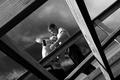
| 06/17/2005 09:29:31 AM | Framing Carpentersby Travis99Comment: *Critique Club*
Very nice image. Works very well for the Naturally Framed challenge, as the carpenters are framed in a carpenters 'natural environment'. Focus is excelltnt. I like the detail on the wood and sky. Their faces don't seem clear though. Seems like the focus is good, but maybe just too small to see much detail in their faces. Looking at it, it may be the shadow over the face of the guy on the right that makes it a bit difficult to retreive detail in that area.
The angle really makes the photo in my opinion. I woul dchange nothing about that. Perfect angle and 'framing'. Great placement of the subjects within both the frame of the wood and the frame of the photo.
I like the black and white for this image. Not sure why. Maybe it's the dramatic sky that makes my eyes enjoy seeing this without color.
Other than the slight shadow of the man's face, I would have to agree that this is an excellent image that needs no major adjustments.
Congrats on the placing and score.
~Heather~ |  Photographer found comment helpful. Photographer found comment helpful. |
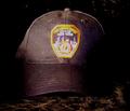
| 06/16/2005 12:03:02 PM | Fallen Heroby thomaspeopleComment: The idea is really neat. I'm thinking I would prefer if this were not smack dab in the center of the photo though. Maybe you could add some dramatic angle or different crop.
The colors are bright. maybe a bit too bright. They appear to be oversaturated giving off kind of a bad 'glow'.
That area with the words in it appears to have a softer focus than the hat itsself. The hat has nice focus and we can see the texture in the area surrounding the decal.
The decal though is hard to look at due to the color and the 'glow' and the appearance of soft focus there.
I think I'd like it if the background did not have a pattern on it. Maybe just a solid black background would work for this and that way, our eyes could focus on the texture of the hat and the words on the hat. Try messing with saturation and brightness/contrast. That may be able to lessen the color a bit and darken the background some.
Overall a nice representation of the challenge, just needs a bit of 'cleaning up'.
~Heather~ | | Photographer found comment helpful. |
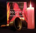
| 06/16/2005 11:26:34 AM | Bell, Book and Candle - Darkness of the Spiritby RiponladyComment: There are so many different types of religions, that I will not claim to know or understand all of them. I do not think that witchcraft would be THe first religion that comes to mind, so one would not think that a photo of religion would fair well in a darkness challenge where most religions represent something hopeful and 'bright and shiny'.
Admittingly, I don't follow or practice this religion therefor don't fully understand the photo. The addition of the bell seems odd to ME and seems a bit out of place, but like I said, I simply just don't understand the photo because this is not my custom.
The candle appears to be tilting a bit to the left, but the flame is straight up, which indicates to me that it's the candle that's crooked and not the photo. I would have maybe placed a penny or something under the candle on that side to help straighten it out.
Focus seems ok. The bell seems to be a bit softer focus than the book, but to me that seems ok.
The colors look neat together. The red in the book and the red of the candle. also kind of neat how there are flames on the book and candle.
This is not MY kind of image, but different people have different tastes and with a subject like this, you're bound to get someone who is totally against the topic.
Just think, some people are ok with killing other people, but a photo of that may upset some other people. It's all about different cultures.
Also, I did not vote in this challenge.
~Heather~
| | Photographer found comment helpful. |
| 06/14/2005 01:13:19 PM | A Good Gameby petecushComment: *Critique Club*
It's already been said, but I think that the focus here should have been on the game. Right now, the focus is on the woman's back. That aspect of the photo has nothing to do with the decision or the making of the decision, so it is rather unimportant at this point.
There were many shots similar to this in the challenge, so maybe not the most original idea for the challenge, but I do think that it shows decisions very nicely. Especially with the current set up on the board. He has 2 ways to go, and either could lead to the capture of his piece.
Lighting seems a bit dark. I would like to have seen more details in the entire photo. The lighting on her shirt and arm are good, but even her head is way too dark. The lighting on the game is dark and also the area behind the game and son is dark as well.
In the Darkness in the upper middle of the picture, there is a bright object. Looks like maybe an action figure?? It's distracting.
Overall neat idea, but suffers greatly from the DOF chosen and lighting.
~Heather~ |
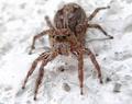
| 06/14/2005 01:05:58 PM | Which Way?by harryindrawanComment: *Critique Club*
Well, with your title, I can assume that you meant that with the spiders multiple eyes, he appears to be looking all different ways. Which could give the impression that he's 'deciding' which way to go? Without the titled I would look at it and say 'nice macro of a spider' without any connection to the challenge what so ever. I don't think that a photo should only meet the challenge because of the title, so while this is a good shot, I may have rated it low due to not meeting the challenge well.
Ok, that being said. Nice macro! lol
Focus is very nice, creepy looking spider. I might have preffered a bit more DOF to show more detail in more of the spider.
I like the angle and framing/cropping.
What is it standing on? Almost looks like he's trying to swim in milk or something. The background is odd and the upper left corner being so blurred is a bit of a distraction.
Overall the image is neat, something I deffinately don't see every day. Thank goodness.
~Heather~ | | Photographer found comment helpful. |
| 06/14/2005 12:46:10 PM | Black's first moveby marvinComment: *Critique Club*
You can definately see her concentration in making the decision here. I think this shot is a perfect representation of the challenge and a great idea as well.
Focus is a bit soft. Both on the girl and on the chess pieces and board. Looks like the lighting might have been a bit dark, so that may be what is affecting the focus of the image.
The colors seem dull as well. The girl looks like she has beautiful bright red hair, but again, due to lighting, I don't think that the color comes out as well as it may in true life.
It looks like you may have used flash? You have purple effects on the pieces from lighting. Makes it look more cluttered than it really is and is quite distracting.
I'm not so sure I like the close vertical crop. I'm wondering if there were another option you could have tried. Was the background too cluttered? Maybe you could have taken the shot outside with someone holding a sheet between the sun and your subject. This would have given a nice even lighting.
There is a thick dark horizontal line running through the dead center of the photo. This divides the photo in an awkward way. Someone suggested shooting from a lower angle, I think that would be something to definately try.
Overall not technically perfect, but a great representation of the challenge.
~Heather~ | | Photographer found comment helpful. |
| 06/13/2005 12:57:16 PM | Loves Me Notby markmulkerinComment: *Critique Club*
When first seeing the 'loves me loves me not' shots in this challenge, I thought 'what a neat idea for the challenge'. Then I'm thinking that It's not really a decision. It's more of a conclusion. An answer. The decisions has already been made by 'HE' and the flower game is trying to discover what was that decision.
Anyway, I think I may be looking to far into it, but those are my thoughts anyway.
That being said..I think you did a really nice job with this photo. I love the colors. The lighter pink left side looks neat with the darker right side. I only wish the greens were a bit more green. I think that would be a nice contrasting color addition.
Background is nicely blurred. White works well for background as well. Nothing distracting there.
Focus and clarity look to be good on the subject. The one remaining petal appears a tad soft, but nothing major at all.
Overall a really pleasing shot to look at and well done.
~Heather~ | | Photographer found comment helpful. |
| 06/12/2005 11:51:16 AM | TOME BEAUTIESby joansuzyComment: *Critique Club*
First thing I notice about the photo is the size. It's awefully small. I think that if you took advantage of the allowable 640 pixels we might be able to read the words on the books a bit better and the detail might stand out more. Your photo is only 443x272.
If you didn't find LucidLotus' comment helpful, then I'm not sure how helpful I'll be, since I think they are right on with this photo, but the books DO seem to be leaning to the right a bit. The right 4 books seem to be completely vertical, the all the books on the left have a tilt. That makes it look like a quick shot that was not prepared well.
The colors are neat. I think that the colors not only stand out, but they go nicely together as well.
The light reflections on the books are a distraction. It makes the shot not 'clean'. Some of the reflections are wiping out the details in the books. Some of the little designs on the books are gone and I think that is the beauty that we need to see here. Maybe putting a thin sheet or something between your light source and the books would help reduce those reflections.
I wish I could read thewords on the books. The only actual words I can read are 'longfellow'.
Overall I think it is an original neat idea for the challenge, but maybe a bit more time spent on the image could have improved it greatly.
~Heather~ | | Photographer found comment helpful. |
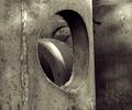
| 06/11/2005 02:26:02 AM | Sewer Pipeby TooCoolComment: *constructive (negative) criticism. ;)
First off, without your title, I wouldn't even know what this is. The shot just doesn't scream anything that I would really like to look at for a long period of time and, while technically well done, it just isn't interesting.
While the opening of the circle is positioned to the left of the photo slightly, the entirety of the circle shaped area is dead smack dab in the center of the photo. No dramatic angle, no strategic placement, nothing.
The division of the right 1/2 and the left 1/2 of the photo is also odd. See the strong vertical line with the darker 1/2 being the right side? There is no shadow there and gives kind of an optical illusion that you cannot tell if the dark part is in front of, or behind the lighter side.
The partial blades of grass really don't do much for the image except to tear straight through the one somewhat interesting part of the photo. The circle is broken at the bottom by the stick of grass.
Focus is ok. The grain is ok for the image.
Just seems more like an abstract to me. I'm not a huge fan of abstracts admittingly.
The thing in the center of the circle seems like an actual distraction since we can't see it and since it's not the sharpest focus of the photo.
Overall this seems technically well done, good lighting on the pipe, nice focus (could have come up with different crop/angle I think) it's just not drawing me in and keeping me there.
Hope I'm not too harsh, Maybe this is just a 'love it or hate it' image.
Now, if this ribbons, I'm gonna feel like an ass.
PS...Forgot to add that the 'tilt' of the object seems like an accident. It's not off enough to be 'dramatic angle' in my opinion, but off enough that we know it's not level. I think I'd prefer if this were maybe MORE at an angle. Maybe even a strong diagonal. I like diagonals. Message edited by author 2005-06-11 02:44:23. | | Photographer found comment helpful. |
| 06/09/2005 01:54:41 AM | young loveby sidpixelComment: *Critique Club*
I like the colors in this shot. I think that's really the best part for me. I like how the horses stand out on the green background and that the background has a little bit of extra color to make it more interesting, but not overwhelming.
I think what i might have preferred here would be a vertical crop. With the horses heads still in the center of the photo, but only showing the front leg and the heads. I guess I'm nto really sure about this. maybe I'd have to see it to determine if it made the comp better in my opinion, but it's just a thought.
Focus and clarity look really good as well.
Overall the image is very nice, adorable and fitting for the challenge.
~Heather~ | | Photographer found comment helpful. |
|
Showing 271 - 280 of ~2785 |
Home -
Challenges -
Community -
League -
Photos -
Cameras -
Lenses -
Learn -
Help -
Terms of Use -
Privacy -
Top ^
DPChallenge, and website content and design, Copyright © 2001-2026 Challenging Technologies, LLC.
All digital photo copyrights belong to the photographers and may not be used without permission.
Current Server Time: 07/17/2026 01:37:28 AM EDT.
|