| Image |
Comment |
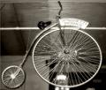
| 07/06/2005 01:12:17 PM |
Off To Spaghetti Worksby whatdewucComment: Really cool looking bike. The spaghetti works sign seems a bit bright as does the object near the bottom center of the image. the horizontal lines in the celeing cross behind the spokes in the larger wheel making it look kind of busy right there and the background just doesn't seem like the best background. Focus on the bike seems really good. We can see a lot of detail in the bike. ~Heather~ |
 Photographer found comment helpful. Photographer found comment helpful. |
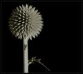
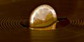
| 07/06/2005 01:08:14 PM |
Summer Nightby jin_tonicComment: Really neat. Good focus. I like the texture of the circle. Neat looking. I like how you have placed the subject to the left of the photo. Lack of color works here. I think it helps to concentrate on the texture. Nice black background. nothing distracting there. I think the lighting was good also for showing the little pointy things. Kind of looks like a firework on a stick. lol Overall pleasing to look at and technically well done. ~Heather~ |
| Photographer found comment helpful. |
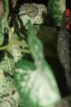
| 07/06/2005 01:05:42 PM |
Lady's Eyeby LeapNLizardzComment: I'm sure you've heard it already, but you may want to turn the date feature off on your cam. It adds nothing to the image and I guarantee you wont be selling any images with the date stamp blaring from the side of the image. The least that can be done is crop the thing out if you can't figure how to turn it off.
Second, your image is kind of small. 250x375 pixels. You're allowed to submit up to a 640x640 image, take advantage of that. Otherwise, we can't really see the details in your image to help you out much.
That being said, your focus looks soft on the subject. We are not getting much detail out of the little guy at all. The blurred leaf is a huge distraction as it takes up most of the photo. The shadow from the blurry leaf in the front takes up another great portion of the photo and engulfs it in darkness. Did you use flash? I think attention would be drawn better to the subject without the shadows, without the huge blurry leaf and had the image been bigger. Maybe crop closer to the eye with a larger image? ~Heather~ |
| Photographer found comment helpful. |
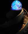
| 07/06/2005 01:27:12 AM |
Crystal Confusionby cools98Comment: I think your crop is too close to the top and right. The left side of the photo contains nothing that adds to the photo at all. The right side is lit, but you cropped off the edge. Colors are neat, and great focus for being a low light shot. There is a small bright something in the background to the left that is distracting from the subject itself. overall I think this is a really neat image, technically well done, but needs a different crop to increase visual appeal. if the background was an issue, try placing a black cloth or something behind the subject to eliminate background elements. looks almost like you cropped to get rid of background crap. ~Heather~ |
| Photographer found comment helpful. |
| 07/06/2005 01:19:43 AM |
...by srdanzComment: Kind of interesting. the reflection is a little weird. I like the circles around it, I think they add a nice 'circle' feeling especially since the 'main subject' isn't a full circle, but rather implied. It could be only 1/2 a fruit for all I know. *wink*. anyway, focus seems a tad soft on the fruit, but the dof is nice. I see your reasoning for the selected crop, but aside from the challenge, I think a crop with the fruit to the left side of the photo might have been a bit more visually appealing. Color seems a bit duller than my brain says it should be, and the bright white areas on the white part of the peel are a bit distracting. Still neat looking though. ~Heather~ |
| Photographer found comment helpful. |
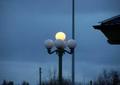
| 07/06/2005 01:12:48 AM |
Lightsby ofurpesiComment: Wow...this is really tiny. You'll probably hear this a zillion times, but the best advice you'll get here is to submit a larger pic. If you got a 'file too large' message, then the ideal solution would be to compress a little smaller, rather than make the pic itself smaller. It's really hard to tell details from this small of a pic, but I will say that the strong vertical line through the image (a post?) is distracting as is the corner of the roof. The lights are interesting, but again, hard to see. It looks like if you had moved yourself to the right and closer to the groud and gotten up a bit closer on the lights, it might have been a better composition. Can't tell how focus is. Color is ok. ~Heather~ |
| 06/21/2005 01:33:48 PM |
Nithhogr - protector of Yggdrasil! (aka "Norbert")by muggle_girlComment: Well, I saw your comment in the forums regarding people not thinking that dragons are fantasy and thought I'd come check it out to see if I could offer any advice on that subject and I think I have found a reason. The way you present this little guy, makes him look like a turtle in the weeds. And as bransheart states, there's not much fantasy about that. I (and I'm sure MANY people who are unfamiliar with HP) did not recognize this as a dragon. So, while he may BE a dragon and THAT is definately fantasy...all we can see is his little face, which definately resembles the common turtle.
Hope this helps to clarify why you may have received the comment about this not seeiming fantasy-ish. |
| Photographer found comment helpful. |
| 06/21/2005 12:04:29 AM |
Flight of the imaginationby jmritzComment: I don't prefer the effect here. This appears way to busy for everything to fall into place together. The clashing patterns of her blouse and skirt against that busy background hurt my eyes. The little thing hiding behind her hand is interesting, but we can't really see it. Looks like maybe a stuffed bird? |
| Photographer found comment helpful. |
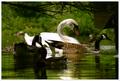
| 06/19/2005 11:44:02 PM |
Mrs. Whiteby kcumanComment: *Critique Club*
Seems a little dark. The darker birds in the front are a bit too dark and hard to see, and they kind of block the more clear white bird in the back.
Focus seems real soft. The white bird, which is the most recognisable, is quite blurry and we can't really get much detail in him.
This is definately naturally framed. I do like the set up, with the trees on the top. I consider that to be framed, where some people might not think that was very framed since it's not on all sides.
I think that had this had a bit more lighting, the focus would be better and the birds would have better detail and had been more visible in the photo.
Overall nice scene though.
~Heather~ |
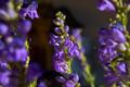
| 06/17/2005 10:02:07 AM |
Building the Framework of Lifeby chefsamComment: *Critique Club*
Not really sure what's suposed to be the main subject here. The flower or the bee. I really almost didn't see the bee. He doesn't seem like a major part of the photo and kind of blends in with the flower a bit. The flower is really nice as well, but almost drowned out by the surrounding flowers that are composing the 'framing'.
The colors are really good and I like them on the dark background. The small skinny flower inthe back though is a bit distracting as it kind of melds in with the central subject.
DOF is good to get the frame blurred while still leaving the subject in focus. I'm wondering though if it might be a little TOO much blurr since the flower on the left looks more like a purplish black blob rather than a flower. the one on the right is good. And as I said before, the one in the far background is distracting even though it's blurred.
Overall I like the photo, but wish the bee and central flower were a bit bigger and took up more space in the photo than the 'frame' flowers.
~Heather~ |
| Photographer found comment helpful. |
Home -
Challenges -
Community -
League -
Photos -
Cameras -
Lenses -
Learn -
Help -
Terms of Use -
Privacy -
Top ^
DPChallenge, and website content and design, Copyright © 2001-2026 Challenging Technologies, LLC.
All digital photo copyrights belong to the photographers and may not be used without permission.
Current Server Time: 07/16/2026 11:27:09 PM EDT.