|
|
|
Showing 241 - 250 of ~2785 |
| Image |
Comment |
| 07/11/2005 11:56:16 AM | berriesby lightningComment: Don't be afraid to take advantage of the max submission size. Your photo is only 450x326 Definately not the smallest I've seen submitted, but also definately could be bigger to show some moredetails. The issue I'm having with this photo is the DOF. The majority of the berries are soft focus. All the berries in the front are soft focus and the squished looking berries in the back are in better focus. Nice colors though. I like the deep blues. The random purple adds interest. I'm wondering what it would look like with just a few 'perfect' berries on a solid background. The lighting appears good. I don't see any distracting hot spots or anything. Lacking something to hold my interest. Possibly having the DOF different would help greatly. ~Heather~ |
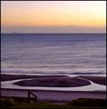
| 07/11/2005 11:51:58 AM | Circle in the tideby JustineNZComment: Well, it's circular but doesn't appear to be a circle. I guess that works for me. The subject doesn't hold me in a keep me there. it seems to be lacking a point of interest. There appears to be quite a bit of noise in the forground on the path mostly. The sky colors are nice, but wondering what a bit of hue/saturation adjustments would do. Having the 'circle' dead center of the photo doesn't seem to be the most ideal crop for the photo...but maybe it is for the challenge. ~Heather~ |  Photographer found comment helpful. Photographer found comment helpful. |
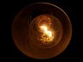
| 07/11/2005 11:48:29 AM | Look me in the eyesby dstrahinovComment: Definately circle. Not high in visual appeal to me though. Focus appears soft, but sometimes even if an image is 'sharp' it can appear soft due to the glass. The area in the center is blown out and having the circle dead center in the photo doesn't work for me either. the letters/numbers are interesting,but I can't really see those well. Subject seems speckled. Can't tell if it's part of the texture of the object, or an effect of 'low light' and noise. Looking further at this...are there HORNS in the background? This is difficult to figure out. Not real clear to me what the message is. Sorry. ~Heather~ | | Photographer found comment helpful. |
| 07/11/2005 11:43:35 AM | Cat 1, Dog 0by zagmanComment: Technically, the photo is good. What I mean by that is the focus and clarity are really good, the lighting is really good, Ithink you caught this at a good angle, DOF works to help get background elements out of the way. All those elements make for a good photo. This is definately not something I'd hang on my wall though. The subject just isn't visually appealing to me. As a documentary photo, it would be excellent. If I were the owner of the dog, or a vet, or maybe someone who studdied these kinds of things, I think this would appeal much more to me. But since I have no connection to the subject or event, It's just not holding my attention.
Like I said though...technically, it is VERY well done. Maybe a little too close of crop on the left, but overall technically good. ~Heather~ |
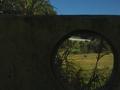
| 07/11/2005 11:38:16 AM | Hector's Bullby RonBeamComment: "hector's bull' is the title of the subject implying that the bull would be an important part of the photo. He's not. We can barely see him. He's just so tiny and far away. The challenge would indicate that your circle was the main subject, but the circle just kind of acts as a frame, rather than main subject. You had a really beautiful sky for taking pics. I do like the idea of framing something with this hole, but would think that whatever it was framing would be the main subject (as you thought too, by your title). Focus appears good. You can really see focus in the upper part of the photo to the left. Actually, I think that's thepart of the photo I like best, the blue with the trees is very interesting to me. ~Heather~ |
| 07/10/2005 02:32:32 PM | |
| 07/09/2005 03:14:15 PM | Swiss' Potatoby andrerussoComment: Well, it's round. visually appealing? no. The plate in the back just really makes this look like a quick last minute entry to try to get 'something' in the challenge. At least take the time to clean up the surroundings for a shot that you're going to enter to compete in a challenge against others. The DOF has no apparent purpose here. The front part of the potato thingy is out of focus and blurry and that's the part of the photo I looked at first. The center, which is the least interesting part of the photo is in good focus, but nothing really to look at there. Definately fits the theme, circle thing on a circle plate. The centered composition doesn't work for this image in my opinion. Lacking something, maybe a dramatic angle or different crop. Definately sloppy background though. ~Heather~ | | Photographer found comment helpful. |
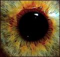
| 07/09/2005 03:11:10 PM | Purple Heartby CEJComment: Interesting colors, but lacking something that really holds my interest. I appreciate that the center of the subject is not dead center of the photo. I'm seeing that a LOT and most of the time it just doesn't work. Hard to tell what this is. A bottle maybe? The purple center doesn't appear to be in focus, nor does anything else in the photo, so it's all kind of a blurred circular thingy. I'm not a huge fan of abstracts, and this is no exception. Some will love it, but it's just not my cup of tea. I think a black border with a thin colored (red?) line would work here as well. ~Heather~ | | Photographer found comment helpful. |
| 07/09/2005 03:08:02 PM | Close Encounterby ToucanPamComment: the background looks horribly tilted. Of course, the cars could be parked on a hill, but given the photo, you could have straightened it out to at least look straight even if in 'real life' it is not. I don't find much visual appeal in this shot. The black and white doesn't appear to work here either. What I do find interesting is the sky in the background. I think it has a nice gradient look to it. Focus on the dish seems soft as well. Overall just not an image that draws me in and holds me there. ~Heather~ | | Photographer found comment helpful. |
| 07/09/2005 03:05:35 PM | Crop Circle of Buttonsby kaelvaComment: Very tiny image. Hard to see much details in the buttons. Definately appears to be circular with circles making up the shape. Color seems kind of lacking and where there is color, it seems dull. The centered crop isn't the most exciting crop you could find, I'm sure. Focus seems soft on some buttons, but hard to tell since the image is so small. Overall just not large enough to be very visually appealing to me. ~Heather~ | | Photographer found comment helpful. |
|
Showing 241 - 250 of ~2785 |
Home -
Challenges -
Community -
League -
Photos -
Cameras -
Lenses -
Learn -
Help -
Terms of Use -
Privacy -
Top ^
DPChallenge, and website content and design, Copyright © 2001-2026 Challenging Technologies, LLC.
All digital photo copyrights belong to the photographers and may not be used without permission.
Current Server Time: 07/16/2026 11:29:54 PM EDT.
|