| Image |
Comment |
| 07/13/2005 12:58:09 PM |
Untitled-164.jpgby xcharrierComment: Her skin tones seem much more natural in this shot. Much more even. I'm not sure about the pose though. The look on her face seemsodd and the angle at which you took the photo is putting emphasis on her behind. You know how when something is closer to the camera it appears larger? Her bottom half looks unproportioned to the upper half. I know she's NOT, cause I saw the other pics. Also, the horizintal line in the background here is chopping her head off. Again, just observations. |
 Photographer found comment helpful. Photographer found comment helpful. |
| 07/13/2005 12:53:25 PM |
Untitled-136.jpgby xcharrierComment: You chopped her feet off. Other than that, I think this is a really nice shot, nice pose, but she seems to be putting too much of her weight on her arms. Creating some unflattering wrinkles in her arms. The other thing that I notice that seems odd is the way her legs have a greenish tint and her arms have a red tint. Neither of which look natural. Very nice eyes, the horizontal line in the background that runs through her head is a distraction. I definately could NOT do any better...just some observations. |
| Photographer found comment helpful. |
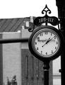
| 07/12/2005 11:56:03 PM |
Turning Back Timeby mystical_princessComment: I think the background hurts this shot. If it were just the building it might not be an issue, but the black pole(?) that is running horizontally through the background is a distraction and the fact that it runs right through the clock adds insult to injury so to speak. See the top of the clock? It kind of blends in with the top of the building. The white sky doesn't bug me, actually, I think it looks nice with the black clock in front of it. Lighting seems very good on the subject. Nothing distracting there. Focus and clarity on the subject are just awesome. Too bad you couldn't get the same lighting effect at 9:15 or 3:45 so that the hands weren't running right through the words, but that's minor. Overall really nice, but wish it could have a different background. Hey, You could always take a huge white backdrop there and have someone hold it behind the clock while you take pics. :) ~Heather~ |
| Photographer found comment helpful. |
| 07/12/2005 11:44:31 PM |
The Aristocratby edwalk74Comment: Very nice. I really like this shot. Focus and clarity are right on, I like the diagonal comp. LIghting is great and I like the color treatment. Overall just a really great image. One of my highest rated photos in this challenge. I love the simplicity. no distractions and thebackground works as well. Congrats. ~Heather~ |
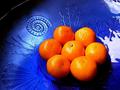
| 07/12/2005 11:42:01 PM |
Winter comfortby lakritstrollComment: Not sure why I like this, but I really do. I like the color the most I think and the set up is pretty cool. They look like tiny oranges, or a huge plate. The blue is just beautiful. The oranges look like they may be oversharpened or something. A couple have a dark outline with 'jaggies'. Maybe compression issues?
edit to finish comment...(son hit submit lol)
I like how you have placed the large circle of oranges to the lower right. The patterns on the plate go nicely.
The bright white reflection on the glass to the right of the photo is a distraction. Otherwise...very nice. ~Heather~ |
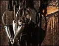
| 07/12/2005 11:35:52 PM |
loose ring snafflesby dragonladyComment: I don't know what a snaffle is, but you make them look beautiful. Very nice focus and clarity. I think the lighting is perfect, what perfect conditions for taking this photo. The background is neat as well. If I HAD to suggest something, it would be that I wish the 'knot' in the wood wasn't there or was the same as the rest of the wood. It's not a big deal at all and I love this shot either way. Who knows, without it, it might not look right, but it's the only thing I can really suggest. ~Heather~ |
| Photographer found comment helpful. |
| 07/11/2005 12:07:28 PM |
Jonesby WesComment: First thing I notice is the crop. I don't prefer it. The red bottle really isn't adding anything to the photo due to focus and lack of clarity, so I'm wondering if you were to take a photo of just the cap, if that would work better? Focus appears good on the cap. Lighting is a bit harsh on the bottom part of the cap. Hard to read the words there due to light reflection. The negative space seem awkward to me as well. I'm thinking this might work better with a square crop with the cap in one corner. Idea is neat though and definately circle. ~Heather~ |
| Photographer found comment helpful. |
| 07/11/2005 12:05:08 PM |
Tunnel into darknessby EmmyComment: Good focus and DOF. I like the detail we can see in the paper. There is a hair or lint or something over to the right near the bottom of the dark background that is a distraction. Everything is nice and round, and then boom...there's a little stick looking thing. Also, the folds in the paper around the edges (near top and right and bottom) make this look 'sloppy'. I love the color. Really nice against the dark background and like I said, the texture is nice. Would like a cleaner surroundings and smoother edges. Overall neat idea. ~Heather~ |
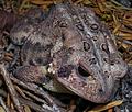
| 07/11/2005 12:02:18 PM |
Wartsby dphillipsComment: Isn't he cute? I love toads and frogs and turtles. Not snakes though. Anyway...My first impression is that the DOF is off and I want to see his face in focus. However, realizing that the warts are your 'main focus' for the challenge, that wouldn't be a good idea. In order for the warts to be more of a main focus though, I might have gotten a closer shot of the warts and not even gotten the head of the frog. Maybe a horizontal line of warts/background, and that's it. The area in the lower right is distracting to me since it blends in with the little toad. As is, the circles just don't seem like the main focus. They ARE there though, so that counts for something. LIghting doesn't seem uniform across the image. Darker in the back and lighter in the front area. Maybe a different light could help accentuate the tiny warts. ~Heather~ |
| Photographer found comment helpful. |
| 07/11/2005 11:58:11 AM |
Digital Olympics !by kbhatia1967Comment: Focus looks good, set up is ok, colors are interesting, although maybe a bit blown out in places. The dust and fingerprints on the CD's is a distraction. Background looks good, nothing distracting there. Not much else to add. Just lacking something that really draws me in and holds me there. ~Heather~ |
| Photographer found comment helpful. |
Home -
Challenges -
Community -
League -
Photos -
Cameras -
Lenses -
Learn -
Help -
Terms of Use -
Privacy -
Top ^
DPChallenge, and website content and design, Copyright © 2001-2026 Challenging Technologies, LLC.
All digital photo copyrights belong to the photographers and may not be used without permission.
Current Server Time: 07/17/2026 02:53:17 AM EDT.