|
|
|
Showing 181 - 190 of ~2785 |
| Image |
Comment |
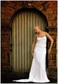
| 09/14/2005 11:43:53 AM | WAITINGby PhilosComment: *Critique Club*
This is a very lovely image. The feeling and emotion in this photo is very high.
Focus and clarity are really good. Nice detail in the background and nice crispness of the model. The detail shown here is awesome.
The wrinkles in the skirt part bug me a bit though. Maybe a bit too much detail there. Wonder if they could be cloned out or if maybe ironing was just the better option.
Lighting seems to be wonderful. Lovely color throughout and no distracting shadows or hot spots.
I'm not sure if it's an editing glitch, or just something that is there, but on her left side (our right) right where her waist is, there's kind of a fuzzy white glow. Also down that same side of her skirt. Looks like it might have something to do with the background right there. Maybe the background bleeding into the forground and it's making a fuzzy combination.
I love the angle and framing/cropping. I like how the model is off to the side here. I don't think it would have nearly the same effect as if she were in the middle or the other side.
This is a really awesome photo and my only complaints are the white fuzzy glow to her left (our right) and the wrinkles. Otherwise, this would be perfect in my opinion. Congrats on a job well done.
~Heather~ |  Photographer found comment helpful. Photographer found comment helpful. |
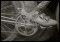
| 09/13/2005 01:44:07 PM | Spinning Circlesby kyeboshComment: *Critique Club*
I have studdied this shot over and over. Parts of my brain want to like parts of it, and parts of my brain don't want to like parts of it. I'm confued on weather or not I actually do like it.
Technically I believe it's pretty well done. Focus is crisp on parts of the photo, other parts aren't due to the motion blurr, but that was intentional obviously.
I think what's bothering me here is that most of the leg and shoe are see through but the end of the shoe doesn't have that same effect.
Also I think that the photo is rather flat in tones. There's no darks or lights. It's kind of all mid tones. I would like to see some contrast.
What I like really is the gear thingy. The center looks really neat and I could look at that for a long time and not be bored. There is a softness and a pattern there that draws my attention. Actually drawing it away from the shoe.
Background is great, nothing distracting there. Overall a good take on the challenge, but lacking something to really make it pop. Maybe that contrast?
~Heather~ | | Photographer found comment helpful. |
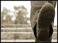
| 09/13/2005 12:22:16 AM | Usedby sz1_Comment: *Critique Club*
I really like this. I'm not sure what it is about an old shoe that is so fascinating to me, but it is. *shrug*
I love the Contrast between the background and the shoe/leg. I think that the background is nicely out of focus and contains nothing distracting to the subject at all.
I'm wondering how this would have looked without the leg in the back? Seems that I'd like to see that as just a one leg kind of deal.
Lighting is great. White sky doesn't bother me at all in this image.
Focus and clarity are good as well. I like the detail in the shoe and the textures of the pants.
The subject matter is actually pleasing to look at. Really neat shot. Overall something to be proud of really.
~Heather~ | | Photographer found comment helpful. |
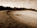
| 09/12/2005 12:29:01 PM | Morning Trapby LeeDComment: *Critique Club*
While there is a spot to the center left that has both black and whites, the majority of the photo is similar in tones. I think that the main are of the photo is not quite high contrasty enough for the challenge. Really the only are of black is the left side of the tree line.
I think it's still a nice image. I like how it's seperated by the curve of the sand area. Textures are nice, although it seems to me that maybe focus is a tad soft, since there should be even more texture in the grass, however, it seems in spots to just be blending together.
Lighting seems to have been good for the shot, no horrid bright spots or distracting shadows.
Overall, not a whole lot to look at in the image, but somehow seems to still be interesting enough to look at.
~Heather~ | | Photographer found comment helpful. |
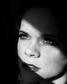
| 09/12/2005 01:40:24 AM | Waiting For Youby mandyturnerComment: *Critique Club*
Very nice portrait. The eyes are just piercing. I think this is an excellent shot for the challenge. The lighting is really what makes the photo, obviously because of the darkness around the face and the way the light directs attention to the beautiful eyes. I'm really glad you didn't leave just the eyes in color. Lately, that's what we 'expect' of a photo similar to this, and I'm glad that this is all black and white.
Focus and clarity are excellent. Really great focus on the eyes and lips.
The skin seems a bit odd to the left of the photo and the tip of the nose. Seems to almost appear flat.
There is a necklace or shirt collar in the lower left of the image and that is a bit of a distraction.
Overall the image is great. I love how she looks like she's staring at something, but we can't really see what it is. Kind of like a 'there's something out there' image.
Congrats. ~Heather~ | | Photographer found comment helpful. |
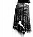
| 09/12/2005 01:20:07 AM | Reachby JutildaComment: *Critique Club*
Well look who's photo I get. :) I saw this one during voting and really liked it. I'm not sure what really it is that I love about the shot, but I think it's the sheer simplicity of it all. Dark shirt and skirt and light background and skin. I think it really works for the challenge.
The pattern on the skirt is pleasing and I love how you placed the subject to the right of the photo leaving the negative space to the left. I think that works really well here.
The lighting is perfect for the shot as well as the challenge. I think that the darks are perfect, and the whites are also perfect. Great contrast and nice range.
Focus and clarity are also right where they should be for the feel of the image.
I like the vertical grain filter. I'm not usually a fan of filters, but this one is so subtle that it looks like it could have came right from the camera itself.
I really do like this. My only nit pick is that we can't see the other foot, so it almost looks like it's been cut off at the bottom, although one can assume that the foot is just covered by the skirt, it also doesn't look like she's standing on anything, so kind of hovering. Still an A+ image. Great job.
~Heather~ | | Photographer found comment helpful. |
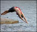
| 09/11/2005 03:07:47 AM | Dive 'N Lakeby ColeyComment: *Critique Club*
I try to guess before looking at the titles what the D and L are. I had guessed 'Duck and Launch', 'Dive and Lowered'. So I think you have a lot of D and L's in this pic. Great photo for the challenge.
You have captured a great moment. I personally like the DOF. Focus is perfect right where it is. In all the right spots. We don't need to see her feet in focus, so having just her 'diving half' in focus works great for me.
Color is also good. I like the way there is not much color in the shot, but her red bathing suit tie really stands out. gives us that tiny something to add extra interest to the shot.
I like the positioning of the subject even though she is directly in the center of the shot, she is kind of coming out of the left side of the photo, making it a left to right photo and we aren't looking directly at the center.
Nothing distracting about the background.
Lighting is excellent.
Overall a great shot, nothing that I can see that I'd really change here. Very pleasing image.
~Heather~ | | Photographer found comment helpful. |
| 09/11/2005 02:56:32 AM | Darkness over Libertyby nico_blueComment: *Critique Club*
'wow, thats a neat shot'
Really though, this is stunning. You know, there really isn't anything I would like to see differently here. I think you captured a moment beautifully. (even if it IS edited, I can feel this moment)
The color is perfect in my opinion. Focus and clarity are great. I love the softness of the clouds and the crispness of the silhouetted Liberty.
Having Liberty in the dead center of the photo was a concern for me, however, upon looking at it in depth, it's perfect. I wouldn't want to see it moved to either side or anywhere. I like it right where it is.
I love the large amount of sky you put in here. Works really well with the small amount of silhouette.
Again, there is nothing I'd like to see differently. Great shot. Would have gotten a 10 from me. Congrats on this beauty.
~Heather~ | | Photographer found comment helpful. |
| 09/11/2005 02:13:55 AM | Dog & Leashby LKMoteComment: *Critique Club*
I'm sitting here trying to figure why this didn't place higher than it did. I love it! Definate link to the challenge. Could be dark and light too...but Dog and Leash is just perfect!
Focus and clarity seem great to me. I love the textures we can make out in the dogs face. Oh what a cutie.
I think the part I really like the most is his eyes. They are dark, yet we can still see them very clearly. they give him such personality in this photo. Just kind of relaxin in the sun.
Speaking of sun, the light on the wall behind him gets a little bright toward the right side of the photo, and the shadow is a little bit distracting.
I love how the leash is sitting in front of him. Looks well placed and not sloppy, but not set up either.
I wonder how this would look if you straightened up the tilted horizontal line of the wall? Would it benefit the photo by straightening it up, or would it make the dog look crooked then? Hard call without seeing it, but maybe something to try.
~Heather~
| | Photographer found comment helpful. |
| 09/11/2005 01:45:52 AM | Playing Dress up & Loving itby twm122Comment: *Critique Club*
Without looking at the title I had guessed the D and L to be 'dressed up and lovely', so I was almost right and you got a message across. Excellent photo for the challenge in my opinion.
She is such a lovely girl too. Congrats!
The lighting on her skin does seem a little harsh. Hot spots on her left (our right) arm. She appears to have beautiful colored skin, but it seems a tad yellowish on her face and left arm from the lighting.
Focus is good. I like how her eyes stand out. I would like to see more distinction between the dress and the background. Not sure if some back lighting might help this? Maybe would also give her some light coming through her hair so that we could better see that from the background. See how it looks like she almost doesn't have hair cause it blends in so well? I think placing a light behind her pointing toward her back might help. Careful though that that doesn't light up the background. May be harder than it sounds.
~Heather~ | | Photographer found comment helpful. |
|
Showing 181 - 190 of ~2785 |
Home -
Challenges -
Community -
League -
Photos -
Cameras -
Lenses -
Learn -
Help -
Terms of Use -
Privacy -
Top ^
DPChallenge, and website content and design, Copyright © 2001-2026 Challenging Technologies, LLC.
All digital photo copyrights belong to the photographers and may not be used without permission.
Current Server Time: 07/17/2026 03:50:22 AM EDT.
|