|
|
|
Showing 151 - 160 of ~2785 |
| Image |
Comment |
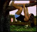
| 09/20/2005 11:58:34 PM | Monkeying Aroundby kylhComment: *Critique Club*
First thing I see when I looked at this is the bright pink background. Too bright. Too pink. Doesn't seem to flow with the rest of the photo. Definately doesn't compliment the girl very well either. Seems to just really clash with everything.
I see that you have listed this in the action category, which would explain why she is such soft focus. cause she's moving. I still think I would prefer to see this shot in sharper focus.
Lighting overall is ok except for the background. I wonder if a little fill flash would helped to bring out some detail in the tree a bit, but really not manditory I don't think.
I like how the tree is off to the left and the branch goes across the top of the photo, kind of frames the girl nicely.
Overall a fun image, but hurt by the background and soft focus, in my opinion.
~Heather~ Message edited by author 2005-09-22 02:10:30. |
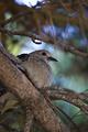
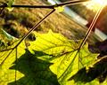
| 09/20/2005 11:58:22 PM | Dove Branchby FotoMunkiComment: *Critique Club*
I really only have one thing to say. Excellent Job! This is such a lovely photo. So peaceful. Your focus and clarity are awesome, and DOF really adds a lot to this photo. The branch is definatley not the main focus of the photo, however, there is a branch in the photo, so I think that it fits the challenge nicely.
The background is wonderfully green against the browns of the forground. Blurred nicely, no distractions there.
I was going to say that I wish the photo were just a bit brighter. Maybe some extra lighting in there somewhere, however, as I sit and look at it, I think it's the browns that really make the photo for me. Expecially the brown whispy things at the top which I think are maybe pine needles. So, really I think that if there were more light in the photo, then it wouldn't be the same color wise.
I really see no reason to not give this photo a 10. Great shot, wish I could offer more in the way of improvement, but I just don't see anything I would like to have seen done differently. Congrats.
~Heather~ Message edited by author 2005-09-22 01:48:56. |  Photographer found comment helpful. Photographer found comment helpful. |
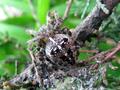
| 09/20/2005 11:57:56 PM | www.eviction....by MardukulComment: *Critique Club*
A bit difficult to see what we're looking at here. Took me awhile to notice that it was a spider, since we definately don't have spiders that look like that around here, it didn't stick out to me right away. Ugh, he's scary looking.
The focus is really on the spider, and not the branch, but there IS a branch in the photo, so it fits the challenge.
Focus seems nice on the spider, DOF helps to make the background less distracting, but the overall shot is quite busy. With the web, the branch and his patterns and legs, the lower right seems just stuffed with stuff. Not really sure how to fix that, unless the spider were in a different location, but just an observation non the less.
The lighting is ok, but seems a tad bright on the legs and front of the spider. It seems like we lose some detail there.
There seems to be noise or grain in the photo as well. More noticable in the background area that is green. See how it's speckeled? I wonder if neatimage would help or not? Something to try at least. You can get a free trial I believe at neatimage.com. *shrug* worth a shot.
Overall neat capture of this ghastly creature, even if a tad busy.
~Heather~ Message edited by author 2005-09-21 14:22:24. |
| 09/20/2005 11:57:32 PM | Bourbon and a branch...JR's favoriteby groundbeefComment: *Critique Club*
I had a nice long crit on this and the site timed out on me, so he we go again...
Focus and clarity seem good on the glass and liquid. I think the detail there is good. I would like to see a little more detail in the plant and I think that would require some extra lighting in the leaves. The leaves seem a little dark.
Is that a branch or a stem? Oh well, close enough.
I like the lighting on the background. I like how it's bright at the top and creates some neat shadow at the bottom. I think though that the leaves are a bit dark and detail suffers a bit from that.
I think that the way you have it right in the center works ok, but would be interesting to see other angles to see if there could be a better one. not really sure with the subject if a different angle would work, but maybe a different crop? Would have to see it to determine it if helped or hurt the photo.
The subject is definately different. Not really something I'd hang in my livingroom, but I could see where some people would...so I think you have something there.
Technically a good photo.
~Heather~ Message edited by author 2005-09-21 14:07:05. | | Photographer found comment helpful. |
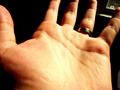
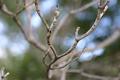
| 09/20/2005 11:57:15 PM | Branches of Love, Life, Heart, and Fateby wavelengthComment: *Critique Club*
Ahhh...with the description, it all makes sense. Even with the title, I would not have gotten it, since I have no experience with palm readin or such. I wonder how many other people failed to see the connection?
The way I see it, almost anything can be turned around to be some kind of 'branch'. So it fits the challenge to me.
On to the photo. Lighting isn't the best. While the background is a nice dark color (minus the window), the lighting on the hand itself is bright. See in the center of the hand the yellowish bright area that kind of erases some detail. In the rest of the hand, we see the finger prints and such, but not there in the middle. Detail is gone. I think a different lighting might be helpful. I'm not sure what you used (no photographers comments) but definately something that's not quite as harsh, in my opinion.
White balance also looks a little off, since the hand seems yellow instead of typical skin tones. This is probably also a result of the lighting.
The window in the background is a bit of a distraction, unless it was meant to be there for some symbolism or something. Even if it was symbolic of something, I think it's almost too small to even really tell what it is. One commenter didn't recognize it as anything, it looks like a window to me, but I supose it could be a lamp with a goofy shade. Anyway, point being, I think that if it serves a purpose in the photo, it's too small to properly portray that purpose. If it does not serve a purpose, then it doesn't need to be there. It's a distraction to the real purpose.
Focus and clarity appear to be ok, if maybe just a tad soft, we still get some nice detail in the finger prints and lines.
Overall, it's an average photo, lacking something to really make it stand out. Good take on the challenge, and need more equal lighting.
~Heather~ Message edited by author 2005-09-21 13:41:43. | | Photographer found comment helpful. |
| 09/20/2005 11:56:56 PM | Hanging by a threadby elee3009Comment: *Critique Club*
You didn't leave any photographer's comments on the photo, so without knowing what your intent was, I can only give my own personal opinion on this shot.
It definately fits the branch category in a very literal sense.
Usually, having the horizon line not horizontal bugs me, however, it's off enough in this photo to actually benefit the photo with dramatic angle. I think it does help to add some interest to the shot. There is some grain or noise in the background that I'm not sure if it was intentional or not, but In my own personal opinion, I would like to see it without the grain.
the color of the leaves is good. I also like the added color of the sun in the upper right.
The focus seems a bit soft throughout the photo. it works on the background to keep the background non distracting, but I would like to see some crisp focus on the leaves. The sharpest focus looks like the spot on the left edge of the photo where the yellow leaf is damaged, which is not the most appealing area of the photo.
I like the angle you chose not only because of the interest it adds to the background but also because the leaves are coming out of the upper right of the photo and create nice diagonals within the photo.
I think it's missing something though to make it really stand out among all the other branch photos.
~Heather~
Message edited by author 2005-09-21 11:31:55. | | Photographer found comment helpful. |
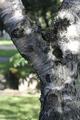
| 09/20/2005 11:56:36 PM | Big Branchby thorgilsComment: *Critique Club*
If you entered this only to participate, were you looking for critiques? I see you have found non of the ones you received as helpful, so I'm not really sure what I can add. What were you looking for when you requested the In Depth Critique? Am I wasting my time? Having little details on your image, I have no idea what you were going for with this image. It seems that you really don't care about it much, and to be brutally honest, it shows.
It's definately a branch, however, most of the photo is composed of the trunk, which is really a different part of the tree than the branch. The DOF is nice to get the background out of the way, but I wish focus on the tree itself were better. Seems soft.
Lighting is ok on the background, but dark on the tree, which makes the detail of the tree difficult to see
The tree is interesting, but I don't think you have presented it well. You did a good job of leveling your horizontal lines in the background. This just lacks something to really draw my interest. But judging on your comments, I think you know that.
~Heather~ Message edited by author 2005-09-21 12:12:59. |
| 09/20/2005 11:56:23 PM | Dieing branchby pkarkareComment: *Critique Club*
What I'm thinking about this photo is that the DOF (Depth of Field) is really interesting. I like how the branch is in nice focus and the backgrould is blurred. however, about the background, the areas of light in the background (the white circle areas) almost run right along with the in focus part of the branch which creates a distraction from the branch. I go to look at the branch, and see the light background and then find myself looking at the background instead, SO...the background is distracting from the branch even though it's pretty much out of the picture since it's out of focus, but it would work better with a solod background, or at least without the bright areas.
OK, on to the angle. It's almost dead center in the photo, and this just doesn't work all the time. Turn the camera, try a off to the side crop, something. This is one photo where it just doesn't work being in the center. If you made the branch 'coming out of' a corner and then branching off into the photo, then I do think that would add some nice diagonals, and interesting perspective.
Overall, I think you have a really neat idea. The subject isn't making me jump out of my seat with excitement, however, it does fit the challenge.
Being your first submission here, you'll learn what individual views like to see, and such.
The little tiny branch in the lower left corner is also a bit of a distraction.
~Heather~ Message edited by author 2005-09-21 02:29:14. | | Photographer found comment helpful. |
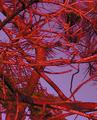
| 09/20/2005 11:56:06 PM | A tree branchby AntoninoComment: *Critique Club*
I think I have to agree with jmsetzler here. It does certainly meet the challenge, but I'm left wondering what the purpose of the photo was. Was it just to take a photo of a branch, or is there another purpose? It's not very visually appealing at all. The focus is soft and the crazy colors hurt my eyes.
I supose it might work as an abstract, but even then, the colors are such that I wouldn't want to look at it for long before I got bored and moved on with my life.
There really isn't a main focal point. my eyes wander looking for a place to land and eventually just wander right out of the photo.
I can't help you much without any photographers comments listed. What were you trying for? What editing steps did you take?
I supose the lighting appears to have been even. No horrible bright spots, or distracting shadows and the background doesn't contain any distracting elements other than the color.
Just really not my cup of tea i'm afraid. I'm not trying to sound harsh, just honest.
~Heather~ Message edited by author 2005-09-21 02:20:45. |
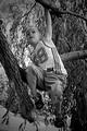
| 09/20/2005 11:55:46 PM | Branch Explorerby jasenComment: *Critique Club*
I really like this shot. I love the focus and clarity. We get some excellent detail in the tree, branches, and the kid. Good crisp lines.
The angle and framing/cropping you chose is excellent as well. A lot of the time having the subject right in the center of the photo is a bad thing, it doesn't work most of the time, but it works very well here. I like how you have put the attention on him, however, still have room for the branches.
The background works excellently. Nothing distracting there.
Lighting is wonderful as well. Nice contrast and tones. There are no dark shadows or distracting hot spots.
You know, there really isn't anything I would change in this photo. I would have given it a 10. Great shot, congrats.
~Heather~ Message edited by author 2005-09-21 02:10:21. |
|
Showing 151 - 160 of ~2785 |
Home -
Challenges -
Community -
League -
Photos -
Cameras -
Lenses -
Learn -
Help -
Terms of Use -
Privacy -
Top ^
DPChallenge, and website content and design, Copyright © 2001-2026 Challenging Technologies, LLC.
All digital photo copyrights belong to the photographers and may not be used without permission.
Current Server Time: 07/16/2026 06:23:56 PM EDT.
|