|
|
|
Showing 131 - 140 of ~2785 |
| Image |
Comment |
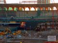
| 12/04/2005 02:02:14 PM | Media Entranceby bmooreComment: *Critique Club*
The soft focus and lighting conditions hurt this shot in my opinion. Looks like an overcast day, and with that HP cam you got, I know from experience that lighting has to be just perfect to get a crisp, well detailed photo.
There's really a lot going on here. While I wouldn't expect there to be in such a scene, there really isn't a focal point, nothing for us to really lay our eyes on and focus on.
There is the sign, however, the sign isn't as clear as I would like for it to be to really give the impression that you were going for.
The area up front is dark and the shadowing also makes it difficult to see detail. There also seems to be a dull 'fog' over the top half of the image which is probably created by simply poor lighting conditions. The best solution for this photo I think would be to just try it at a different time of day, or on a different day where the sky wasn't so overcast.
~Heather~ |
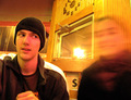
| 12/04/2005 01:26:27 PM | ________by TheLittleIslandComment: *Critique Club*
There are a few things about this shot that stand out to me right away. First, the yellowness of the shot. Makes it appear to be bad lighting or the yellow balance is off or something. It kind of looks like a result of the low lighting though. This also gives the entire image a softer focus than I would like to see. Obviously, you were going for the soft focus on the person on the right, but the person on the left, and the background are also a bit soft. Not TOO soft, but I would like to see just a bit more focus throughout.
I'm not really sure I see the importance of the dollar sign. Is this something you added? Was it already there? Does it have a meaning to the photo? Without a meaning, I find it very distracting, as it's so dark and 'in your face' that I tend to just stare at the dollar sign. If it has a menaing, then I think that it's not obvious enough to me to really add anything to the photo.
The white glare in the dead center of the photo is also distracting. It creates a break in the photo. If our eyes wanted to flow through the photo, they would stop and focus on the large white spot in the center and the dollar sign.
I think the concept is interesting. One person looking at another person in the photo who doesn't come out looking like he does. Like 'what are you doing?' or 'what the heck?'. This does give me the sense of odd.
~Heather~ |  Photographer found comment helpful. Photographer found comment helpful. |
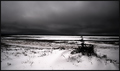
| 12/04/2005 01:08:14 PM | Sky versus earthby sz1_Comment: *Critique Club*
I think I may be in the minority here. While the photo is lovely, technically well done, and I do think that it gives a sense of even, I'm not particularily drawn into the photo. There really isn't anything drawing me in and holding me there.
Focus and clarity appear really great. Nice details in both the sky and the ground.
The little bush adds something to the shot that makes this a little more than just another seascape shot.
I like the contrast. Nice whites, and nice darks.
The one suggestion I could make would be to straighten up the horizon line which appears to have a slight lean to the right.
Otherwise, you did a very good job with this photo, congrats on your placing.
~Heather~ | | Photographer found comment helpful. |
| 12/01/2005 01:38:40 AM | Flag Artby woodseyComment: Oh wow...Haven't seen this before. With all the regrets Setz had about submitting this almost identical shot years ago, and all the snotty emails he got and rude comments about patriotism, you would think that someone wouldn't want to go through that, but some people are a glutton for punnishment, I guess. I think this shot is pleasing to look at every time I see it (I know it's different, but also very similar). I think my only suggestion would be that the blue here looks almost black. Otherwise, nice focus and lighting. the wrinkle in the bottom right might be a bit of a distraction/flaw. Definately looks like a fun shot, and while we have seen it a zillion times, it's going to be new to someone, so that's what counts. (despite the zillion comments you get that say 'unoriginal'.) | | Photographer found comment helpful. |
| 12/01/2005 01:17:41 AM | jennaby gtp1164Comment: I want to first say that this is a neat portrait and that I certainly couldn't do any better, but wanted to point out a few things that I notice that stand out to me right away. First and formost, the jaggies! Horrible jaggies along her right (our left) arm and her top strap. Because she's light on a very dark background, it stands out a lot there. Secondly, the shadow along her nose, makes her nose look huge. I can tell when I look at her, that her nose if in fact not huge, but the way the shadow lays, it appears that way.
The next thing is her skin, looks like some neat image there and she has no texture. The combination of the unnatural jaggies and the lack of skin texture, makes her look almost fake. Also, I would like to see more hair. It blends in too well with the background, and I think with as beautiful as she is, I want to see all of her. Well...you know what I mean.
Ok, that being said...I still think it's an excellent portrait, and if it were me, I be happy with it, but if you were looking for some picky details, there they are. ~Heather~
Very nice focus by the way. i also might like to see this with the right cropped, and more negative space to the left of the photo. The right 1/4 seems to be adding nothing to the photo. Hope this helps, it's just one opinion. |
| 11/28/2005 01:17:31 AM | usb over cdrby brassilComment: *Critique Club*
I see you haven't logged on in almost a week, so don't know if you'll actually get this or not, but here it is anyway.
Since you didn't offer any details on what you were trying to convey with this image, it's really hard to say if you achieved what you were trying for, therefor, I can really only offer advice based upon my own personal opinion of the image.
What really jumps out at me first thing is the focus. This looks like it was maybe hand held. There definately seems to be a lack of focus for some reason. In a low light shot like this, the best advice I can give is set the camera down, and use the timer if available. That way, there would be no camera shake from being hand held OR from hitting the button. This would help to get the photo in focus. IF in fact, this wasn't hand held, then definately need to work on getting the focus on the image.
The color is vivid. Nice and bright. Unfortunately, I don't think that it adds enough to the image to make for a very visually appealing photo. I think it lacks a major focal point. Maybe an interesting view. A different perspective, or dramatic angle might add something to the photo. The centered CD just isn't drawing me in.
I believe it definately fits the challenge, and it is a creative way of adding the light.
The dark background works well against the bright colors, however, there is something on the right of the photo that is a bit of a distraction. I can't tell what it is, but it's just to the right of the CD, and is brighter than the background, but not bright enough to tell what it is, which does make it a distraction to the actual image. If it's meant to be in the image, than I don't think it's doing it's job by being there, since we can't see enough of it for it to really add anything to the photo at all.
I hope you find this helpful, and how that it give a bit of insight as to why the photo may have scored as low as it did.
~Heather~ |
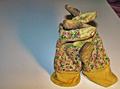
| 10/14/2005 03:20:22 AM | Even Gardening Can Feel the Shadow of Prayerby olddjComment: Oddly enough, they don't look like they are praying, they look like they are hugging. So, even without the title, I think this fits the challenge nicely.
As for the photo itself, where to start? How about the background. Very sloppily done in my opinion. The upper right corner being angled like that is not only creating a dark distraction on a white background, it is also making the photo look like a quick shot that wasn't appreciated by the photographer enough to clean it up. If you meant for it to be there, then it's not working either way.
Also regarding the background, it appears that it's suposed to be white. However, there is blue and yellow tint to it. This may be caused by the white balance being off, however, I feel that it is due to poor lighting.
Despite what you title implies, I think the shadow is distracting. Especially on the background that appears that it is suposed to be white.
Focus. It's difficult to say for sure if you have crisp focus. It looks ok in some places, and soft in others. The pattern on the gloves, which is clashing with the texture of the gloves, really makes the gloves themselves hard to look at. See how there is kind of a vertical pattern in the material of the gloves? That being over top of the flowers really makes it difficult to pick out one pattern over the other, and they kind of just mesh together.
I think that I would also prefer this with a bit more even lighting. Looks like you have 2 light sources. Maybe a lamp coming from the right and then the flash? See the very dark shadows behind the fingers of the gloves? Those look like maybe flash? Then there is the large blue shadow on the background. Also, there is a lot of noise in the photo. It's mostly apparent in the background, but still looks to be the results of poor lighting.
The subject is not personally appealing to me, however, they are presented in an interesting manner, to which fits the challenge.
I would say that the idea is good, but appears to have been a quick shot to get something into the challenge.
Try centering the subject more on the background, which would eliminate distracting upper right hand corners, less harsh lighting. maybe try natural lighting. Set this up near a window or outside even.
That's the best opinion and suggestions I have. Hope this helps in some way.
~Heather~ | | Photographer found comment helpful. |
| 09/27/2005 03:22:52 PM | Bee Trapby cycomerlin14Comment: *Critique Club*
Definately a different perspective here. I think this is very effective in making what could be an ordinary photo neat by using perspective.
That being said, it's a bit hard to tell what were really looking at at first, but if you really study it, it's pretty obvious.
Focus does seem a bit soft, the grain doesn't add anything to the photo in my opinion and I can only wonder what this would look like in color. may be easier to tell what it is we're looking at.
I really like this though, the idea is spot on what I would expect to see in a perspective challenge.
~Heather~ | | Photographer found comment helpful. |
| 09/27/2005 03:13:46 PM | Looking Out My Window....by jrjrComment: *Critique Club*
I drew this photo for critique and it somehow didn't get critiqued, so here I am for that critique.
The very first thing I notice about this photo is the right tilt of the background. Makes everything look like it's going to slide off the edge of the world. I wonder if there was a way to straighten up the background, yet still have the window from angled? I think it would be possible, just play around with angles and perspectives.
About the perspective aspect, is this really a creative perspective? I do think that it's a different type of shot, and I like the way it's shot through the window, but I'm just not so sure there is a special perspective that adds to the photo. If you take the definition of perspective as just a way of looking at something, then sure, works for me. lol. Does that make any sense?
Focus and clarity look awesome. I love the detail in the front boat and the houses.
The reflections in the water are not as crisp focus probably due to some ripples in the water, but I think that adds to the photo, not distracts.
Colors are very nice. Wish the boat were a bit brighter lit. The way this is set up, the background seems like just that, a background element, because it is so small in relation to the big picture. The boat seems like it would be more considered a main focal point, yet we don't really see much of the boat.
A good photo of a lovely view. ~Heather~ Message edited by author 2005-12-04 12:53:58. | | Photographer found comment helpful. |
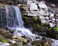
| 09/27/2005 03:13:16 PM | Down to water levelby MarkComment: *Critique Club*
Sorry for the delayed critique, I had drawn a couple photos from the list and somehow didn't get to critique them, and just now noticed they weren't done, so here goes...
First off, I think I'm in agreement with the other commenters. The photo hurts my eyes. Really pretty scene, nothing 'jume out of my seat exciting', however, looks relaxing and definately not a place I'd see every day. I think it's the softness that hurts the photo in my opinion. It's not just the water, it seems that the rocks to the right are soft too, and also the rocks to the bottom, so really it's the whole photo. Was this a hand held long exposure? Maybe a little movement that blurred it?
One comment states that a tighter crop would work, and one states that the crop may be too tight chopping off part of the waterfall. Hmmm... I'm going to have to go with tighter crop. I think that by cropping off the tiny section to the left would eliminate any feeling that there was something else to the left. Also, by eliminating the rocks at the bottom of the photo, it brings our view up to the bottom of the waterfall, which is certainly more exciting than the dark rocks at the bottom of the photo.
While I think the green is a very pretty shade. Nice and vibrant, I think that there just isn't enough of it to really help the photo. In otherwords, it creates a random distraction rather than adding to the visual appeal of the photo. Does that make sense?
Lighting appears to be ok, although the mixture of dark objects to light objects just doesn't seem to flow. The photo isn't balanced right. Not really sure what you could do to fix that in a natural setting such as this, (natural in the sense that you can't change it) but it is an observation.
Overall I get the feeling of the location, but I'm not drawn in. ~Heather~ Message edited by author 2005-11-14 01:19:39. | | Photographer found comment helpful. |
|
Showing 131 - 140 of ~2785 |
Home -
Challenges -
Community -
League -
Photos -
Cameras -
Lenses -
Learn -
Help -
Terms of Use -
Privacy -
Top ^
DPChallenge, and website content and design, Copyright © 2001-2026 Challenging Technologies, LLC.
All digital photo copyrights belong to the photographers and may not be used without permission.
Current Server Time: 07/16/2026 07:21:22 AM EDT.
|