|
|
|
Showing 121 - 130 of ~2785 |
| Image |
Comment |
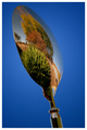
| 12/05/2005 02:35:59 AM | Autumn Reflectionsby BradComment: Well, this is a very crisp photo. I think what really makes it pop is the background. The reflections, while clear and crisp, aren't nearly as interesting as a neat looking spoon on an awesome blue background. The handle of the spoon almost looks like it's had a negative effect applied, although I realize it's just reflections, it looks like it's got a large white halo around it. I know it doesn't...but appears that way. Other than that...very clean shot. the border compliments it nicely and it's generally pleasing to look at. Would make a great ad with an icecream shop reflected in it hehe. ~Heather~ |  Photographer found comment helpful. Photographer found comment helpful. |
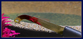
| 12/05/2005 02:06:01 AM | Hey !!by BrianRComment: Well, it's definately a knife, but it doesn't seem to have a purpose. Looks like it was toseed in a fish tank? The reflection isn't helping me to figure out why the knife is in the sand next to a plastic plant? Focus looks sharp on the blade, but looks like maybe a bit oversharpened (no pun intended) due to the white areas around the knife. could just be reflection though, if so my apologies. the background doesn't contain any distractions, however, I don't feel that it adds to the image either. This doesn't affect the score any, but I will also mention that the border doesn't work with the image. Maybe a plain thin black border would work best. presentation is important. ~Heather~ | | Photographer found comment helpful. |
| 12/05/2005 01:50:20 AM | Everybody Loves Jillby ginjerComment: I'm not getting it. I mean, it fits the challenge i guess. Resembles a spoon, but not enough of the photo is in focus to tell what it is. The spot that I see that is in focus is the corner of the metal thing in the bottom right. This to me doesn't seem like it would be the most interesting part of the photo, so I can't figure out why it would the the crispest focus. I guess this must have been easier to picture seeing the entire scene and knowing what you were going for. As is, it's a bit busy, soft and confusing. ~Heather~ | | Photographer found comment helpful. |
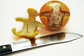
| 12/05/2005 01:40:37 AM | Creative Carvingby MontereykiddoComment: HAHAHA. Certainly didn't notice that in the thumbnail. I wonder if this violates the no penis rule? Hmmm? LOL. Very nice focus and clarity, love the idea it's definately clever and original. The lighting creates some shadows that are a bit distracting and the texture of the white surface doesn't add to the image in my opinion either. Cute. Made me laugh. ~Heather~ | | Photographer found comment helpful. |
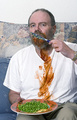
| 12/05/2005 01:35:13 AM | Dangerous to eat peas with a knifeby donnievComment: This isn't a very appealing image. I'm not really sure what it's suposed to be. Is that suposed to be blood? If so, it doesn't look very much like blood...kind of looks like the guy was eating spaghetti and missed his mouth. Or maybe barbeque or something. Anyway, the background elements are also a bit distracting. There is a horizontal line cutting right through his head in the background. Maybe if he were trying to pay attention to what he was doing (eating) rather than looking directly into the camera, it might help too. The 3 different leafy/floral patterns in the photo kind of clash with each other. The leaves on the plate, the leafy things on the blue couch, and the flowers on the pillow above don't blend so well.
Focus though is really good, it shows a lot of detail, even wrinkles in the peas and shirt. Lighting is also decent. Just not my cup of tea, nothing personal. ~Heather~ |
| 12/05/2005 01:08:02 AM | cracking!by idemaerschalkComment: A spoon and fork in ice? A little difficult to see. The lighting in the center is harsh, with some blown out areas creating quite a distraction. Looks like you may have tried to tone it down a bit post processing, but instead, it kind of gave it a greyish look. Not sure how to recover from that, other than try different lighting. I wonder, if this were frozen in ice, would a backlighting have made an interesting effect? ~Heather~ | | Photographer found comment helpful. |
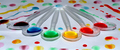
| 12/05/2005 01:05:39 AM | Colorful Spoonsby NstiG8trComment: I'm so happy to see the colors in the 'right' order. So often we see created 'rainbows' and they're all mixed up. Blame it on my OCD to like seeing these in order. The colors are great. Nice vivid and bright. Focus appears to be good as well. Wish we could have this bigger, but I realize the size limit restricts this, and the crop makes it just that much smaller. I think this would look great as a huge image hanging up somewhere.
Lighting is good, I don't see any distractions except the darkish dye to the left of the photo near the purple spoon. Otherwise, a fun image. ~Heather~ | | Photographer found comment helpful. |
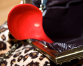
| 12/05/2005 12:43:32 AM | Spoonful of Family Loveby SonifoComment: Deffinately different. That's a whole lot of reflection for something so small. The pink around the edge is a bit of distraction to me. It's not so bad on the girls sweatshirt, but around the edge of the spoon, it's a bit much. Is this a spoon or a scoop? I'm thinking it's a scoop, but oh well, they serve the same purpose I guess. Focus is good, background is good as well, nothing distracting there. Fun photo. ~Heather~ | | Photographer found comment helpful. |
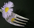
| 12/05/2005 12:40:37 AM | Mirrowed Flowerby AlanBesComment: Don't you hate it when you forget to check your title only to find out after the challenge starts that you have terribly screwed it up. ;)
As for the photo itself, I can't imaging why there would ever be a flower on a fork. Seems way out of place to me. the reflection is ok. i wish the background were just a bit darker. There is a shadow from the flower in the background just above the fork, and a bit of texture in the blackness in the lower left corner. Focus is alright on the fork and the flower. ~Heather~ | | Photographer found comment helpful. |
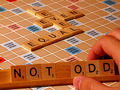
| 12/04/2005 11:57:39 PM | Not Oddby wavelengthComment: *Critique Club*
Without photographer's comments, I'm not really sure what you were trying to achieve here, so my advice will be based on my own personal opinion.
The first thing I notice here is the over orangish hand. Looks like maybe some lowish lighting, which you might have needed to keep reflections off the shiny board. However, the skin tones look unnatural and it's a bit of a distraction.
I like the concept, maybe just a bit TOO set up, but otherwise a neat idea for the challenge. There are a lot of 'Odds' in this pic as well. 3 fingers, triple words scores, the word odd, the very many 1's in the photo. So really, it COULD have been used for either challenge, but probably more fitting here since the words are based on being even.
Lighting seems a little dull. Would like to see the colors punch a bit more, and would like to see the lighting on the hand be a bit different, maybe softer.
Focus and clarity are really good. Nothing distracting there. The background (board) is quite appropriate. Really, my only complaint is the hand and lighting.
Otherwise, nice shot. ~Heather~ | | Photographer found comment helpful. |
|
Showing 121 - 130 of ~2785 |
Home -
Challenges -
Community -
League -
Photos -
Cameras -
Lenses -
Learn -
Help -
Terms of Use -
Privacy -
Top ^
DPChallenge, and website content and design, Copyright © 2001-2026 Challenging Technologies, LLC.
All digital photo copyrights belong to the photographers and may not be used without permission.
Current Server Time: 07/16/2026 10:15:05 AM EDT.
|