|
|
|
Showing 1201 - 1210 of ~2785 |
| Image |
Comment |
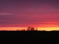
| 05/22/2003 06:05:28 PM | Deep Purpleby Dim7Comment: *Critique Club*
This is really pretty. I think I only have one suggestion really to make on how this could appeal more to my personal tastes.
I would like to see this with less black at the bottom. Since it really doesn't add to the shot in my opinion, I see no need to have so much of it. Maybe crop off just 1/2 of the blackness and that would be enough to bring our eyes out of the dark and up to the beauty.
The angle is good, I don't mind the large clump of weeds being right in the middle. I think that gives us a bit of ground to kind of point towards the sky and say "hey...looky over there".
I wonder if the focus seems just a tad soft. Like the brush isn't really as sharp as I think it could be. They sky is very nicely done however. Great colors, and the small patch of clouds in the upper left is a great touch. I don't think it would have the same beauty without the clouds there.
Quite pretty. We don't seem to have nice sunsets here. Good find. ~Heather~ |
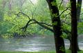
| 05/22/2003 05:57:05 PM | Rainy Day Greensby ruthiekComment: *Critique Club*
This is a really pretty scene. I don't think that it was captured well though.
The lighting, obviously being a rainy day, wasn't very good to shoot in. The focus is soft, and this could be a product of low light. The haze at the top is ok, because it only effects the background, and not the tree branches in the front.
The angle and framing/cropping are good. I like how the large branch arches across the photo to the left. I wonder if maybe a little extra grass at the bottom would help to enhance the greenness.
It's green, definately fits the challenge. Overall, it's a pretty shot, just suffers from softness in my opinion.
~Heather~ |  Photographer found comment helpful. Photographer found comment helpful. |
| 05/22/2003 04:33:07 PM | Primary Care - "Code blue"by drydocComment: *Critique Club*
I like it. I think that it would make a great ad or comercial. I do think that I would have left out the reflection of the cars on the right of the photo. Not quite sure how you could do that without simply cropping it out, or moving the entire shot over a bit.
The lighting looks good. No distracting glares on the motorcycle. No harsh shadows either. I think that you got the lighting just right, and on shiny metals, that can be most difficult.
I like the angle, it lets us see enough of the motorcycle and products to make it interesting.
Focus and clarity are really good. We can read the bottles, and see exactly what it is that you are doing to the cycle.
I think I would have left out the toothbrush. Simply on the visual appeal basis. I don't like looking at my own toothbrush, let alone other people's toothbrushes. Kind of an ettiquette thing, I guess. Most likely a product of some sort of obsessive compulsive disorder on my part. lol
I like the addition of the red stool. I think that any other color would have been too much, or make it cluttered.
Nice shot. ~Heather~ | | Photographer found comment helpful. |
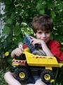
| 05/22/2003 04:16:15 PM | These are MINE!by OneSweetSinComment: *Critique Club*
This is absolutely cute. I guess the only thing I see that I would like to see differently would be the crop.
There is a bit of room to the left, but the right is cropped a bit tight, as is the bottom.
I think that the background works well here, no distracting elements. The colors are definately there, and in a natural environment too. I think that is why this appeals to me. It may be set up, however, it's still quite natural.
The focus and clarity are great. Detail in both his face and toys is really good.
Lighting seems to have been working with you this day as well. The color stands out nicely, and other than some shadow on his left eye (our right) the lighting adds much to this shot.
Good shot. ~Heather~ | | Photographer found comment helpful. |
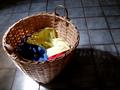
| 05/22/2003 03:20:34 PM | Recurring Primariesby MalokataComment: *Critique Club*
I think this has a nice ring to it. I really love your floor. It's dreamy, and adds a lot to this shot. I wonder if you have a wide angle lens though cause the upper horizontal lines of the floor look curved a bit, like an arch.
The lighting is good on the floor, and the basket, but I don't think it adds much to the primary colors in the basket. The yellow is a bit washed out and the blue is almost totally hidden in the shadows.
Focus and clarity are great. I love the texture of the basket and the pattern on the floor.
Angle and framing/cropping look good. I think that a head on shot would not have had such an impact as this does.
Overall it has a really nice feel to it. I just wish that the colors stood out a bit better for the challenge.
~Heather~ | | Photographer found comment helpful. |
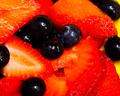
| 05/22/2003 03:06:42 PM | Berry Deliciousby ladpupmoeComment: *Critique Club*
This hurts my eyes. I think the saturation is too high or something. The red seems a bit TOO red. The berries aren't really blue. Most of them seem black or deep purple.
I think that they yellow plate would be effective had we been able to see a bit more of it.
The focus seems a slight bit soft to me, and that is probably due to the closeness or the overly bright reds.
It looks delicious, don't get me wrong. lol
I think that if you backed up a bit, maybe tried some different lighting so the reds wont be SO red, this would be a great comercial shot. I dont think that lowering the saturation would work well. You could try it, but it might make it look dull then.
~Heather~ | | Photographer found comment helpful. |
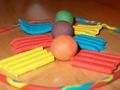
| 05/22/2003 02:50:22 PM | Plastecineby hawkidaComment: *Critique Club*
My eyes are first drawn to the balls here. I think because of the angled bricks of clay, they act almost like an arrow, pointing right at the balls.
I can see that you took a moment to set this up, however it does look sloppy. It looks like you simply ripped apart the primary colors and threw them on the table. this is most clear in the blue square in the upper left, and the yellow in the upper right. Had you even taken 2 seconds to smoothe them out so that they laid flat, that would have made this look like a bit more thought was put into it.
I honestly think this would work better in the secondary challenge. It seems like you have created a story. Blue and yellow make green. Red and blue make purple...etc. This story fits much better into secondary colors than primary colors.
The focus is ok, but I find the bit of out of focus ring to be distracting, as it is right there "in our face" so to speak.
The colors are ok. I've never tried to photograph clay before, so it could be a tricky texture, but I wonder if maybe different lighting would help the colors really punch.
The background is not good. I would have went with a solid color background. Probably white.
~Heather~
| | Photographer found comment helpful. |
| 05/22/2003 02:34:15 PM | tea gear patternby kenboComment: *Critique Club*
I like this. I think that the setup is excellent. The angle and framing/cropping is near perfect. If I had to make a suggestion on that aspect, I would say to crop the yellow bowl differently, maybe closer to the middle of the bowl. However, I would not want the symbols cropped at all.
The lighting seems to be a problem for me. I think that the image appears too dark, especially near the upper left and on the yellow bowl. There is shadow in the upper left creating some extra darkness. I think that had there been some extra lighting that the colors might punch a bit harder. Maybe even jump right out of the screen. lol
Since you photographed glass subjects, extra lighting would also mean extra lighting control so you wouldn't get annoying glares on the glass.
Your focus and clarity are good. I like the detail in the dishes. You have done a great job with this.
~Heather~ | | Photographer found comment helpful. |
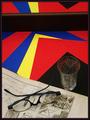
| 05/22/2003 02:26:45 PM | Time Warp / Still Lifeby jjbeguinComment: *Critique Club*
What can I say that could be of importance to someone who is great enough to have won 9 ribbons? My best answer to that would be, The Truth.
I don't really care for this image. It confuses me first off. I don't understand the relation of the paper, the glass and the blueprints.
There are a few things that really bother me the most. The first is that we cannot tell what the blueprints are for. I think that is what makes this confusing for me. What is the point? I know you put them there for a reason, but I'm not seeing the reason because I don't even know what it really is.
Secondly, you seperated this photo at the top for a reason with what I assume is a reflection. However, it's tilted. If you put this there on purpose, which I assume you did, I feel that it should be straightened up or removed. I think it's quite distracting.
Your focus and clarity seems good, and the primary colors really jump out of the shot. Lighting looks good, especially on the red blue and yellow papers. I think that is what makes it really punch.
One more thing, your border looks like it's suposed to be red and blue, however being so thin and so close together, it kind of blurrs in together makeing it appear a pinkish/purple color. Just something my eyes are doing automatically probably. ~Heather~
| | Photographer found comment helpful. |
| 05/22/2003 02:11:57 PM | Burstingby GraciousComment: *Critique Club*
I think this is cute. The yellow and red are quite clear, and are also nice and vivid. They stand out well.
I am undecided on the stars. I like them, cause they give this a playful kind of attitude, however, directly under the slinky, where the slinky pieces are close together, The stars make it a bit cluttered. So I guess I like them on the outter part of the slinky, but not inward where they are cramped.
Something I find to be a bit of a distraction is the green part of the slinky that peeks in from the left. The rest is so bright and cheerful, that the green sneaks in and creates a distraction.
For the challenge, I'd like to see some blue, however, I don't really see how you could add blue to make this look good. Unless maybe the stars were blue. Otherwise, I don't really think blue would fit in. It would be like that small patch of green in the corner, distracting.
Focus and clarity seem to be good in my opinion. And I love the framing/cropping you chose, with the slinky coming out of the upper left and the stars spilling out over the 'negative space'.
The lighting really makes this shot. I appreciate that there are no distracting shadows. That, in my opinion, would have ruined this shot for sure. Great job.
~Heather~ |
|
Showing 1201 - 1210 of ~2785 |
Home -
Challenges -
Community -
League -
Photos -
Cameras -
Lenses -
Learn -
Help -
Terms of Use -
Privacy -
Top ^
DPChallenge, and website content and design, Copyright © 2001-2026 Challenging Technologies, LLC.
All digital photo copyrights belong to the photographers and may not be used without permission.
Current Server Time: 07/24/2026 09:12:15 PM EDT.
|