|
|
|
Showing 1191 - 1200 of ~2785 |
| Image |
Comment |
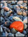
| 05/22/2003 10:24:20 PM | The Sunset Stoneby moondoggieComment: *Critique Club*
There really isn't much I can say about this shot. It's simple and lovely.
The DOF really works here in my opinion. I like how the focus is in the front and on the orange stone, and how the backgroud is just that. Background. Nothing distracting in the background, and it's blurred nicely.
The lighting is really excellent. I think that is what makes this photo for me. There is shadow on the 'dull' rocks, and then the orange stone just jumps out and says 'hey, look at me'. I like the little reflection of the sun in the orange stone as well. The small patches of light throughout the shot are really nice.
Focus on the stone is excellent. Nice clarity and detail in the stones. I like how we can see the texture in the rocks.
I see nothing that i'd like to see differently here. It's a great shot.
~Heather~ |
| 05/22/2003 10:11:06 PM | Foodby AllenComment: *Critique Club*
This is a good setup. I like the green, orange, and purple you have chosen, and it looks very natural and yummy looking.
The lighting seems to be good on the oranges and lettuce, but the egg plant is creating a bit of a glare.
The focus and clarity are ok, but because of the glare on the eggplant, it seems a bit softer than the oranges and lettuce. I like how we can see the texture in the oranges.
I think I would like to see this with the top section of lettuce cropped. So there is just one bin showing. I like the arrangement. It looks like it was just thrown in there naturally, not set up to be a "still life" kind of shot. Which I think is what makes this shot different.
~Heather~ |
| 05/22/2003 09:40:18 PM | beybladingby zanedogComment: *Critique Club*
In asking for an in depth comment from the CC, I think it would be beneficial to include some details of what you were trying to accomplish here.
I have no clue what this is, nor does it really appeal to me. yeah, there are a few secondary colors, but they aren't really interesting at all. Not being able to tell what it is, where it is or WHY it is there really depreciates the value of this shot in my opinion.
The white line seperating the photo in half doesn't really add anything either. It's not really well ballanced, and my attention is drawn more to that bright white line than to the circular things. (which I assume was suposed to be your main focus)
It looks like a post processing filter was used. I say this because of the strange look of the white line in the center, and the outline of the circular object to the far left.
Overall, this is really not my cup of tea. Sorry.
~Heather~ |
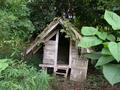
| 05/22/2003 09:29:52 PM | Hidden in the Greenby InnaNComment: *Critique Club*
This is a nice image. It makes me smile thinking that some kids played in it. I don't know what it was really for, but that's what my imagination is telling me.
The focus on the hut seems just a slight bit soft. Nothing that really hurts the photo at all. The angle and framing/cropping is good. I like the larger green leaves to the right. I think they frame nicely, and help 'hide' the hut.
I wonder if some saturation adjustments would help to bring out the greens in the leaves. There are a few different colors of green there, and I like that a lot.
I wouldn't say that the green is the main focus of the photo. I think that the main focus is the little hut, which is fine, but for the challenge, I think that the green should just scream to be the center of attention. The green loses the battle here against this cute little hut.
Still a nice find though.
~Heather~ |
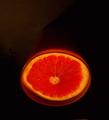
| 05/22/2003 08:35:18 PM | Juicyby ElizaComment: *Critique Club*
At first, I notice 2 things that I think shouldn't be there. First, is the light area of background in the upper left corner. And second is the small patch of something peeking out from the bottom of the photo near the bottom right corner. These create a bit of a distraction once they are noticed.
I like the color of the grapefruit, and the lighting is good. The lighting is what makes this photo stand out from a lot of shots. Creates a spooky feel on such a common subject, that it does tend to draw attention.
Focus and clarity are ok. I wonder though if it would be possible to get a bit more detail on the grapefruit? I love the texture of the little bubbles in the middle, and would love to be able to see that.
the angle is good. You can tell it looks like it was flipped, but I like that aspect. A view you normally don't see.
Overall an ok shot.
~Heather~ |  Photographer found comment helpful. Photographer found comment helpful. |
| 05/22/2003 08:26:28 PM | Purpleby arnitComment: *Critique Club*
There is something creating a purpleish pink tint to her forhead. And I'm not sure that is very appealing. I tried this with a crop just above her eye brows, and I think that works nicely too.
The purple makeup under her eyes, makes her look like she's either been crying a lot, or like she's got real bad allergies or something. not really something common.
There is a yellow area on the bridge of her nose, that looks like it was a lighting glitch or something. Maybe a harsh reflection of light. Some skin colored powder could cut down on the ammount of glare on her face. She does have a glare on her forhead as well.
I like the white negative space. I think that it actually helps us focus on her face a bit. Kind of like "oh, nothing over here...lets look at the girl".
Focus and clarity are great. You have good detail in her face. We can see individual eye lashes, and that's good.
~Heather~ |
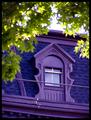
| 05/22/2003 07:42:51 PM | The Purple Windowby kellymcgComment: *Critique Club*
Now THAT is some bright purple.
A couple of thing stand out to me right away. First, because the photo loaded from top to bottom, I noticed that the sky was quite a bit bright. It engulfs the leaves, and the upper edge of the house.
I think that cropping they sky to the top of the house would benefit the shot. It would still be framed on the upper corners by the leaves, and the white sky distraction would be eliminated.
The second thing I noticed right away is the wire running through the middle of your subject. Nothing really you can do about it, but I would mention that it is a distraction.
The color is great, and I think that the angle you took this at is good as well. I like the added bottom ledge of purple too. It really does look good on that blue. Maybe not something I'd personally live in, but who knows, it could grow on me.
your focus and clarity are great. I like the detail in the ledge, the window frame, and the siding.
A nice find. ~Heather~ |
| 05/22/2003 07:34:39 PM | Weeping Flowerby Mo ElfComment: *Critique Club*
I like this, and I can see what you were trying to do here, and it's a great idea.
I do have to agree with some of the other commets though that the important part (in my opinion) seems to blend in a lot with the surroundings, making it seem a but mushed.
The color is beautiful. I like how it take up the whole shot, but unfortunately it also absorbs some of the detail as well.
I almost missed the water droplet, it's hidden down there in all the color.
I am glad for the small patch of yellow in the background, it does help the little wiskers in the middle to stand out a bit better than the rest of the shot.
A really pretty macro. Just maybe TOO much color. lol
~Heather~ |
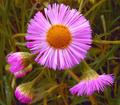
| 05/22/2003 07:17:34 PM | Common Fleabaneby drdab99Comment: *Critique Club*
I'm going to be really picky here. The color you have chosen, which appears more of a light magenta color is considered a secondary color, only when dealing with colored LIGHT, and not pigments. The pigmented secondary color, which would be color on any actual surface of object, is actually a deeper purple.
Ok, now that I have that out of the way... I'll talk about the shot itsself.
Excellent capture! I love the one flower that just jumps up and screams look at me. The droopy flowers do add character. The background seems to have some noise in it. Seems like it's pretty speckled or something. The focus and clarity of the flowers is really great. I expecially love the detail in the center of the flower.
The angle and framing/cropping is great. I wouldn't change a thing about it. The one in the center is definately the center of attention and he has his little future flowers hanging around.
The lighting is good on the flowers, I think that is one major reason that the color is so strong and vivid.
Not a whole lot to complain about here. lol A nice shot.
~Heather~
|
| 05/22/2003 06:34:50 PM | The Spring Is Here...and It's bitterly Cold!by tolyanchikComment: *Critique Club*
Wow. I see you really got a lot of useful comments on this one. Probably learned a lot from those huh? lol I'll try my hand at some actually useful words on your shot.
First thing that comes to mind when I look at this is that this is actually pink. Purple would be the secondary color I think you were trying for. However, this does appear to be way more pink than purple. Pink is considered,neither primary nor secondary, but is officially titled a "tint". For example, pink is a tint of red. Created by mixing white and red. While red is a primary color, white is not, therefor, pink wouldn't really be acceptable for this challenge.
But, setting that aside, I'll talk about the image its self.
What stands out right away is the strange crop. You take the subject all the way to, and out of the frame on the right, but left a small bit of black space to the left. I find that strange. I would either like to see blank space all around, or none at all. I would probably prefer this to be cropped to the flowers on the left.
The lighting seems a tad strange to me. Did you use flash? Just doesn't seem very natural in my opinion. If it is, just ignore me. lol.
Focus seems good, I think that the 2 out of focus leaves near the bottom of the shot are a little distracting. I tried this crop, and I thought it was quite nice. Try this... Crop out the leaves on the bottom, and crop out the black space to the left. That leaves the entire subject taking up the entire frame. Looked pretty nice that way.
Would make an awesome puzzle.
They are very pretty flowers. i wonder if some hue/saturation adjustments could have given this a more purple appearance, and if that would have helped this shot to do better in the challenge.
~Heather~ | | Photographer found comment helpful. |
|
Showing 1191 - 1200 of ~2785 |
Home -
Challenges -
Community -
League -
Photos -
Cameras -
Lenses -
Learn -
Help -
Terms of Use -
Privacy -
Top ^
DPChallenge, and website content and design, Copyright © 2001-2026 Challenging Technologies, LLC.
All digital photo copyrights belong to the photographers and may not be used without permission.
Current Server Time: 07/24/2026 12:47:40 PM EDT.
|