|
|
|
Showing 1181 - 1190 of ~2785 |
| Image |
Comment |
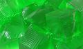
| 05/23/2003 01:38:32 PM | There's Always Room for Jelloby StevePaxComment: *Critique Club*
I really like this shot. I think it looks yummy and I think it's also well done.
The smoothe shiny texture of the jello seems like it would be difficult to properly light and look good. However, I think you did an excellent job with it.
I do like the lighting. There is only a small part that is giving off a glare from lighting, and that's to the left of the photo. Not an enormous problem, but something worth mentioning.
I like the idea of backlighting, I think that could be interesting. It could produce more dramatic lighting for this shot, and probably make it seem like more than "just a shot of jello".
Focus and clarity seem good to me. I have the hardest time capturing textures properly, expecially smoothe ones, and we get a lot of detail out of the jello, even though it is smoothe. We can see all the little cut marks and even a few bubbles.
The color is good. Definately green. Fits the challenge. I like how it's not all the SAME exact green. Probably due to the lighting, there are some darker places, and lighter places. This makes it so it's not all just one big blob.
Overall a nice subject for the challenge in my opinion.
~Heather~ |  Photographer found comment helpful. Photographer found comment helpful. |
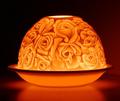
| 05/23/2003 12:29:10 PM | Limogeby BarbComment: *Critique Club*
Hi there. I think this is a very nice first submission.
There are a few things that I would like to have seen differently, however, I think that it is still a nice attempt.
The subject itself is beautiful. I love the flowered pattern on the glass. It does seem a bit tilted here. Sometimes things are purposely angled for some dramatic effect, but it is off only slightly here looking more like a mistake than dramatic effect.
The subject is directly centered in the frame of your photo, which isn't always a bad thing, but if you were to add some negative space somewhere, that also helps to add some dramatic effect. Maybe add in some more of the reflection, and some negative space to the top of the photo? I'd have to see it to say if I'd like it, but it's something to try anyway.
The focus does seem a bit soft to me as well. This is a very comment side effect from shooting low light shots. A very important thing to remember, is DON'T try this hand held. Something else that will help A LOT, is if your camera has a timer, set your camera down, on a solid surface, and use the timer. That way, you will have NO camera shake when it is time to take the shot. The slightest movement throws it all off.
I am thinking that the softness of the flowers is also because it looks like frosted glass. However, the saucer looking thing also does look a bit unfocused.
Something else to look into is the shutter speed. If you have a camera that allows for you to adjust the shutter speed, you could play with shutter speeds and see what kind of effects that makes. Sometimes has pretty neat effects on low light shots. Just be sure not to touch or move the camera when shooting.
Overall, I like the shot, but think it's maybe a bit plain. could benefit from some dramatic angle, or something.
~Heather~ | | Photographer found comment helpful. |
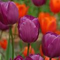
| 05/23/2003 11:54:50 AM | tulipby UberFishComment: *Critique Club*
This is a great example of Secondary colors. You have Green, Purple and Orange in the shot, and I think it looks marvelous.
There are only a couple nit picks that I have about this, and they are quite minor.
First. I can see that you have done a rotation correction on this, then cropped. You left a small piece of white in the upper left corner. I noticed this right away, due to the fact that these photos load from top to bottom.
Second, I would like to see this with the tuilps which are poking out from the bottom cropped off. They add nothing to the picture, and I think it would take nothing away from the picture to crop that small portion out. Even if it is cropping a bit of the tulip in the bottom right corner, I think I would still prefer that to seeing those little tops of the intruding tulips.
Focus is great in my opinion. I like the DOF. The background is blurred nicely, and not distracting at all to your main subject.
Lighting conditions appear to be a bit dull, however, with the waxy texture of tulips, had the lighting conditions been really bright and sunny, I fear that these would have suffered from glare. So probably the better choice to go with a little dark, than too bright. I do think though that maybe if you played with saturation levels, it could bring out the colors a bit? Something to try anyway.
It's a really nice shot.
~Heather~ | | Photographer found comment helpful. |
| 05/23/2003 11:44:44 AM | Green Water Dropby craigantComment: *Critique Club*
I like this. The setup is good. I like how you have put the drop in the upper left corner, and not dead center of the photo. It makes for a visually appealing shot that way.
The reflection of the drop is nice, and I think it adds to the shot. I am glad you were able to get the entire reflection in the crop.
What is bothering me here, is either the focus or the quality, or both. I can't tell if the focus is off, or if the quality is making the focus just LOOK off.
I see the white area, which my brain is telling me isn't really suposed to be totally white. This could have been some overexposure. I'm not really sure about that. However then it's all pixelated. See the jagged edges around the white glare on your drop?
The outline of the drop it's self doesn't seem very sharp either. Like I said, I can't figure out if this is just more of the quality issue, or if the drop is out of focus as well as having quality issues.
The color is great. I really like this shade of green. I like how the drops look like frog eyes among mucky water.
So I guess the only problem I really have here is the quality. Nice job.
~Heather~ | | Photographer found comment helpful. |
| 05/23/2003 11:30:23 AM | candled colorsby giseleComment: *Critique Club*
Unfortunately, I'm one of those party poopers on here that doesn't particularily care for the blurred shots where little to nothing is recognizable.
The comments you got are full of praise, but don't really explain why you only got a 4.3. Hopefully, I'll be able to help out some.
First thing that jumps out at me, are the colors. The challenge was for secondary colors, which are Purple, Green and Orange. You got some orange in your shot, and so it qualifies, however, the orange doesn't look like the main color in your shot. When I first see this, because of the angle, my eyes are lead from front to back. I see the red candle, then the blue candle, THEN I see the orange.
I also see the blue background. So the Orange isn't really the main focus in my opinion.
Speaking of focus, had not been for your title, I might still be trying to figure out what I'm looking at. I think that blurring, and long exposures work sometimes, when there is a reason. To create motion, or special effects. However, It looks very odd to see your candles producing "motion" all on their own. Why would they be needing any kind of motion effects? If you were trying to blend the colors, I don't think it worked too well. There is a very very small piece of purple, but I think it would need to be more noticable to be effective.
The angle is ok to get all the colors in the frame, but I do think that I would have put orange in the front. Make it the first thing we see.
Overall, just not my thing. I'm a huge fan of detail and this just doesn't have any.
I know people like praise, but I also know that people like to know why they got the score they did. This is only one person's opinion, but it may help to explain the 91 votes you recieved of 1's-4's. I probably would have given it a 3. Hope this helps.
~Heather~ |
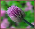
| 05/23/2003 02:07:29 AM | Nature's Colorsby TerryGeeComment: *Critique Club*
I see that there are some mixed feelings on the border, which is really the first thing that jumped out at me. I am one of the ones that don't like it much at all. While it does enhance it's purpose in the challenge, it kind of reminds me of my grandma's wordrobe back in the 80's. *shudder*
This looks like those little purple clovers we get in our yard, but I assume it looks much different after it's opened up all the way.
The background works very nicely here. I like how you have blurred it to the point that it contains no distracting elements, and stays out of the way of the subject. It really does let the flower be the center of attention.
I think that the focus on the flower is great. Wonderful detail, and the capture of the little water droplets creates supurb detail.
The lighting conditions look like the were working with you for this shot. Natural lighting is always my favorite, I think.
I think the angle is nice as well. I like how you have the stem going down into the bottom right corner, that is very pleasing to the eye.
The colors IN the photo are great. Ditch the orange though. :)
~Heather~ | | Photographer found comment helpful. |
| 05/23/2003 01:50:13 AM | Color for a young girl's hairby bjc0001Comment: *Critique Club*
You definately have your mixture of secondary colors here. The only one I am not really fond of is the little flourescent green one in the front. A secondary color is a mixture of equal ammounts of primary colors, and I don't think that the glowing green one qualifies. Even if it did, I don't think that it really goes smoothly with the rest of the colors you have here.
The lighting is a little harsh on a couple of the plastic pieces, and I think that you got a really great suggestion from dadas115 on how to deal with that. Not much I can add there.
My brain wants me to see that doily as being white, however, it has a flourescent green tint to it. Is it that color naturally? Or is something changing the color? I would definately like a white background for this. Color is great, but sometimes it IS possible for too much color.
It's a little busy, but I'm undecided on weather or not I like that aspect about this. This shot really screams children to me. And Children are anything but setup and organized.
Focus seems a bit soft, and this is probably due to the harsh lighting conditions. I especially notice that the purple hair band in the back/middle is blurrier than the surrounding pieces. I find this odd, but probably a texture thing.
I like how the subject fills the entire photo. I don't think that negative space would work in this situation.
~Heather~ | | Photographer found comment helpful. |
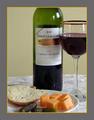
| 05/23/2003 12:18:36 AM | Wine and Cheeseby orussellComment: *Critique Club*
Here is what I think. I think that the crop is actually ok in my opinion. I dont mind at all that you have cropped off the neck of the bottle, nor the side of the cup. I have seen a lot of ads this way. It puts the focus on the brand of the bottle, rather than the 'prettiness' of the bottle.
I think that the tablecloth should be straightened up. there is a wrinkle in the back that kind of takes away from the smootheness of the bottle and glass.
The focus is a little soft, especially on the food items. I like the food items, and think they are an excellent addition for the challenge. Green pickles, and orange cheese. I do think though that the bread, like the tablecloth, takes away some of the smootheness because of the rough texture. The smoothe things, kind of clash with the rough things. Maybe throw in a smoothly cut piece of bread, or maybe some crackers instead.
The lighting works really well for me here. I like how there are a couple little reflections,that are not so big and bright that they are distracting.
I do not like the grey/cheese border though. lol. It's a little much for me. Not quite sure what color border would work. Probably just a thin plain black one.
Overall, it's a nice set up, with a few minor adjustments, I could see this on the front of a party invitation.
As for the color of the wine? I know my cool-aids better than my wines, so if you hadn't mentioned it, I'd never know. lol.
~Heather~ | | Photographer found comment helpful. |
| 05/22/2003 11:21:16 PM | orange wavesby GotchyaComment: *Critique Club*
This is a good macro. Never would have guessed what it was.
I like the colors. Definately fitst the challenge.
Focus and clarity are really good. You show us some really good detail in each little section of the blinker light.
I like the sun coming in from the top. It sparkles enough to be noticed, but not too much to make it distracting.
The little circle though, is a bit distracting. Is that the little mark from where they put in the little screw?
I like the different shades of orange. I think that is what appeals to me most in this shot. I'm not usually a huge fan of abstract, however, I think that I like this. It's clear, and you can tell that it IS actually something. A lot of abstracts you look at and are like "what the??" ANd you can't even recognize it as reality.
This is quite clear, althought it's not clear what it is at first. I like the angle and how you have these at a diagonal and not just straight across the photo.
So the only thing I'd really like to see differently is that little circle removed. Good find. ~Heather~ | | Photographer found comment helpful. |
| 05/22/2003 10:35:21 PM | The Hardest Timesby DavidLevinComment: *Critique Club*
Well David, Like others, I guess I am confused as to how this fits into the Secondary colors challenge. I think that it has the feeling of sadness, which is represented by the color blue, which maybe fits into the primary colors challenge, but secondary, I just don't see.
As for the photo itself. I think that it's a great shot. An excellent black and white.
The shot seems to be leaning to the left a bit, however, the door seems straight, so it just looks odd to me.
The tones are good, nice white whites, and nice black blacks. Focus and clarity are excellent. Good texture on the bricks and bush, and the details in the shirt are really good as well.
It's an excellent shot, just not for this challenge.
~Heather~ | | Photographer found comment helpful. |
|
Showing 1181 - 1190 of ~2785 |
Home -
Challenges -
Community -
League -
Photos -
Cameras -
Lenses -
Learn -
Help -
Terms of Use -
Privacy -
Top ^
DPChallenge, and website content and design, Copyright © 2001-2026 Challenging Technologies, LLC.
All digital photo copyrights belong to the photographers and may not be used without permission.
Current Server Time: 07/24/2026 12:44:57 PM EDT.
|