|
|
|
Showing 1171 - 1180 of ~2785 |
| Image |
Comment |
| 05/26/2003 01:54:18 AM | Come Togetherby friscaComment: *Critique Club*
You recieved some really interesting comments for this.
First off, the right hand (our left) looks orange to me, not red. So I think their moniter must be off. I am mentioning this, just so you know it's not YOUR moniter that's off. lol
The color is definately good. I think that both the orange and blue stand out very nicely. The background helps with this. Although the blue is dark, and the background is dark, I think that the shinyness of the blue hand is what helps it to stand out and not blend in too much with the background. There is nothing distracting in the background, however, there is a small light colored speck to the left of the crease in the wrist of the right hand (our left). If I adjust the brightness up, I can see it better than when it's darker.
I do like the angle and framing/cropping. I like that it's off center, and I think that makes it a little more dramatic and visually interesting. MY opinion though is that I wish that the hands were more symetrical. Some like symetry, some don't. I saw one comment saying they were glad they weren't symetrical. It's just a personal preference thing. I think that I'd like to see it with the orange hand being straight down like the blue hand.
I think it's the simplicity of the shot that I like, and having the hands the same would simplify it even more, to my liking.
Focus and clarity are good as well. I like that we can see the creases in the knuckles and texture of the hands. Great detail.
A really nice shot. Very deserving of the great score. Congrats!
~Heather~ |  Photographer found comment helpful. Photographer found comment helpful. |
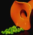
| 05/25/2003 02:11:29 PM | Secondary Colorsby ploogieaComment: *Critique Club*
I like the colors, but think that the Skittles are a little tacky. The round dish is elegant looking and the skittles are kind of kiddy looking.
I do like the lighting. There are no glares or distracting shadows anywhere, which is good considering you were photographing some shiny objects. I wonder though, if maybe there could be a little more light on the skittles. They seem darker than the object.
It looks really nice with the background as well. Bright objects on dark background. Nothing distracting there at all.
There is a dark blob in the middle of the skittles, which I don't find adds anything at all to the shot. I'm not sure what it is, or why it's there. As is, I find it a bit of a distraction.
I like the angle you chose to shoot this at, and the framing you also chose. I like how the flowing top of the orange object is in the right of the photo.
Overall, I really like it. I only think it would look better with maybe some green jems rather than skittles.
~Heather~ | | Photographer found comment helpful. |
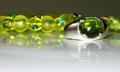
| 05/25/2003 01:44:54 PM | Jewelsby GalyNetComment: *Critique Club*
There is quite a bit of noise (speckles) in the background. I think that makes the photo less smoothe than it could be, which takes away from the smoothe jems.
I disagree with having less forground. I like the reflection of the ring, and would not like to see that cropped out.
The focus and clarity are really good, and I like the detail we can see in the ring, and even the scratches in the table.
Lighting appears to be ok, but maybe need a little more in the background? I'm not really sure exactly what causes noise, but see it usually in areas that aren't quite lit right.
I also think that a different background color would work, as there really aren't many secondary colors in the shot. While there are a few traces of green, I don't think that the photo is ABOUT the color.
I like the setup, the angle of the ring is good, and the framing/cropping is good as well. I like the crop at the top, because if you added more room at the top, you would have your subject right dead center of the photo, and I think that wouldn't look quite right.
I like how you have the main green jewel in the front and the little jewels in the background for support.
~Heather~ | | Photographer found comment helpful. |
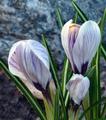
| 05/23/2003 05:35:40 PM | Crocus....Secondary Colors Challengeby djmskiComment: *Critique Club*
This is quite a nice shot. I really like the colors used. Definately fits the challenge.
I see you're from Northern MI, I'm from Kalamazoo, so we're neighbors. :)
What I really like about your shot is the way it stands out from the background. I think that is important to be able to get as much detail out of the subject as possible. I also like the colors, I think they are quite strong, and you have been able to include all 3 secondary colors in the shot.
The focus seems a bit soft, and the background does appear to have a bit of noise. I think it is even more obvious because it colides with the texture of the background, and creates a noisy environment back there. However, The subject still stands out nicely.
The lighting appears to be on your side for this as well. I like how There are little patches of sun hitting the petals on the left sides of the flowers. I would not want the sun to be any brighter, however, because it's almost washing out the detail on the right most flower. Not quite, but almost.
The angle and framing/cropping is excellent. I like how you have the flowers placed in the frame, and the leaves are just kind of surrounding them.
Not really a lot that I would like to see differently here. You have good DOF, and other than the noise in the background, I think that this is excellent. Great shot.
~Heather~
PS, normally, you would have recieved more comments on your shots, but I think people were overwhelmed with flowers in the last 3 color challenges. Keep working and glad to have you posting! | | Photographer found comment helpful. |
| 05/23/2003 04:11:47 PM | Purple Syrup for Purple Diseaseby bosniakComment: *Critique Club*
Wow. What can I say? I wasn't able to vote on this challenge, but had I gotten the chance, this would have been a 9.5.
The only thing I can see that might make this a little more appealing in my opinion would be to find a way to reduce the shadow under the spoon.
Otherwise, I'm afraid I don't have much to offer as to improvements for this shot. I like it all.
I especially like the syrup that has spilled out of the spoon. Because you cannot really clearly see the color of the syrup IN the spoon, I believe that is an important part of why this shot did so well.
The color is excellent, definately goes with the purpose of this challenge.
I really like the angle and framing/cropping you chose for this as well. I like how we can see right down into the spoon, and we have a very clear view.
There are no distracting elements in the background. You have chosen a nice, plain background to display your subject against.
Your focus and clarity are also supurb. So good that we can see the texture in the spoon.
A very great job. What a fun photo. ~Heather~ | | Photographer found comment helpful. |
| 05/23/2003 03:54:38 PM | Tupperware Orangeby cathysappComment: *Critique Club*
Good one.
I like the depth in this. While it isn't hugely deep, what depth it does have is really strong. The lines are really nice and defined.
Most of them anyway. I see that the lines which go off into the upper right, and lower left, are not repeated in the upper left and lower right. See what I mean? Those 2 corners kind of just blend in and don't have the lines that create the detph in the rest of the shot.
I do like where you have positioned the center circle of the tupperware. It's off center enough to be 'dramatic' and not look like an error, yet in the frame enough to still show the upper right portion of the object.
Focus and clarity are good. The logo is easily recognisable and easily readable.
The color is excellent and difinately fits into the challenge. It is a nice, brightly colored orange, with a nice pattern to it.
I really can't see anything that I would like to see differenly other than maybe some extra detail in the U/L and L/R corners.
What a fun shot.
~Heather~ |
| 05/23/2003 03:12:55 PM | lillyby jbruno1397Comment: *Critique Club*
I would have to agree that your greens don't really look green. Also, despite what was mentioned, Pink is not a secondary color. It's technically considered a "tint". A secondary color consists of a mixture of equal amounts of 2 primary colors. A tint (pink for example) is created by mixing white or black to a color. White and Red are mixed to get pink.
Anyway, I do see what looks to be a small section of orange in the middle of the pink, so that counts. :)
I don't think though, that the orange is enough to screem "This is a photo of secondary colors". And the green isn't really showing through.
I agree with the comment that this is a bit too centered. I wonder how this would look if the flowers were down in the bottom left corner, and there were some of the lake in the upper right. This could create a dramatic angle, and make it a bit more visually appealing.
Focus and clarity look to be good, but I think that the lighting makes it a bit difficult to tell exactly. The detail in the shot is definately muted some by the bright lighting.
I do think it's a pretty shot. It's a really nice scene. Nice flowers, nice reflection, but maybe just not right for the challenge.
~Heather~ |
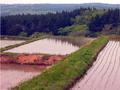
| 05/23/2003 02:56:39 PM | shades & shadows of May greenby kenboComment: *Critique Club*
Hi there. While this does include some secondary colors, the only part that really appeals to me much is the reflection of the trees in the water of the field that is entirely in the photo.
The sky in the background is not very appealing, nor is the hazy fog over the farthest mountains. I think that I would prefer this if that part were cropped out, at least to the bottom of the white sky, that way we can still see the trees that are reflecting.
The focus and clarity appear to be just fine. I do like the lines of plant in each field. I think that those lines of plants look really good with the reflection of the trees.
The entire photo looks like it has a bit of a pink tint to it. Keep in mind that I've never seen these in person, but the pinkness doesn't look natural. I think this can be caused by a white ballance issue, and can usually be corrected with with post processing hue and saturation adjustments.
It's a nice scene, and with a few minor adjustments, I think it could be a nice photo too. ~Heather~ |
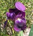
| 05/23/2003 02:43:02 PM | Power Flowerby hughletherenComment: *Critique Club*
I do think that the background is the biggest issue here for me. It really clashes with the flower. See how the flower is graceful and smoothe? The background is sharp and choppy. It also doesn't work well with the pattern in the petals of the Iris.
The color of the flower is good, I like the color a lot. However, again, I think that it is hindered by the kind of dead looking, harshly lit background.
The angle and framing/cropping of the flower is ok, but I think I would have tried my best to get that leaf in the bottom right corner out of the shot. Because of DOF (which is otherwise good) that leaf is blurry, and a stands out a lot creating a bit of a distraction.
The DOF is ok. Blurring of the background is a good thing, especially in situations where the background really doesn't work out well. However, I wonder if it maybe could have been blurred even more? That could have helped.
Focus and clarity of the Iris is really good. I like the detail we can see in the veins of the petals, and the fuzzy center poking out at us is a nice touch as well.
I love these flowers. We have a bunch here at my house too, but they aren't close to blooming yet.
~Heather~ | | Photographer found comment helpful. |
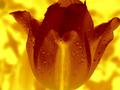
| 05/23/2003 01:58:33 PM | Flaming Tulipby OneSweetSinComment: *Critique Club*
You again? LOL Just kidding.
This is a nice shot. I'm not real fond of the background, however, I think that the colors go well with the flower.
I think you might have gotten a bit too close. The crop is touching the flower on 3 sides, but no on the left. I think that either making the crop touch the left side as well, or creating a bit of space on all the sides would be better. Just to keep it uniform.
The focus and clarity appears to be good. I like the little droplets. They do make for a nice visually appealing touch.
Definately Orange, and that makes it fit the challenge perfectly. I really do like the mixture of colors, but something about the background doesn't appeal to me other than the colors.
I also notice a strange yellow line that goes all the way around your flower, even through the orange blotches in the background. Was this created by the effect used? Seems strange, and upon looking at it, find it to be a bit of a distraction.
This appears to have good lighting. No really hot spots or distracting shadows or anything. Otherwise it's definately different, and it has a nice ring to it.
~Heather~
P.S. I just realized that I've tried something very similar a long time ago. Check it out, you'll get a good laugh. //www.photosig.com/go/photos/view?id=344326 |
|
Showing 1171 - 1180 of ~2785 |
Home -
Challenges -
Community -
League -
Photos -
Cameras -
Lenses -
Learn -
Help -
Terms of Use -
Privacy -
Top ^
DPChallenge, and website content and design, Copyright © 2001-2026 Challenging Technologies, LLC.
All digital photo copyrights belong to the photographers and may not be used without permission.
Current Server Time: 07/24/2026 10:20:47 AM EDT.
|