|
|
|
Showing 1161 - 1170 of ~2785 |
| Image |
Comment |
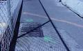
| 05/26/2003 11:01:27 PM | Concrete Guidanceby eloiseComment: *Critique Club*
I cannot say that this is the most interesting subject i've ever seen. this really doesn't interest me much at all.
The focus seems to be on the fence, and not really on the ground, where your colors are. The colors aren't really a huge part of the shot. The orange almost isn't orange, and the green is very small, and kind of concealed by the shadow of the fence.
I think that maybe a different time of day, where the shadow wasn't so strong over the subject would have been a better choice.
Also, the photo seems to have a purple/bluish tint to it. I realize that it doesn't really HAVE much color. Everything else seems grey, but even the grey seems to be a bit blueish.
The angle and framing/cropping is ok because you were able to keep most 'distracting' elements out of the shot. Had you chosen a lower angle on the subject, you probably would have gotten 'crud' in the background that would distract from the markings on the pavement.
~Heather~ |  Photographer found comment helpful. Photographer found comment helpful. |
| 05/26/2003 10:48:06 PM | Fiery Nightby MarjoComment: *Critique Club*
Very nice colors. Definately fits the challenge. The lighting is really good.
However, I think that the lighting is the main cause of the biggest problem with the photo that I see, which is focus. It is soft focus on the horse, and blotchy in the shadowy areas.
To help out with the focus issue, you should not try low light photos hand held. Always put the camera down on something, or use a tripod. Another suggestion would be to (if available) use the timer or remote. This will prevent camera shake because then you don't have to push the button and rish moving the camera.
The angle and framing/cropping are nice. I like how you have focused on just a small part of the horse, and not the entire horse. I think that by doing it this way, you have also increased the effectiveness of the color, which is very important in this particular challenge.
The background is good, no distracting elements in the background, however, it is blotchy, from what I believe is the low lighting.
I really like the shot, and I think that it would have done a LOT better with sharper focus.
~Heather~ | | Photographer found comment helpful. |
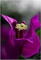
| 05/26/2003 08:49:29 PM | Bunga Kertasby tkonxComment: *Critique Club*
This is a really nice looking flower, and I think you did a great job of capturing it's beauty.
The color is really great. I think that the lighting was a factor in helping to bring out the color. The lighting conditions look to have been working with you this day, however, I do think that maybe a bit of added lighting in the lower portion of the shot would help even more to bring out MORE color.
Some people just LOOK for things to complain about. And I'm one of them. *wink* The water does not bother me. I think it creates some really visually appealing effects in the very center. What does seem strange to me though, is that there is kind of a row of a few white dots in the background, right between the petal on the right, and the center yellow part. Not sure what that is, but when noticed, I find it to be a bit of a distraction.
One more thing is the crop. You have a really tight crop on the petal to the right, however you give the petal on the left a bit more room to breathe. I wonder if you could give the right side just a slice more space between the edge and the petal.
The background is great. You have blurred it very nicely, and I think that with the exception of those 3 freaky dots, that the background works nicely to help the color really pop out.
Focus is excellent. Great DOF. You show us some really great detail in the flower.
A very nice shot, of a very pretty flower. Good job.
~Heather~ | | Photographer found comment helpful. |
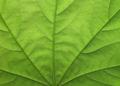
| 05/26/2003 12:07:32 PM | Green Maple Leafby WILDBLUEComment: *Critique Club*
Wow. What great detail you show us in this photo. The focus and clarity are supurb.
I think that the lighting really helps to accnet the detail in the veins the 'fan' part in the middle.
The color is excellent. I think it fits into this challenge very nicely. The lighting also helps bring out the color in the shot.
The angle and framing/cropping are great. I like very much how this fills the entire frame of the photo, and how you have the 'fan' part coming out from the very bottom. This creates great visual appeal.
I wish there were more I could say, however, there really isn't much I can add in the way of improvements. The shot seems quite flawless to me.
This would definately be a 10.
Great job, and Congrats! ~Heather~ | | Photographer found comment helpful. |
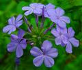
| 05/26/2003 11:17:05 AM | The color purpleby MusicmanComment: *Critique Club*
Wow, does this really jump right out of the screen!
The angle and framing/cropping on this is just perfect. I think that having the subject centered here really works for this shot. Some kind of side angle just wouldn't produce this kind of depth.
Focus and clarity are really good as well. We can see all kinds of detail in flowers, especially in the very center, where the fuzzy little things are.
The lighting looks great to me as well. As does the DOF. You have blurred the background nicely, and I find no distracting elements there. The purple on green really looks great.
Definately fits the challenge, and the colors stand out very nicely.
I don't really think there is anything I'd like to see differently here. I can't really make any suggestions on improvement. Just a really great shot.
~Heather~ |
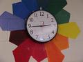
| 05/26/2003 11:00:03 AM | All Colorsby ChuckieComment: *Critique Club*
The challenge was for secondary colors. While there are secondary colors in the photo, I don't think that they are the main subject. There are also many OTHER colors in the photo, and I think that they drowned out the purpose of the challenge.
Setting that aside, about the image itself...
It does seem that the lighting wasn't the best for the shot. There is glare on the clock, and not enough light on the colors. They seem dark. I bet that some brightness and saturation adjustments could help bring out the colors a bit more, just be careful not to brighten the glare on the clock as well.
Focus is ok, but maybe a touch soft. The little 'minute' lines dissapear in places. I'd like to see that a bit more uniform.
I think that the subject might be a little too centered. There is a slight tilt to the clock, however, not enough to make a dramatic visual effect. As is, it looks like an accident. I also wonder if you cropped the top and bottom the same, if that might help to balance this out some.
I think it's an interesting subject, with the colors around it like that, just maybe not specific enough to be effective in the secondary colors challenge.
~Heather~
You guys still going to be able to submit during the summer? |
| 05/26/2003 03:04:07 AM | Tears of Innocenseby ska120sComment: *Critique Club*
I like the look on the girls face, and the angle at which that face has been taken at. Nice dramatic visual effect there.
However, there is a lot in this image that I would like to see differently/improved upon.
First and most importantly in my opinion is the quality of the image. I'm not really sure why it looks so blotchy and pixeled (in the darker areas). Probably due to low lighting. Flash isn't always the best source of lighting, so even if you have flash available, I would try to use some kind of overhead lamp or light.
Extra lighting also does help increase sharpness and get your shot better focus. This shot lacks in sharpness, and I think that is important also. The eye is the main focus, and I think that had it been sharper, it would have a higher visual impact on the viewer.
I'm not really seeing the colors here either. The darkness COULD be purple and the skin COULD be orange, but that's stretching it A LOT. The color is definately not the main focus of the shot, and I think that for the challenge, it should be.
Because the person to the left of the photo is not adding anything TO the photo, it's probably best to crop that person out of the photo. I find the small piece that we can see to be a bit of a distraction.
I don't really know much about your camera or it's limitations, but if it's a lower end camera, I wrote a tutorial that could help you out some. It's posted in the "Learn" section at the top under "Tutorials". It's titled "Cheap enhancements for low end digital cameras".
Keep shooting!!
~Heather~ |
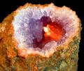
| 05/26/2003 02:48:56 AM | Secondary Stoneby adineComment: *Critique Club*
Nice colors! Definately fits the challenge, and I like this because it's naturally occuring.
The black background is great. Nothing distracting there. The angle and framing/cropping is good. I wonder if you could have had this at more of an angle, but probably not. Then you wouldn't be able to see down into the rock, where it's important. Just talking outloud here. lol
No freaky blue grass this time I see. *wink*
Seriously though, I think that the focus is a bit soft, but I'm also thinking that this could simply be because of the textures of the rock. The hardest thing for me to photograph is textures and they always come out looking soft no matter what I do. I'm not really sure how to fix it either. Maybe a side light would give it some depth on the top, create a bit of shadow, and increase the "height" of the inner texture? Then again, It might hinder the lighting that makes the inside so great. *again, just talking outloud*
I tried this with a tighter crop, and I think I like it that way. Up close and personal. Probably even be able to cut off most of the black background. Both ways look good. Maybe for the challenge though, a tighter crop would bring our eyes directly to the innermost part, where the 'important' colors are.
Love the lighting to bring out the orange. I think that's the best part in my opinion. You did a great job making that stand out.
~Heather~ | | Photographer found comment helpful. |
| 05/26/2003 02:35:57 AM | Mardi Grasby BitzComment: *Critique Club*
I really like this. This is a really great nicely set up shot. The feel is fun, neat, and lively.
I think that if I HAD to chose something that could use work, it would be that I wish that some of the purple feathers didn't seem so dark. There was the suggestion of some extra lighting on them, which could work.
I think that a darker background is a bad idea, because the feathers on top are already dark, and the dark background would make this blend in too well, and make it a mushy mess. lol
The focus and clarity are good. I like the detail in the mask, and the sequins and ribbon are nice and crisp. Detail is simply great.
I like the angle and framing/cropping as well. The centered subject here is alright due to the angle of the mask. This creates the dramatic angle that I believe keeps it from being "too centered". Had the mask been straight, I think that would be boring and too centered, however, just that slight tilt was enough to make a world of difference.
Lighting is perfect. I like the little flecks of light on the ribbon and forhead ornament, and I like the shadows created by the mask, and ribbon.
Put this all together, and you have a really excellent image. And you do! I could see this on the front of a birthday card, or party invitation. As is, no changes. It's great.
Congrats on a job WELL done.
~Heather~ | | Photographer found comment helpful. |
| 05/26/2003 02:15:56 AM | What I Seeby arnitComment: *Critique Club*
Strange that I got "Purple" also as a CC assignment.
I think I had suggested cropping the face in that shot, but I think in this one I'd like to see MORE of the face actually. Right in the middle of her head seems like a strange place for a crop. Especially when showing so much of the shoulders. While her shoulders may be pretty, I don't think they really need to be in this photo to work with the challenge. The white actually takes up more space than the green, which is suposed to be the main thing for the challenge. So, I think for this shot, I would show more head, less shoulders.
Focus and clarity are again really good. We can see the little creases in her lips. Great detail you show us here.
The lighting is good as well. No distracting hot spots or annoying shadows.
Again, I like how you have positioned her to the right of the photo, however, I think that I'd like the negative space to be more green for the purpose of the challenge. Outside the challenge, I think the background works very well.
I think that there is a great deal of white between the red and green, and I think that makes it seem like the shot isn't quite focused on the colors. Maybe making the green area of the background larger, and creating less skin would help to put the visual focus on the color and not nessisarily just the girl.
As for your poem, I'm not really sure I get it. But this line "Believe in me though u cannot c what lies within the Dark " Kind of makes me think that you were trying to make us look really hard for the green, which is partially hidden in the darkness. Maybe even TOO hidden.
~Heather~
|
|
Showing 1161 - 1170 of ~2785 |
Home -
Challenges -
Community -
League -
Photos -
Cameras -
Lenses -
Learn -
Help -
Terms of Use -
Privacy -
Top ^
DPChallenge, and website content and design, Copyright © 2001-2026 Challenging Technologies, LLC.
All digital photo copyrights belong to the photographers and may not be used without permission.
Current Server Time: 07/24/2026 09:14:37 AM EDT.
|