|
|
|
Showing 1141 - 1150 of ~2785 |
| Image |
Comment |
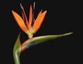
| 05/28/2003 12:02:23 AM | Bird of Paradiseby GalinaComment: *Critique Club*
Oh wow. I dont think I've ever seen one of these before. I've definately heard of them, but I guess I've just never came across one. Very pretty.
Definately fits the challenge well. Got all 3 colors in one shot. The colors stand out really nicely on the black background as well. Nothing distracting in the background. Nice and simple.
The angle and framing/cropping are good. I like how this sneaks in from the top, and leads your eyes all the way to the point on the end.
My only suggestion would be to have the entire photo in focus. most of it is already in focus, which leaves the small tiny part that is out of focus to be a bit of a distraction. I'd like to see that tip nice and sharp.
Lighting is good. Brings out the colors nicely. Good focus on the part that is in focus. You show us some really nice detail here, and I like that very much.
~Heather~ |  Photographer found comment helpful. Photographer found comment helpful. |
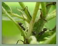
| 05/27/2003 11:57:51 PM | In the Jungleby micrixComment: *Critique Club*
Ew. Creepy.
The thing that stands out to me here that could use fixing/improvement is the blurry object in the middle at the bottom of the shot. I find that because it is a brighter color than the rest, and quite blurry due to DOF, that it jumps right out of the photo and is the first thing I'm noticing here.
You have really nice DOF to get the ants in focus and the plant blurred slightly. I like the detail that we see in the ants. Really nice macro shot.
The lighting appears to have been very good as well. Natural lighting, which it looks like, isnt always reliable, and I think you took advantage of a good situation here.
The shot is green, and qualifies for the challenge, but I do think that the MAIN subject isn't the color, but the ants. Still a really good shot though.
I like the angle and framing/cropping as well. I think that anything farther away would take away the good detail which is appealing the most to me here.
~Heather~ | | Photographer found comment helpful. |
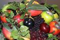
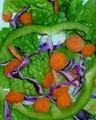
| 05/27/2003 11:53:14 PM | Fruit Bowlby jpb56nyComment: *Critique Club*
This seems way too busy and cluttered for my personal taste. I'd like to see this with about 1/2 the stuff. Maybe just use some of the grapes, the orange fruits, and a few leaves from the raspberry plants.
The focus doesn't really seem to be consistant. The leaves seem ok, but the fruit itself seems a bit soft. Could be a result of lighting issues.
This does appear to be just flash. Not usually the lighting of choice. You could have taken this outside maybe. Or into a well lit area and seen the difference. It would create some depth, and probably reduce a lot of the selective glare on various fruits.
The angle and framing/cropping is ok. Had there been less elements in the photo, it would have worked better, however, I do like how you fill the entire frame of the photo with the subject. Still possible even with fewer elements.
The colors are ok. a few colors you don't really need in there, which does distract a bit from the colors you are trying to highlight. Fewer elements would help this also.
~Heather~ |
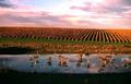
| 05/27/2003 11:46:58 PM | Orange Autumn Leavesby Girl from OZComment: *Critique Club*
Im not real fond of the water and reflections in the forground. I do like the rows of vines in the background however. I think that if you foucussed on just that, the composition would have worked a lot better in my opinion.
I also think that if you leveled the horizon it would have a higher visual impact for me as well. It's tilted strangely to the right, and just a few notches to the left would work a lot better.
Focus and clarity seem ok to me. There really isn't a lot of detail in the rows of vines, but I don't really think that it needs a lot of detail. Overall, the effect of just the lines really works nicely without needing to see anything further.
The lighting is really good. Conditions seem to have been on your side for the challenge.
Colors are really good too. The orange and green fit for the challenge nicely.
~Heather~ | | Photographer found comment helpful. |
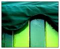
| 05/27/2003 11:38:49 PM | ice cream hutby deceptiveComment: *Critique Club*
This is a very nice shot. When it was loading (top to bottom) what I saw first was a turquoise color, but when it loaded all the way, it's definately green.
What I like most about this shot is curved lines on top of the vertical lines. I think that is very nice. I like the way that the straight lines meet the curved ones. That is very visually appealing to me.
Focus and clarity are really good. You have captured the detail in the top of the hut and the texture in the wood as well.
At first glance, I thought that the lighting might be a little harsh, creating some reflection on the glossy wood, however, that doesn't really appear to be the case. It's shiny, but not distracting at all.
I like the angle and framing/cropping you chose as well. The way that the vertival lines are nice and vertical, and the way that the curved wave goes across the photo works very nicely. I like how the subject fills the entire frame of the photo.
I really wish I could offer more in the way of improvement, however, I don't think this really needs any improvement. I like it just as it is. Not very often I get to say that. Congrats.
~Heather~ | | Photographer found comment helpful. |
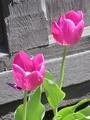
| 05/27/2003 09:00:26 PM | Twolipsby mephotoComment: *Critique Club*
Secondary colors are creted by mixing equal amounts 2 primary colors. A tint is created by mixing white or black to a color. Pink is created by mixing red and white, therfor pink would be a TINT and not a secondary color.
You actually DO have a small bit of purple in the photo however, to the left of the left tulip. The green also qualifies as a secondary color. However, neither the small bit of purple, nor the green stand out as a main subject. I would say that this photo doesn't work well for the purpose of the challenge.
Setting that aside, I'll talk about the photo itself.
The lighting appears to be a bit bright on the flowers. See the center of the tuilp on the left? No detail what so ever there. The brightness washes it all out.
The flowers stand out nicely on the background. Looks like you did some desaturation there, and I think that it works very well. No distracting elements in the backgruond.
However, because the focus is nice and crisp on the background, it makes the softness of the flowers really stand out. I think I would prefer the opposite, with the flowers in sharp focus and the background blurred slightly.
Pretty colors. Just not for the challenge.
~Heather~ |
| 05/27/2003 08:42:48 PM | Where the dressing?by ladpupmoeComment: *Critique Club*
You really like the food shots, don't you?
This one looks really good to me, minus the peppers. lol
The focus seems a little soft in some places, but I'm thinking that maybe it's because of the lighting, or maybe the texture that makes the shot looks soft. We still get really good detail out of it though.
The setup doesn't look natural to me. The way the peppers fall into the shot, looks really 'arranged'. Not like the ones in the resteraunt don't, but maybe I'd like to see this in a bowl or something. It looks like it was thrown on a table. Maybe if we couldn't see the white border, or if we could see the edge of a bowl or something. That might add a bit of visual appeal.
The colors are definately Secondary. Great way of meeting the challenge.
I tried this with a crop 1/2 way through the upper pepper and it works pretty nicely. Still allows for all the colors, but also takes away the "set up" look of having the peppers right there. There really isn't much going on in that upper portion of the photo, so I don't think you'd be losing anything with a crop like that.
Doesn't make me scream with excitement, however, it's not a bad shot at all. I'm going to go eat now. lol
~Heather~ |
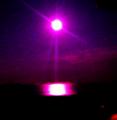
| 05/27/2003 08:11:45 PM | moonlightby kate_rioComment: *Critique Club*
This photo really lacks in quality. You said that you had to resize it with great difficulty. Sometimes the sacrifice is too great. I learned the hard way too in the candid challenge. :)
I can see that we are looking at the moon, but is that then also the reflection of the moon as well? What is the red at the bottom?
There is definately some purple in there among the pink glow, but it is really pixeled and blotchy.
I think that the darkness was the killing factor. I'm not familiar with your camera, but I know that dark photos are beyond the limitations of some cameras, creating shots that look like this.
A few 'low light' suggestions are to not try to take the shot hand held. Also if the camera has a timer setting, use the timer as well, so you don't have to touch the camera to click the button. That will reduce the ammount of camera shake created by you.
This really isn't my style, and I realize that it may have held some interest before the resizing accident *wink* but as is, it really lacks anything to hold my attention at all.
Keep at it. I've seen your other shots, and you're right. this is definately not your best.
~Heather~ |
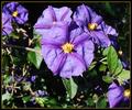
| 05/27/2003 07:56:37 PM | Deadly Nightshadeby IsaacComment: *Critique Club*
The color is very nice, but I'm wondering if you could have gotten a different lighting and still gotten the good color.
The lighting, which I'm assuming is natural lighting is greating some harsh shadows in the background, and on the leaves.
The agle and framing/cropping are ok. I would mention though that maybe it's a little unballanced by the flowers being at the top, and one in the bottom right, but lots of blank in the bottom left.
I might have cropped this to just below the bigger main flower.
Focus and clarity are really pretty good. There is some blurr in the background to help the main subject stand out a bit better, and there is really good detail in the flowers themselves.
I'm not really sure if I like the orange in the border or not. it doesn't look really BAD, but not quite sure that it really does much to help either.
Keep clicking!
~Heather~ |
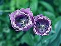
| 05/27/2003 07:09:47 PM | Twins in Purpleby PHOTOCHlXComment: *Critique Club*
This image looks oversharpened to me. I think that the white areas look unnatural, and there is a strange area around the edge of the tulips. I've never seen these kind of tuilps before. Interesting.
The angle and framing/cropping is not my preference here. The subject is too centered in my opinion and needs some dramatic angle or placement to make it appeal to me in that area.
Focus and clartiy seem hindered by what I'm thinking is oversharpening, however, I think that the DOF is very effective.
The way you have blurred the background to 'get it out of the way' is very nice. Not distracting in any way. Lets the subject really stand out of the photo to be noticed.
The colors are nice. The purple flowers on the green background fit the challenge nicely.
~Heather~ |
|
Showing 1141 - 1150 of ~2785 |
Home -
Challenges -
Community -
League -
Photos -
Cameras -
Lenses -
Learn -
Help -
Terms of Use -
Privacy -
Top ^
DPChallenge, and website content and design, Copyright © 2001-2026 Challenging Technologies, LLC.
All digital photo copyrights belong to the photographers and may not be used without permission.
Current Server Time: 07/24/2026 09:31:03 PM EDT.
|