|
|
|
Showing 1131 - 1140 of ~2785 |
| Image |
Comment |
| 05/29/2003 02:44:43 PM | sweet & sourby Pep VentosaComment: *Critique Club*
You got a lot of great comments on this one. This almost looks like one of those old victorian paintings of fruit on a table. I think it's the red cloth that imprints that image in my head.
Those are all about shading and color, so that kind of image, I think that the red cloth works very well to create that kind of feeling.
However, I don't think I prefer it. I think that since we're talking about color, I think that the color in the shot should stand out nicely, and it's a bit dark here. Even though the cloth itself fits in with the colors you were working with, it is too dark to scream 'look at me'.
The first thing that popped into my head when I saw this was "why in the world is the green apple upside down". I realize that you were probably trying for some variation, to make the shot something other than '2 apples sitting on a cloth'. But I'm not sure that turning it upside down really helps at all. It confuses me, and even thought it's 'different', I don't think it works for me.
Focus and clarity seem to be good. I like the detail that we get in the apples. The little specks and even the blemishes are nice. Nice and clear.
I like the setup of the red apple in front, and the green apple in the rear at an angle. This does make for a nice composition in my opinion. I like the red apple laying down, but think that maybe the green apple should be stem up.
Overall it's nice, but the background doesn't work for the purpose of the challenge, not quite sure what color would have worked though. maybe a cream color?
~Heather~ |  Photographer found comment helpful. Photographer found comment helpful. |
| 05/29/2003 12:28:41 AM | Red & Green Peppersby WILDBLUEComment: *Critique Club*
Hi again.
There are two things in this image that are just screaming out at me. First, I think this would be much more effective with a stem on the red pepper as well as the green one. I think that it would balance it off a bit, and it would also define the red blob in the back as a pepper.
Second, the water droplets are not adding anything to this shot, and I actually find them a bit of a distraction. Sometimes waterdroplets are effective in creating a nice visual effect, and sometimes they look like a sad attempt to try to make an average object look exciting. In this case, I don't think it creates a nice visual effect.
Also, the red pepper does look like it's a softer focus than the green pepper. I think that both peppers should be of equal sharpness.
The angle and framing/cropping is ok. I do like this horizontal cropped shot. I think it's different, and therefor interesting.
The black background works very nicely in helping the color come out. Nothing distracting in the background at all.
The lighting is ok, but maybe needs a little extra on the back side of the green pepper. Either that, or you could go for a really dramatic lighting, and put the light on the front, and NO light on the back, so the pepper kind of dissapears into the darkness.
I like the shot. It has a good feel to it, and with a few minor adjustments, I think it would be really really great. Definately has that feel.
~Heather~ | | Photographer found comment helpful. |
| 05/28/2003 11:48:31 PM | Trappedby OneSweetSinComment: *Critique Club*
Hi again. :)
This auto thingy seems to be assigning me the same photographers each time. lol I don't mind, I'm getting used to particular styles, and I feel like i know some people's children. :)
Anyway, I wish that the focus on this were just a bit better. It's not bad at all. You actually have to study the pic to 'find' anything wrong with the focus, but it does seem that the right side of the photo is a little sharper than the left side. See the thread areas in the ball? We get much greater detail out of the right side, than the left.
The lighting is ok. Somethings about the lighting I like, and somethings I wish were a bit brighter. For example, I think that it's great how you have reduced reflection on the ball, this could have been much much worse, and you controled that nicely. But, the shoe seems a bit strange. Someone mentioned it looked "flat" but I'm not really sure how to describe it. It's not 'dark' but it's not really well lit either. Maybe flat is a good word?
The angle and framing/cropping are alright. I like the angle on the ball, and how the foot comes out of the top of the frame. I do wish though that the bit of skin wasn't in the background. That seems to be a bit of a distraction.
Overall a nice shot. Is this your son playing soccer?
~Heather~ | | Photographer found comment helpful. |
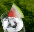
| 05/28/2003 09:23:53 PM | ATwist on a Twistby BJComment: *Critique Club*
This is really refreshing looking. Someone will slap me for saying this, but I'm so glad you didn't put little water droplets all over this. It amazes me that every other photo you see now has water droplets all over it. Sometimes it works, I guess. But other times it looks like a sad ploy to try to make something that isnt interesting, interesting by splashing it with water. Which then just makes it desperate.
Anyway, I really like the angle and framing/cropping you chose for this. Out of the ordinary, and I like the dramatic angle. Not head on, which is is good for visual effect. I also like the fact that you didn't just turn the camera, you turned the GLASS itsself. You can see this by the way the water is leaning inside the glass. Sometimes it looks silly to see something leaning, but the elements that should be leaning with it, such as hair and water, are still perfectly straight. I like the realizm in this shot.
Focus and clarity look great to me. I think that the clarity of the ice really makes my mouth water. We can see it, and see it very clearly, and it's displayed well. Also, the watermellon is delicious looking as well. not dried out and nasty, really fresh and juicy and ready to eat.
I see some negative comments about the background, however, I think it's ok. The color of the watermellon is different than the color of the background, making it stand out nicely. You have blurred the background in such a way that there are no distracting elements visible in the background, and we can focus solely on the subject.
Had this had a different color background, I think it would take away from the color of the watermellon. As is, I think that it fits the challenge nicely. And without an "in your face" aproach to the colors.
Nice job.
~Heather~ | | Photographer found comment helpful. |
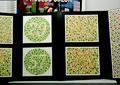
| 05/28/2003 06:39:09 PM | Uh-Oh...by GeneralEComment: *Critique Club*
The comments on this are so funny. And the pic is funny as well since looking at these comments. It is so often that I've seen comments that say "I don't see the * color here". Or "Wheres the color".
By looking at the comments, I think I know where those comments came from. LOL.
I actually think that they are suposed to be (round) 29 and 57. And (square) 86 and 75.
Well see how I did...maybe it's ME that's wrong. lol
Anyway, about the shot...
I disagree with comments that you should have focused in on one of the boards. This could have easily been seen to violate the artwork rule. So, your choice was a good one. However, the distracting elements, (the upper part, and the table) are still a bit of a problem. Only way to really fix that would be to either shoot from a lower position, and crop out the table or move the entire display, which was most likey out of your control.
i do think though, that shooting from a lower view wouldn't have worked for the purpose of this shot. You wouldn't be able to clearly see the numbers (not like some people can anyway) and I think it would not be visually appealing that way.
SO...you made a good choice.
Focus and clarity are good. I think that the detail in the boards is good, and they are clearly displayed.
The angle seems odd, however, I thin that is the fault of the display itself, and not the photo of the display.
not the most thrilling pic in the group, but it does make a nice point, and it's all the right colors.
Lighting is good, no bright spots or glares on the posters, which I think is VERY important.
A good shot.
~Heather~ | | Photographer found comment helpful. |
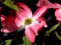
| 05/28/2003 05:44:03 PM | Dogwoodby marinajoeComment: *Critique Club*
I keep getting an error message trying to post this, sooo, here I go again...
I think that people got run down with flower images in these last few color challenges. While I think that this is technically well done, I'm afraid that it's not very 'different'.
The angle and framing/cropping are ok. I even don't mind the little flower peeking in from the upper right. I like how the color is mostly at the top, and the bottom is kind of plain.
The focus is a bit soft. I would like to see some extra detail in the center yellow part of the blossom, however, we still get really nice detail in the petals of the flowers. I like the lines shown.
The colors are good in my opinion. Yeah, there are a few places that look a bit pink, but I can see the red. The pink is probably just the redness being diluted by the lighting. Not a big deal. Fits the challenge nicely in my opinion.
Speaking of the lighting, I think that it's ok on the flowers, however the shadows being created by the leaves are a bit of a distraction. I think that fill flash is what is used to help reduce shadows in unwanted places.
Overall, technically well done.
~Heather~ | | Photographer found comment helpful. |
| 05/28/2003 02:11:36 PM | Complimentary Jacks Awayby RLSComment: *Critique Club*
Great effect. I like it. It makes them look as if they are being sucked up into a whirlwind into the sky.
I am assuming that because the jacks are a flourescent green, that the balls are suposed to be flourescent red. This would explain why they are bright. lol
However, they do almost look orange to me, and orange and green aren't complimentary. No matter. Still a good shot.
The sky is a little dark. I'm wondering though if I like that aspect about this because if the sky was nice and bright, it would take away from the jacks and balls. So maybe by having a darker sky, it helps the jacks stand out better?
Focus and clarity look just fine to me as well.
The angle and framing/cropping are great. You have all of the subject within the frame, and haven't cropped anything in half. I also like the depth. The ones near the top are smaller than the ones in the front. Great shot!
~Heather~ | | Photographer found comment helpful. |
| 05/28/2003 01:59:11 PM | Metalic Auroraby adineComment: *Critique Club*
They might as well just assign your entire portfolio to me. lol I've gotten the last 3. :)
This is such a simple shot, yet very effective. The color is great, and definately fits the challenge in my opinion. Blue/Orange.
Abstracts are hard for me to comment on sometimes. Most of the time focus is unimportant in an abstract, but there are parts here that I can see have good focus. The center of the photo along the bottom for example.
I like how this splits the photo. Not right in the center, but off center a bit, and also the bit of blue reflections that go over the orange looks nice as well.
I like how it seems to swirl together. While I'm not usually a huge fan of abstracts, I'm liking this one quite a bit. Excellent creativity and execution.
If I HAD to make a suggestion for improvement, I would mention that the little speckles throughout the shot are a minor distraction, and I'd find a way to remove those. Now that the challenge is done. Editing is definately an option.
~Heather~ | | Photographer found comment helpful. |
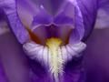
| 05/28/2003 02:26:44 AM | Open Wide and say AHHHHby BAMartinComment: *Critique Club*
I really love the colors. Definately fits with the challenge.
The only thing that I can see that might improve this shot in my opinion is if it were a bit more symetrical. I like symetry for the most part, and the way this shot is, I feel like I'm leaning to the right a bit.
The hovering piece of flower above the yellow part is really fascinating. I find myself staring at it quite a bit.
The focus and clarity of the purple part is great. Soft is good. I wish thought that the yellow part were just a bit sharper though. Still not bad at all, and the lack of super human crispness doesn't affect the shot bad at all, but would be a nice bonus.
The lighting for this was super. I think that was very important in getting the great color you show us here. Also I think that the detail is very appealing as well.
Great shot.
~Heather~ | | Photographer found comment helpful. |
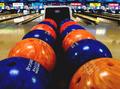
| 05/28/2003 01:00:22 AM | Cosmic Bowlingby AnachroniteComment: *Critique Club*
Hi again. I'm assuming you want honesty, so I'm gonna give you just that. Only cause I know ya though.
I like the shot. But I don't find it emensely thrilling. I think it's the background and the reflection of the background on the lanes that really kind of crushes it for me.
The focus and clarity of the balls is really good, but I do think I would prefer if the front most balls were in focus with the rest of the balls.
The angle and framing/cropping is really good. I love the angle expecially. Really draws you into the photo, but then it stops like a car hitting a brick wall. Draws us in, but for what? A cluttered, busy background.
The color of the balls is great. Definately Complimentary, definately strong. They stand out nicely even with the amount of color in the background. i think that the lighting on the balls is good as well, however I dont' like all the glare on the floor and lanes.
Like I said, I do like the shot, the balls are excellent. Just needs some different background in my opinion.
You can hate me now. :(
~Heather~ | | Photographer found comment helpful. |
|
Showing 1131 - 1140 of ~2785 |
Home -
Challenges -
Community -
League -
Photos -
Cameras -
Lenses -
Learn -
Help -
Terms of Use -
Privacy -
Top ^
DPChallenge, and website content and design, Copyright © 2001-2026 Challenging Technologies, LLC.
All digital photo copyrights belong to the photographers and may not be used without permission.
Current Server Time: 07/24/2026 10:20:19 AM EDT.
|