|
|
|
Showing 1121 - 1130 of ~2785 |
| Image |
Comment |
| 06/01/2003 10:51:57 PM | Mind controlby IncarlightComment: *Critique Club*
This is so true.
The little child statue actually looks so engrossed in watching the TV. lol Good choice of models.
I like the angle. We can see that the child is watching tv, really engrossed in watching it, and we can see that it's not even something great it's watching. The angle is good to show all this, and show how close to the TV the statue is to absorb all the 'information', which is actually just crap.
Focus and clarity look ok, although it's a little hard to tell with the 'texture' on the tv and the reflection on the statue.
I like the reflection of the tv on the statue. I don't think it adds anything to the 'meaning' however it's quite cool looking.
Lighting is perfect. I assume it's just from the tv, and it doesn't create any hot spots or really dark shadows, I think it's perfect for the shot.
While I think that this was technically well done, however, it's missing something for me. It just doesn't draw me in and keep me there. Still well done though.
~Heather~ |  Photographer found comment helpful. Photographer found comment helpful. |
| 06/01/2003 06:03:36 PM | Matrixby sselmanComment: *Critique Club*
This is one of those reasons I wish people would leave a little information on the photo when asking for a CCC.
I have no clue what this is, what it means, or anything.
Hard to really leave a detailed comment without knowing SOMETHING.
I can say that it doesn't really appeal to me. I sat looking at this very perplexedly for awhile trying to figure out what the heck it is.
The lighting is dramatic, but maybe too dramatic. It engulfs your subject, whatever it is, and makes it really difficult to see and identify.
It also looks as if this is really really soft focus. Making it even harder to see what's going on in the shot.
The way this is really bright at the top and not quite as bright at the bottom leaves this a bit unballanced to me.
The color isn't bad, but I think it needs more than just ok color to be of interest to me.
Which there were more I could say.
~Heather~ |
| 06/01/2003 05:49:10 PM | Down In It.by oldwisemonkComment: *Critique Club*
I don't really find this particularily interesting. I can't even read what it says. Looks like a very shallow DOF on a computer screen, where very little is in focus and you can't even read any of what is in focus.
I might have liked to see at least one recognizable word in this shot. Either that, or at least have the cursor in focus.
I guess the lighting is ok, no bright spots or distracting shadows.
There really isn't a lot to comment on here.
The green lettering fits in with the whole theme of the movie. I supose it fits the challenge in that aspect, but there really just isn't anything to look at.
Sorry I couldn't be of more help.
~Heather~ |
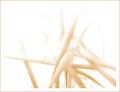
| 06/01/2003 05:30:50 PM | Matrix...A Computerized Dreamby OneSweetSinComment: *Critique Club*
Hello once again.
While I respect the 'out of the box' interpretation of the challenge, I think that I probably would have voted this low as well, and it has nothing to do with the 'meaning' or for the theme of the challenge either.
What I find particularily distracting is the overall lack of focus. I've tried to find a spot that was sharp focus, and I cannot. I realize that you may have done this on purpose to make it like a 'dream', but I only think that works when the lighting is really 'soft' as well. Like a white light and soft focus. I don't think it works well in this case.
The angle and framing/cropping are ok. I might have liked to see the start of this little waterfall. Maybe show us the top?
The lighting seems like it was a bit dark. The colors of this shot seem muted to me.
I really think that anything and everything could have fit into this challenge, so your interpretation is as good as any in my opinion.
I think that this possibly would have done much better with just a bit more focus. Even with the 'dream' theme, sharper focus would still have worked.
~Heather~ |
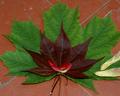
| 06/01/2003 12:41:56 PM | Red Maple ~ Green Mapleby ladpupmoeComment: *Critique Club*
This fits the challenge nicely. The red/green combo is nice, and the idea is creative.
The lighting looks a bit muted, like the lighting conditions were not ideal for this shot. It does make this seem a bit flat and lacks the depth I think it needs to stand out at us. Not that there really IS much depth, but some sun or something (but not too harsh) would help in my opinion.
Also, the focus seems a bit soft. It seems that there is a sharper focus in the upper right hand corner, and then the rest is a bit soft. It is really obvious if you look at the cracks in the tiles.
I do also think that a different background might have helped out some too. With the texture (cracks) in the background, I think that they take away from the texture of the leaves. Creating a bit of a distraction. There is that one crack that cuts all the way through the leaves. going from the upper right to the lower left. Cutting objects in half, even if from 'behind' bothers me for some reason.
I think that the idea is good. Quite interesting, and effective. Just a few minor adjustments and this could be great.
Oh, I will also mention that the seeds are a distraction in my opinion as well. I think that with the total green/red theme, the little white/yellowish ones really stand out more than anything, and on top of the cracks in the tiles, really take away from the image.
~Heather~ | | Photographer found comment helpful. |
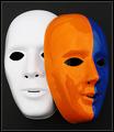
| 06/01/2003 12:21:45 PM | Mask paradeby AnastasiaComment: *Critique Club*
Excellent. I really like this, but there are a few nit picky things that I can mention that I think could use a bit of adjusting.
First, the objects that we can see in the colored masks eyes are a bit of a distraction. I think it looks like the edge of the other mask, and a cord that might be used to hand the mask? There is something in both eyes, and the mouth and maybe covering them up the distractions with something black might have helped it to blend in with the background. I disagree with the comment to move the colored mask, as I think that the setup is great. I like the positioning of the masks.
Other than those small things, I think the shot is great. The colors are really excellent. They are bold and very strong, and stand out against the background and other mask very well. I disagree with using 2 white masks, because the purpose of this challenge is the color. Maybe outside the challenge, that might be something to try, but not for this challenge at all.
I like the angle and framing/cropping you chose. I think that the centered setup works well because of the tilted angle of the subject itself. While I like this, I also wonder if a little more space around the edges would work, or if it would make it look 'lost'. Something to try out of curiosity though.
Focus and clarity are really great. Very sharp edges, and not over sharp.
The black background works perfectly. Nothing distracting there. Helps the subject really jump out of the photo. Nice.
Last thing I can mention is the lighting. At first I was like...EEK look at all that glare and reflection. But looking at it, I think it and the lack of glare and reflection on the white mask, I think that if both masks were like that, than this would be a boring shot. I think it would be flat and less exciting.
So I think you did an excellent wonderful job. Great shot!
~Heather~ | | Photographer found comment helpful. |
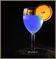
| 05/30/2003 12:49:09 AM | A Good Mixby RuchartComment: *Critique Club*
Nice ATTEMPT? I like how everyone assumes you were trying to "copy" something. I know the shot they're thinking of, but I've never really looked closely at it, so I wont be comparing you to him, nor this shot to that shot.
I do want to say that the ONLY thing that really bothers me at all about this shot are the light glare and the reflection of the orange on the left side of the glass. The glare on the right side below the orange does not bother me, and I actually like it.
I guess I do also wonder if a bit more black space would be better to the left. Either that, or center the subject dead on. It's not off center enough in this frame to really create a dramatic use of neg. space.
Otherwise, I love the colors. They stand out very nicely on the background, and are quite strong and vivid.
Your focus and clarity are great. I almost wanted to say that I wish the orange were a bit more clear, however, I like the darkness on it, and I don't think it would be easy at all to achieve both.
I also like how we are not looking straight on at the glass, but at an angle slightly.
Really nice. Love that color blue.
~Heather~ | | Photographer found comment helpful. |
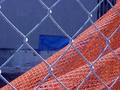
| 05/30/2003 12:25:48 AM | Urban Abstractby eloiseComment: *Critique Club*
And we meet again. Not quite sure why I keep being 'randomly' assigned to your shots, but maybe there is a reason. I have actually seen you growing a bit here. You're seeing different things. Getting creative. I like this.
I see angle here. Creative angle. Not just a snap shot. And I think that is what I notice most. You got up close and personal, you framed well to 1/2 and 1/2 the shot. I wonder though if maybe you had gotten down just a slight bit farther, if you could have gotten a shot of the orange fence, with the building in the background, but the section of the building that was solid, like farther up on the building? Just something to try. I don't really know what the surroundings were like, so might not even be possible.
I also see focus and clarity. The texture of the orange fence (which we call a snow fence here in MI.) is excellent. Really great detail there. Also, I think you blurred the background enough so that we can see it, but so that it is in fact a seperate element from your main subject which I feel is the orange fence.
The chain link fence is also a bit blurred, which says to me that you did not want it to be the main subject, which is a good choice as well.
The lighting could be better in the background (like you have any control over that huh? lol) I think I'd like there to be a bit more lighting in the background, but less lighting on the chain link fence in the forground. Now I'm asking for the world. See how there are some distracting light glares on the chain link fence? We have to see these before we see the orange fence.
I think your subjects are getting a bit more creative, a bit more interesting, however, still not making me get excited here. I got a peek at your matrix shot, and I'm hoping I might get that too as a CC assignment. (meanwhile, you're probably thinking "will this girl just leave me alone")
You set a goal to consistantly break 5. That's really good. Really hard too. lol. I can't do it consistantly. hehe. I know what I want, I can see it. But me and the camera just don't click.
Keep it up, you're definately on the right track.
~Heather~ | | Photographer found comment helpful. |
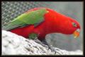
| 05/29/2003 11:08:35 PM | I'm watching youby MusicmanComment: *Critique Club*
The first thing I notice here is that the bark is really really in focus and sharp. Right around the feet of the bird. See how that seems much more strong than his eye? I would prefer this the other way around. His eye really is an eye catcher. The title is perfect, and That is exactly what I want to look at here.
However, with the bark being so clear, I'm sitting here admiring the detail you captured in the bark, and ignoring his eye. Also, there is a bit of a glare in his eye, which is really too strong to be considered an effective catch light.
Personally, I think you did a good job of getting the fence out of the way. The blurred background works very nicely and is effective in reducing distractions on the bird.
Lighting appears to have been just great. Conditions look like they were working with you on this day. With the tiny exception of the glare in the eye, I think that the lighting creates no distractions. No bright light, no annoying shadows. Nothing.
The angle and framing/cropping are ok. I think that I like having him bent over like this. It makes for a 'different' kind of view than we usually see with the bird 'sitting pretty'. I do think though that maybe he could have a little more room to breathe on the right side. I think this would just be a suggestion that I would have to SEE in order to say if I really liked it or not. He himself is so spread out, that it makes for a spread out shot to begin with. Making the shot even bigger could actually damage the shot and not enhance it. So take that suggestion as just an experiment rather than a dead set 'must have'.
Overall, I think he's really pretty, and it's well done. A bit more focus, and I think this would have topped even better.
Great colors.
~Heather~
| | Photographer found comment helpful. |
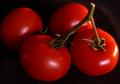
| 05/29/2003 10:52:55 PM | Tomato On The Vineby STEINRComment: *Critique Club*
Am I missing something here? I thought that the compliment to orange is blue? I think this would have worked well in the secondary colors challenge. Where secondary colors are Orange and Green (and purple, which doesn't apply here).
Anyway, Setting that aside to talk about the photo itself...
It's a very good image. I think it may need a bit more lighting. I think that the lighting on the stems is a bit dark, and even if they had been an important color in this shot, they would be a bit dark to really bring the color out to the full potential anyway.
The color of the tomato is really good. I think that the orange stands out very nicely here. It is strong, and vivid, and very effective on the topic of color. However, when talking about complimentary, I feel that there needs to be 2 strong colors, and the green (even if it WAS the compliment of orange) is not strong enough to qualify for this.
Focus and clarity are really good. I think that you show us good detail in the stem and the smoothe texture of the tomato really stands out nicely.
I like the set up. The angle and framing/cropping you have chosen for these garden goodies is really good. I think that the way the area setting is good. I only wonder though if you could have not cropped the left tomato, or have cropped it more. Right now, you just barely shave off a bit of the tomato, and have not cropped any of the other ones, so it almost looks like a bit of an accident. Not really anything that was done for a reason.
Maybe a side light shining right on the stems (so it misses the tomato) would help the stems to shine more, and not put too much lighting on the shiny tomato.
Yummy looking for sure.
~Heather~ | | Photographer found comment helpful. |
|
Showing 1121 - 1130 of ~2785 |
Home -
Challenges -
Community -
League -
Photos -
Cameras -
Lenses -
Learn -
Help -
Terms of Use -
Privacy -
Top ^
DPChallenge, and website content and design, Copyright © 2001-2026 Challenging Technologies, LLC.
All digital photo copyrights belong to the photographers and may not be used without permission.
Current Server Time: 07/24/2026 03:50:20 PM EDT.
|