|
|
|
Showing 1071 - 1080 of ~2785 |
| Image |
Comment |
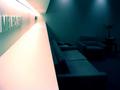
| 06/09/2003 03:07:55 PM | Melbourne, Australiaby Girl from OZComment: *Critique Club*
This has really interesting angles. I think that is quite visually appealing to me. I like how the lines lead you into the photo, even though they really don't lead anywhere interesting.
This photo gives me more of the impression of a business than a home. Almost reminds me of a doctors office, or waiting room of some kind. Still though, it shows that your home is in Melbourne.
The lighting to the left gets just a tad bright on the shelf under the writing, and also in the crease above the writing. however, the lighting on the word itself seems good.
You show us enough in the dark area to be able to see what it is, but not enough to really make it jump out as something interesting. I like the seperation of the photo by color. The pinkish on the left and the blue on the right. I also appreciate that that seperation is not directly in the center of your photo.
~Heather~ |  Photographer found comment helpful. Photographer found comment helpful. |
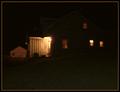
| 06/09/2003 02:58:48 PM | Country Living = Dark Nightsby mcraelComment: *Critique Club*
Well, there really isn't much to look at here, but living in the country myself, I can actually relate. It does say "Home" very nicely, especially to me on a personal level.
The visual appeal isn't really that high though. Cause there really isn't much to look at. I think that the most interesting part is the little porch to the left of the photo, but to the right of the barn. That wooden little inlet has the most detail of anything in this shot.
I do see though that if I jack up the brightness, I can see the outline of the house, and a hill in the yard. Even this is enough to add a bit of interest. I'm wondering if this is how you are seeing it on your moniter? With a slight more brightness?
When I set the moniter 'properly' this does appear to be a bit too dark. Definatley prefer it with the added brightness.
I think that the angle and framing/cropping are ok. The brightly lit garage/barn to the left kind of throws this off balance a bit. It's lit well, and detailed, and there isn't that kind of leverage on the right side of the photo.
For a low lighting shot, your focus appears to be very good. I see some detail in the wood slats to the left of the house.
Definately says home, and definately different, but lacking something to really make it stand out to me. Maybe it's jst as simple as a brightness adjustment.
~Heather~ | | Photographer found comment helpful. |
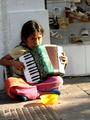
| 06/09/2003 02:20:16 PM | Poverty and Dignityby diegohsComment: *Critique Club*
I notice a couple things here. First off, the focus. It does seem to be clearer and sharper on the shoes in the background, and the girl is not very well in focus. i think I'd have prefered this to be the opposite way. With the girl in focus and the shoes slightly out of focus. Either that, of the entire photo in focus. That way, we can see the detail of the girl, and still see the expensive price of the shoes in the background.
Also, the lighting is a bit bright in a few places. on her left hand (our right) and that side of the instrument, the lighting is quite harsh. It looks as if she is pushing puttons, but because of the light, we can't really see what's going on there. The shadow on her face almost covers up what looks to be a precious expression. Really full of emotion here.
The angle and framing/cropping is good to include the shoes, but you have cropped a small part off her elbow. I wonder also if you could have rotated this a bit to the right, as everything seems to tilt to the left. I feel like the bowl is going to slide right out of the photo.
A truely touching shot. As for meeting the challenge, if this is what you think of when you think HOME, then who am I to say otherwise.
~Heather~ | | Photographer found comment helpful. |
| 06/09/2003 01:44:37 PM | home is where the Heart isby ritaardComment: *Critique Club*
To be honest, this really isn't my cup of tea. It does give the impression of a snapshot at a party. Spur of the moment shot, bad lighting and uncontroled distracting elements kind of damage this shot.
First, the main subject looks like those to guy hugging in the center. It appears this way, becuase they are the biggest, central object in the photo. That being said, there are a lot of distracting elements in the photo as well. I think that the person who is cut in half to the left is distracting, and adds nothing good to this shot. Also, the red eyes are a bit of a distraction. The guy in the back left, who appears to be trying to fight his way into the photo, with the red eyes and open mouth really doesn't add to the photo in a positive way. Being so close to what looks like the main subject, and looking rather silly, he's a large distraction.
The lighting obviously was very low, and it appears you have used flash. This makes the skin tones in the hand which is very close to the cameara look yellow and unnatural.
I think that this would have been a bit better, if you could have focused in on ONE thing. Maybe if you could have blurred the background, and just focused in on the 2 guys.
The focus and clarity are good. I will say that the lines are nice and crisp, and there is quite a bit of detail in the photo. Probably too much though.
It's a good snapshot. Definately captures a moment, but not really in a creative way. As for meeting the challenge, I say that if this makes you think of home, then who am I to say otherwise.
~Heather~ |
| 06/09/2003 01:23:48 PM | A World Apartby jmark53Comment: *Critique Club*
Telephone lines...yeah yeah yeah. lol You don't need to hear it AGAIN.
looks like it might have been a bit of a windy day, cause the globe looks to be in focus, but the trees, are really soft focus, which leads me to believe they were swaying in the wind a bit.
The angle and framing/cropping are good, with the exception of the unavoidable powerlines. Since the challenge is over now, you can always just clone those out, and tada! No more powerlines. I think that the globe being centered works here, as we can tell how big it really is. At first, I thought you picked a silly part of the globe to photographer, in the middle of the ocean, with nothing really to look at. But realize that with the surroundings, it's probably difficult to get an interesting pic otherwise.
one suggestion could be to stand under it, and shoot up toward the sky, so the sky would be the background, and wouldn't have anything else distracting from it, but the it would be difficult to judge size.
We do live on earth, most of us anyway, so I think that this does fit the Home Sweet Home theme.
The background elements aren't totally pleasing to look at, but hard to avoid.
~Heather~ | | Photographer found comment helpful. |
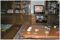
| 06/09/2003 01:02:08 PM | Creative messby sselmanComment: *Critique Club*
This definately is representive of home, but I don't really see how it's creative. Looks like you were sitting on your couch, realized you needed a shot, reached over, grabbed the camera and shot. You say that it's creative, but I'm not seeing the creativity part.
The focus appears to be really soft throughout the photo as well. I can't even identify 3 of the items on the table, and the others are really soft focus. The items on the floor and on the shelves are also soft focus. Selective focus works sometimes, but I don't think it adds anything of interest at all here.
The angle and framing/cropping need some work too. The whole shelving unit/entertainment stand thing is leaning to the right. Looks like everything should slide off the shelves and out of the right of the photo.
The lighting in my opinion is also poor. There is what looks like a flash reflection in the Television set, and on this side of the table as well. I am wondering if the lighting is contributing to there being nothing in sharp focus. Sometimes when there isn't enough light, it hurts the focus.
It does fit the challenge, definatly your home, but I think it simply lacks 2 things, focus and a point of interest.
~Heather~ |
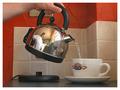
| 06/09/2003 12:29:41 PM | First Things Firstby agwrightComment: *Critique Club*
I see the complaint about the reflection. I have to disagree. I think that the reflection helps to bring this even more 'into your home'. I feel that this is something that you always do IN your home, and this does give a nice sense of home.
Your focus and clarity are really good. Nice detail in the cup, the pot and even in the reflection. Although it's pretty small, and we can't really see everything, it still looks like a kitchen back there.
I like how this is centered, but not really. The cup is to the right, and the pot is to the left, but it all kind of meets in the middle.
I think that the lighting is perfect. It displays the subject nicely, in my opinion, no harsh shadows or annoying bright spots. The is a noticable light coming through the window in the reflection, however, I don't think it effects the photo negatively. Overall very nice.
I do notice that the tiles on the wall are tilted, but I don't think that's the fault of the photographer, I think it's the fault of the person who put the tiles on the wall. lol Cause the tile line at the top of the cup, going to the left is nice and straight, however the one right above it tilts to the right slightly. Oh well, not a big deal at all. Just something that is noticable.
I think it's an excellent shot.
~Heather~ | | Photographer found comment helpful. |
| 06/09/2003 02:37:39 AM | Home of them passed awayby vjozComment: *Critique Club*
Had not been for the title and description, I don't think I would have even figured out that this was a cemetery.
The background is nicely blurred, but I think that works against you here, as it's hard to grasp the surroundings without being pointed in the direction of this being a cemetery. You know. Once something's been pointed out, it's obvious, but until then, you're like "what the??".
I also don't think I'm too fond of the angle. Why did you decide to take a photo of the back of the angel? Especially as it looks like he's been shot in the back. I think the large hole in his back is not pleasant.
The rain is a nice touch. I think that had this been executed differently, the rain would have added a lot to the shot.
The flowers are dead center of the photo, yet they are reallyout of focus. I find this distracting. Especially with the patch of grass to the left that is in nice sharp focus. I realize that you were trying to focus in on the angel and make that the sharpest focus, however, with the patch of non focused flowers right in the middle, it doesn't work out as nicely.
Lighting seems to have been good. No horrible hot spots, or distracting shadows.
Also, the background seems to be leaning to the right, and even though the angel is upright just fine, seems a bit odd for everything to be leaning this way.
As for meeting the challenge, that's up to you. Everyone sees things differently, and if this is what you think of when you see home, then so be it. Who am I to say differently.
~Heather~ | | Photographer found comment helpful. |
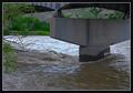
| 06/09/2003 02:23:38 AM | The Roar of a Fast Flowing Riverby CLarson557Comment: *Critique Club*
While it's not the FIRST thing I think about when I see this, it does definately reflect noise. Even under little bridges, with little streams, the waves and ruslting bounces off the underside of the bridge, and the roaring of the cars above definately doesn't help for a peaceful environment.
Your focus and clarity seem to be good. We get nice detail in both the bridge and the waves in the water. I especially like the wet spot on the pillar where the waves have beaten on it. I think that enhances the movement of the water a bit.
The angle and framing/cropping are ok. I'm not really sure I like that dead stick coming out of the left side of the photo, but not really much you can do about that cause it's right in the middle of things.
While I think it's technically well done, I'm not really sure it appeals much to me. The muddy water, lack of much color, and dirty looking background, aren't really visually appealing to me.
The lighting kind of makes things look dulled. Even though the green is bright, it, and the bridge and water still look muted, like the conditions weren't exactly great for the shot. Maybe a different time of day could put some exciting lighting on this, and bump it up a notch on the appeal scale.
As I said though, overall I don't think you made any huge technical errors.
~Heather~ |
| 06/09/2003 01:14:12 AM | Road Thunderby OneSweetSinComment: *Critique Club*
Focus and clarity are really nice here. In my opinion, you captured the rust perfectly. You got a lot of nice detail in here. The sharpest focus is on the rust around the tailpipe, and that is excellent. You also were able to capture detail in the surrounding objects, however, slightly blurred as to really make the tailpipe stand out as the focus of your shot. Quite effective.
I wish you could have gotten a bit of smoke coming out of there as this beast started up. I think that would have implied even more noise and sound into the shot. Definately would have made me think of the first bursting roar as the start pedal is pushed.
The angle and framing/cropping are ok. Glad you didn't take this straight on of the tailpipe. Probably wouldn't have been really identifiable at that angle, and would have gotten crappy background stuff in the way. This way, we can put it together with it's surrounding elements and recognize it right away.
The lighting is good on the rust, however bright in a few spots, mainly on the tailpipe under the grass reflection. Otherwise, lighting helps in enhancing the detail nicely.
Overall technically good, but not really something I'd hang in my livingroom. :)
~Heather~
| | Photographer found comment helpful. |
|
Showing 1071 - 1080 of ~2785 |
Home -
Challenges -
Community -
League -
Photos -
Cameras -
Lenses -
Learn -
Help -
Terms of Use -
Privacy -
Top ^
DPChallenge, and website content and design, Copyright © 2001-2026 Challenging Technologies, LLC.
All digital photo copyrights belong to the photographers and may not be used without permission.
Current Server Time: 07/24/2026 06:26:20 AM EDT.
|