| Image |
Comment |
| 06/13/2003 07:16:50 PM |
Portible Soundby WILDBLUEComment: *Critique Club*
I think this would be more effective had there been some headphones in the shot. I could totally be wrong about this, but it looks like a walkman. WIth that image in my head, walkmen don't make sound, unless there are headphones with them.
As a product shot, it's good. Focus and clarity are good. Even the DOF is pleasing.
The color is excellent. I really like that blue color.
I think that the white background works perfectly for this. Nothing distracting, and makes the item stand out very nicely in the shot.
Overall a really great shot, but doesn't make me think "sound". (but hey, since I'm not voting, who really cares, huh?) lol
~Heather~ |
 Photographer found comment helpful. Photographer found comment helpful. |
| 06/13/2003 07:03:27 PM |
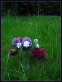
Country Livingby MonaComment: I can't say that this interests me much. Here is what I see...
A tilted plastic cup full of out of focus, half dead, flowers in the middle of an unmown yard. The light is really bright on the whites, and too dark in the pinks. I think the thing that bothers me most, is WHY is this cup of flowers sitting in the middle of nowhere.
Don't mean to be harsh, but I'm not seeing the point, nor the country living here. and i live in the country.
The one thing I see that works though, is the way that the purple comes together in the photo. Border, flowers, and specks in the background as well. It flows nicely with the color. |
| 06/13/2003 06:58:33 PM |
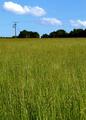
The Ecologistby UberFishComment: That's a lot of grass leading up to those powerlines which I don't find to be particularily interesting. weather or not it has to do with the magazine, it doesn't really appeal to me. the grass is great, and the sky is perfect, just not much interest in between. |
| Photographer found comment helpful. |
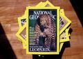
| 06/13/2003 06:57:20 PM |
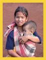
National Geographicby InnaNComment: Perfect. Just perfect. I love the angle and framing/cropping. The focus and clarity are really good, and lighting is nice as well. Great shot for the NG. If I had to make a suggestion it would be to have included the rest of the girls arm at the bottom, but not absolutely needed. great shot. |
| Photographer found comment helpful. |
| 06/13/2003 06:45:45 PM |
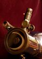
Sky & Telescope ~ Eclipse of Sunby ladpupmoeComment: Took me a minute to realize that the thing in the center was an 'eclipse' and not just an annoying glare. I still find it to be a bit distracting from the telescope, which I find to be much more interesting. Focus and clarity look good. I think it's a nice shot to be on a magazine. light glare to the right is a bit distracting, expecially since the sun's suposed to be all covered up by the eclipse. :) |
| Photographer found comment helpful. |
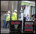
| 06/13/2003 06:43:51 PM |
The Big Issueby agwrightComment: Rotate this a few degrees to the left. Seems to have a bit of a right tilt. Thought the people might just be on a hill, but everything else is tilted too. The signs, the "give way" sign and the building as well. Focus is ok. not really sure what this is a picture of, but there are some really specific magazines out there. the actual magazine could explain the picture. I looked it up, and didn't really find much dealing with what the magazine was suposed to be about. anyway, it's a good shot, interesting with the cops, and humorous warning sign. just needs a bit of straightening in my opinion. |
| Photographer found comment helpful. |
| 06/13/2003 06:39:17 PM |
National Geographicby SwashbucklerComment: One thing I've realized this challenge, is that slapping a yellow border on something definately does not make it National Geographic. The focus here is way too soft, and the shot is really grainy. What bothers me most though, is the fact that the large leaf in the bottom right is partially semi-focussed, and partially unrecognizable.
It is a good angle on the birds, and the closeness is great for the front cover. Wish you hadn't clipped the beak with the border though. |
| Photographer found comment helpful. |
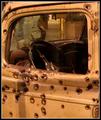
| 06/13/2003 06:34:50 PM |
American Crime: Bullets to Oblivion... The Bonnie and Clyde Storyby tfarrell23Comment: The sharpest focus I'm seeing here is in the bullet holes near the bottom of the photograph in the center. The rest of them seem a bit soft. The shot is interesting though. Love the old look. I think it could definately be something on the front of a magazine, just with a tiny bit sharper focus. |
| Photographer found comment helpful. |
| 06/13/2003 06:25:47 PM |
National Geographicby ashwinComment: This is definately a magazine cover, but I think the point of the challenge was to make your own, not take a pic of one that is already made.
That being said, your focus is way too soft to portray this magazine properly. I can't even read half the stuff printed on this cover. I also don't care for the harsh shadows under the magazines. Subject is too centered, and just doesn't draw my interest. |
| 06/13/2003 06:22:40 PM |
conehead digestby grigrigirlComment: I looked it up, but "search for 'conehead digest' showed no results". Oh well. s'pose it could be real. anyway, the focus on the girl is way too soft for my personal liking. love the statue though. angle is good. the border is aweful. weather or not it's on the real magazine, it does not appeal to me at all. |
| Photographer found comment helpful. |
Home -
Challenges -
Community -
League -
Photos -
Cameras -
Lenses -
Learn -
Help -
Terms of Use -
Privacy -
Top ^
DPChallenge, and website content and design, Copyright © 2001-2026 Challenging Technologies, LLC.
All digital photo copyrights belong to the photographers and may not be used without permission.
Current Server Time: 07/24/2026 03:44:35 AM EDT.