| Image |
Comment |
| 04/21/2006 06:50:11 PM |
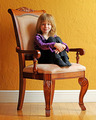
Marissaby dsa157Comment: She looks so small in that big chair. Interesting.
Nice lighting, good use of angles. |
 Photographer found comment helpful. Photographer found comment helpful. |
| 04/21/2006 06:49:03 PM |
|
| Photographer found comment helpful. |
| 04/21/2006 06:48:22 PM |
"Amanda'by tfarrell23Comment: Strange how the eyes are sooo blue and the teeth still white. I cannot even find a quick fix in Photoshop. :( Skin tones are too red and the overal feeling is that this has been neatimaged to much. |
| Photographer found comment helpful. |
| 04/21/2006 06:45:53 PM |
|
| Photographer found comment helpful. |
| 04/21/2006 06:44:27 PM |
|
| Photographer found comment helpful. |
| 04/21/2006 06:43:38 PM |
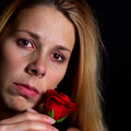
Love Lostby cloudsmeComment: Composition is good but the light is very contrasty and the skin tone is a bit unnatural. |
| Photographer found comment helpful. |
| 04/21/2006 06:40:49 PM |
The One of my Dreamsby KivetComment: Her left eye (from her point of view) is smaller than her right eye. To compensate for this it would be better to create a composition where the smaller eye is closer to the camera to get a result that shows both eyes at equal size. Therefore you'd have to shoot the face at an angle and not straight on. This would also compensate for the fact that her mouth is not in the same line as her nose and eyes.
The lighting effect is interesting but a little bit harsh around the edges of the hair. |
| Photographer found comment helpful. |
| 04/21/2006 06:34:24 PM |
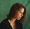
R*E*T*I*C*E*N*Tby RoosterComment: I like the way the colors work here and to some extent the position of the girl in the frame. I'd like to see more of her body turned towards the camera to create depth. |
| Photographer found comment helpful. |
| 04/21/2006 06:32:09 PM |
Colleenby danderson107Comment: I like the flow of the compostion and the brightness of this.
The elbow part of the arm looks so hard defined against that black background; I wonder if a white / brighter one would have worked better to get a better transition from the bright skin to the background. |
| Photographer found comment helpful. |
| 04/21/2006 06:29:42 PM |
Valerieby loveComment: It is a little bit soft and the background is too close (the crases and folds draw to much attention). Increase the distance between subject and background to create better out of focus blur.
I like the diagonal flow of the compostion and to some extent how the light falls. But this is very en profil, would like to see the other part of the face more, even if it only included the slightest hint of the 2nd eye. |
| Photographer found comment helpful. |
Home -
Challenges -
Community -
League -
Photos -
Cameras -
Lenses -
Learn -
Help -
Terms of Use -
Privacy -
Top ^
DPChallenge, and website content and design, Copyright © 2001-2026 Challenging Technologies, LLC.
All digital photo copyrights belong to the photographers and may not be used without permission.
Current Server Time: 06/19/2026 08:18:02 AM EDT.