Water can scald in less than 3 secondsby
Gracechild7Comment: ~~~~Critique Club Comment~~~~
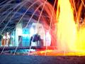
*Composition (content)*
Interesting composition.
Good balance between the main subject and the background subject.
Good horizontal portayal.
The lights on the building in the background provide some light intensity balance with the light of the fountain at the right. It also gives some variancy in color; yellow-red vs blue white.
The arches of the background-building and the water itself provide depth.
I guess that the material in the bottom is a concrede edge from the fountain. This gives a frame to the bottom, it doesn't leave the composition open at that end, which might be a good thing if anything beyond that isn't interesting.
Standing back more to capture more of the fountain and to do more with the rule of thirds might have made this better tough.
*Background*
When you are able to control aperture, you migh have wanted to experiment with the settings to get only the fountain edge to edge in focus and blur the background. Focus on 1/3th from the bottom of the frame an try F5-F2.8
*Camera Work (Technical)*
You don't have much control, but fortunately the shutterspeed was slow enough to capture the motion of the water. That is a good thing.
The whitebalance is slightly on the blue side, a better camera would have done a better job or provided better manual settings.
Unfortunately the camera destroy's alle sharpness and detail by very agressive jpeg compression (I talked to you about that earlier in the forums) and that is what ruins this picture for the viewer. It could also do with some exposure compensation experimentation.
*Digital Processing (technical)*
It makes no sense to discuss this. Because of the agressive jpeg compression many post processing techniques will come out bad. It might help under the new rules to make your image smaller!!!!!! You are not limited to 640x480 I believe, but can also RESAMPLE (Lanczos / bibubic algoritm; try Irfanview if you don't have an editor that can do that; DONT RESIZE, ALWAYS RESAMPLE!!!). That process might take some of the compression artefacts away and allow you to save at a higher compression level, close to 150kb. The small file might even allow for some sharpening without worsening the picture! Check the new rules about the file size and check the forums about resampling and saving.
*My opinion*
This is a very interesting picture (seriously, I don't say this to make you feel better), but it is ruined by the camera. I hope that the new rules allow you to post something of better quality, because your approach to photography is promising.