|
|
|
Showing 2611 - 2620 of ~2734 |
| Image |
Comment |
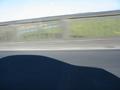
| 12/16/2002 04:56:59 PM | Motorway Motionby SlimharpoComment: ~~~~Critique Club Comment~~~~
Composition (content)
It is a bit empty, there is nothing there that really grabs you. The only thing I really like about this, is the frozen shadow (because it moves at the same speed as the car) in front of a motion blurred rail.
On one hand it is nice that the car shadow is horizontally level, on the other hand does the eye expect the natural horizon to be level.
It is a pity that we cannot see more of the landscape beyond the rail, because it seems like a good view, it would have added something.
In the left corner there is a big reflection from the inside of the car, it distracts and isn't nice.
Background
See composition.
Camera Work (Technical)
Focus & exposure is good. Colors ok.
Digital Processing (technical)
Noth much to say. Try to save at the highest quality level, you have plenty of room.
My opinion
It might be a bit harsh, but there is simply not a grabbing subject, the wow-factor is very low. The idea is basically okay, try something trough the front windscreen, try to include a car in front of you for example that stays sharp because it remains at the same distance while the movement of both in the mean time motion blurs the surroundings. |
| 12/16/2002 04:34:36 PM | Swishby cykhansenComment: ~~~~Critique Club Comment~~~~
Composition (content)
The composition is basically okay. You've got a slope and overhanging tree that lead the eye, a nice background, a subject in motion and snow that gives the picture an extra 'winter' touch. Nothing wrong with that.
There are some things that could be improved:
Take the subject (boy on the sled) out of the center. You don't have all the control with a moving subject of course, but it would have come out best if it was just right of the tree with the rest of the frame the same I think.
I wonder what it would have looked like when you panned the subject and blurred the background with your own movement. It would give the image a great extra human touch that it now lacks.
The difference in color and intensity between the trees and the white slope is very good. And I really like the falling snow.
Background
Nice background, everything says winter. The background at the right, beyond the path woulde have been better when it was blurred by choosing a wider aperture, but I see from the settings that you needed that you needed the ISO 50 and small aperture to allow for a longer exposure time. The only solution to that is to try it at another time of day when there is less light.
Camera Work (Technical)
Can't say for shure, but it seems a 1/3th stop overexposed. Altough the detail in the trees doesn't want a shorther exposure. It is very hard with snow.
Was this on a tripod? If not, I admire your steady hand.
Whitebalance seems to be a bit off, a bit blue/purple in the snow.
Digital Processing (technical)
I loaded the picture in Photoshop and autolevels alone took away a lot of the purple/blue cast that was over the whole picture. I only saw it clearly when I took it away. The result is a more natural look of the trees and foreground shadows. A bit of fooling around with the white eye dropper in the snow took even the remaining blue cast out of the snow, but it enhanced an overexposed look of the snow.
I don't want to brag about PS, but I believe that PS Elements 2 and other cheaper imaging software have these capabilities too (ask in the forums, I am not shure). It can really enhance the quality of your picture. The difference for this one was stunning, especially when I added some unsharp mask too.
Don't forget to save at the highest quality level possible, your picture is 70kb and 150 is allowed. A higher jpeg quality keeps more detail in the trees for example, saves the sharpness of all edges and gives better color rendition. (In PS use Save for the Web)
My opinion
The corrected image looked very good, now a panned version and you would have a high ranked pic. Message edited by author 2002-12-16 16:36:17. |
| 12/16/2002 04:01:48 PM | Going nowhere fastby boyte1Comment: ~~~~Critique Club Comment~~~~
Composition (content)
Original composition, I like the way treadmill guides you trough the frame and how the theadmills beyond that explain what we are looking at, what setting we are in. They also provide good depth and form a second diagonal trough the frame that leads the eye.
Nice motion blur.
Too bad that the power plug is plugged in and that the black of it contrasts so much with the wall, because it is a little distracting.
Background
The background is to busy, not that you have much control over it. The situation around the right leg isn't nice. A mirror on one side, more mirrors against the wall on the other side, with a lot of stuff. Would have been nicer without the mirrors.
Camera Work (Technical)
Good choice of shutterspeed, exposure is good, focus and depth is good. The only minus is the noise here and there (depends on what you like). Sharpness is ok, but tilts to the hard side with some lines, but overall ok.
Digital Processing (technical)
I tried a bit of unsharp mask in Photoshop and it depends on what you like, it could add something (right shoe and sock). On the other hand it oversharpened the diagonals.
Not much else to mention.
B&W is a good choice in my opinion.
My opinion
Good. Message edited by author 2002-12-16 16:02:27. |
| 12/16/2002 02:28:53 PM | Tick Tockby jab119Comment: ~~~~Critique Club Comment~~~~
Composition (content)
The clock is cut off at the bottom and a lot of open space is left at the top. It is something I forget to pay attention to when framing. Busy with the exposure, avoiding camera shake and when I review it on the pc "Damn, the ship's mast runs out of the frame"..... See wingy's comment on what to do when that happens.
The black vs white is indeed very nice.
The lighting is uneven, with the main light source from the left. You could try to position a reflecting paper (A4/A5 printing paper) at the right. But that also adds a bit more light, on the other hand you have plenty of room to use a smaller aperture (higher F). Another benefit of reflecting light at the right is that it will fill the shadow in the clock at the left to some degree.
The clock seems to tick uneven, it remains in the same position for longer every two seconds it seems. :-) Well captured motion!
Background
Good contrast with the clock, all focus is on the clock and the motion.
Camera Work (Technical)
Excellent exposure, camera sharpness ok, dof not an issue.
Digital Processing (technical)
Could have benefited from a bit unsharp mask (tried that myself). Don't forget to save your file at the highest possible quality level, it is only 50k of the 150k allowed. That might have caused the unsharp feel of "quartz", "china" and the numbers at the left side.
My opinion
Nice, but not outstanding.
(edit) And before I forget to mention it, don't pay attention to comments like "we have seen that before". When I would base my votes on that, almost everyone gets a 1. Message edited by author 2002-12-16 14:31:20. |
| 12/16/2002 02:05:50 PM | Liquid stick shiftby kosmikkreeperComment: ~~~~Critique Club Comment~~~~
Composition (content)
Composition is good. Classic subject placement by the rule of thirds, the rest of the frame being filled by the riples. The color is great, the differences in blue intensity adding to the shape of the waves. The use of the flash led to one minor negative aspect: a few blown out patches and points that are a little bit distracting. If you haven't try to bounce the flash on a reflecting surface (white ceiling or white paper) or put a diffuser in front of the flash to get rit of those spots.
Background
Nice & soft. :-) Is it water are we looking at Neptune, nice effect. Not nice is the high amount of what appears to be noise in everything but the main subject. Could be the result of using ISO200, but for ISO200 there is a bit too much in my opinion. Have you tried to use one stop wider aperture in combination with ISO100? Should take the noise out.
Camera Work (Technical)
See above.
Exposure is good, focus is good, depth of field is good (but you might want to try the wider aperture / slower ISO trick, don't know if that will affect the DOF too much). Sharpness is OK.
Digital Processing (technical)
Nothing to mention here.
My opinion
Frozen water drop effects are great subjects, good choice and well captured. Nice color.
I don't like the grainy look and the flash blow outs & reflections are a bit distracting.
|  Photographer found comment helpful. Photographer found comment helpful. |
| 12/14/2002 07:39:57 PM | lust for saleby shutterflyComment: I ran into this pic again and I remembered it from the challenge. Yes, sex sells, but besides that it is also a great pic. I like the exposure, your friend Emma really stands out. The hair, skin tones, the blue of the lingerie and subject shadow detail are captured.
The wall on the upper right balances very well with the hair, while the edge between the wall and the bedd adds perspective. Because the right side is blown out exposurewise all focus is on Emma. The way the money is distributed over the bed (could use the wrong word there, English is not my first language) adds depth.
Her position is very good. Original and giving a good profile, definitely creating a feeling of lust (altough I will not pay). :-)
To come back on the exposure, I think you did a good job. The main subject is really good, the overexposure on the right and around the money is a justified tradeoff.
| | Photographer found comment helpful. |
| 12/11/2002 05:43:57 PM | Boy's Toysby AzrifelComment: no text anymore Message edited by author 2006-06-03 20:08:11. |
| 12/09/2002 05:07:01 PM | |
| 12/09/2002 04:57:39 PM | Old Blue-Eyeby IsaacComment: ~~~~Critique Club Comment~~~~
Composition (content)
The composition is basically OK. It is just that the subject itself isn't very appealing. It might have been prettier to make a portrait of both eyes.
Background
There is no background.
Camera Work (Technical)
The flash was not a good decision. First of all, this picture didn't need the F8.6 aperture, you could try to open it up to F2 / F2.8 . It could of course be that you have no control over it.
It creates a nasty glare from the skin, not nice at all. Try to get more natural light or let someone hold a table lamp ore something. Don't use a flashlight/torch as that light is often to bright, you want the diffuse light from a "low" Watt bulb or the tinted glass of a bulb. What works is a flashlight diffused by a piece of transparent (the kind you can use to draw the stuff that is on the paper below it) paper. You could even put that between the subject and your flash. That too diffuses light. It would have made the skin much more pleasing, now it looks a bit sweaty.
The skin that isn't affected by the flash looks very natural and the hair has detail, which is nice.
Focus and sharpness are good.
Digital Processing (technical)
Nothing to mention.
My opinion
Interesting choice of subject, but I don't like the picture because of the sweaty look created by the flash. |
| 12/09/2002 04:40:30 PM | Inriby juhaseilaComment: ~~~~Critique Club Comment~~~~
Composition (content)
This is a subject that deserves to be centered and has symmetry as a strong point. Unfortunately it is not, but when I look at it a bit better I guess it would have meant that the Jezus in the window in the back would have been hidden from view by the Jezus in the foreground so I understand the decision to do it as it is. Now that I think a bit more about it, centering would also have made the cross obstruct the view on a part of the roof construction. I do think that it could have been cropped/framed a bit better to get a symmetry between the two upper corners. Nonetheless it is a good composition.
Background
Great background, all kind of textures in the same historic style. A historic background for a historic figure. And it is beautifully lit as well, kudos to the people who run the place.
It is busy, but it relates to the subject and is therefore not distracting. I wan't to look at both and it isn't bothering me.
In a way it shows the lifecycle of Jezus, because the construction of the roof depicts the bright Star that attracted the wise men from the east at his birth, while the cross shows his terrible end.
It also gives great depth to the place.
Camera Work (Technical)
Very good exposure and I can see from the technical details that it was pretty hard. F2.8, 1/40s and ISO800, I gues it was hand held?
For F2.8 the depth of field is enormous.
Good focus, very sharp.
Digital Processing (technical)
I have said all there is to be said, nothing to add.
My opinion
I really liked this shot and I am surprised that it is way down here in the votes. In my opinion the picture meets the challenge very well, because it has some blue in it (duh), but also because Jezus / church can be a big support for people who feel blue.
It is original and looks very good. Added to my favourites. |
|
Showing 2611 - 2620 of ~2734 |
Home -
Challenges -
Community -
League -
Photos -
Cameras -
Lenses -
Learn -
Help -
Terms of Use -
Privacy -
Top ^
DPChallenge, and website content and design, Copyright © 2001-2026 Challenging Technologies, LLC.
All digital photo copyrights belong to the photographers and may not be used without permission.
Current Server Time: 06/11/2026 02:20:52 PM EDT.
|