| Image |
Comment |
| 08/13/2004 06:41:12 PM |
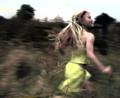
Night Walkby cassilda_terryComment: I just wondered about the many vanishing point photos that were so boring because of the lack of a 'real' point of interest. Adding some human interest would work and voila, I was presented this photo;
Like the composition (use of person & positioning in frame+shadow box, angle),
shadows (lines lead, texture of the fence on the floor),
lighting (shadows/ person's body & face).
Another interesting factor is the balance between the purple pants in the foreground and the purple floor in the background. The purple works well with the yellow/orange (natrium light?).
The vanishingpoint leads back to the person again and that is cool. |
 Photographer found comment helpful. Photographer found comment helpful. |
| 08/02/2004 03:49:47 PM |
|
| Photographer found comment helpful. |
| 07/22/2004 11:21:11 AM |
Like the Windby ImagineerComment: Great photo. I saw it while I voted in an internetcafe in Stockholm (I said I wouldn't vote, but had some minutes left). It is strange how it works on the mind, the photo does not so much depict a scene, but more a feeling/emotion. |
| Photographer found comment helpful. |
| 06/22/2004 01:25:15 PM |
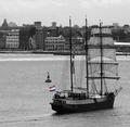
Proudly waving the red white and blueby johnmkComment: Nice work, putting the ship this far forward in the composition focusses attention on the rear end. Just having the flag in color enhances that. I like the square framing.
Well done.
|
| Photographer found comment helpful. |
| 06/22/2004 01:13:55 PM |
Back to the Harleyby myfelixComment: The idea is good, but the background and lighting hurt the shot. The background is messy and the light is so that it creates very hard shadows. Use a second light behind the MC to get some backlight for your model and a fill light for your background. To make the background look less messy:
a) Use another background, or
b) Increase the distance between the MC and the background and use a wide aperture (like F2.8 or less) to let the shallow dof blur it into oblivion.
The model's pose makes it look like we are looking from the wrong side. This feeling is also enhance by the way the steer stands pointing away from the viewer. |
| Photographer found comment helpful. |
| 06/20/2004 05:39:50 AM |
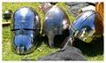
Which One would You choose???by NgporterComment: The one on the right. The left one is too hot and heavy, the middle one looks a bit on the light side (armour-wise). The right one has a lot of space to keep your head cool, seems to have decent protection, you can move your head faster and see more, especially with the corner of your eyes.
|
| 06/16/2004 02:19:51 PM |
|
| Photographer found comment helpful. |
| 06/16/2004 02:13:24 PM |
Import vs Domesticby fpilatoComment: I firmly believe that export Heineken is better than our domestic Heineken. But both Heineken's give me a headache, so I prefer domestic Amstel. But in the end I rather have a bourbon.
Great color & soft bokeh. Nice work. |
| 06/16/2004 01:41:51 PM |
Lady In Waitingby trainComment: The use of the mirror as a compositional and storytelling tool made me stop and look a while during voting. That's a good sign so I scored it an 8. :)
This may be a bit of work, but I wonder how it would work if you had used a low reflector with gold color to bring more warmth and more light balance into this shot. It would not be visible in the mirror. The light on the arm and cheek is very harsh and cool now. |
| Photographer found comment helpful. |
| 06/16/2004 01:26:59 PM |
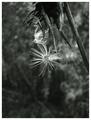
When The Wind Blowsby sherComment: Sorry Sher, I scored this a five. I didn't get the 'waiting', therefore was searching for the main element and because I couldn't find it I didn't like the composition.
Now that I come back to look at how you did in the latest challenges I see a spider and its web. Now I wonder if the photo is about the spider or about the seed. Is the seed waiting to fall (or is the photographer waiting for it to fall) or is the spider waiting for a prey?
In any case I'd think I'd like it more when you had used more of the frame. When I draw a diagonal from the topleft to bottomright there is very little in the left side of that. Tilting the camera a bit up and slightly to the right might have worked. But perhaps the background would suck that way.
The exposure, B&W tones are great! Did you use the R25 filter for this one? |
| Photographer found comment helpful. |
Home -
Challenges -
Community -
League -
Photos -
Cameras -
Lenses -
Learn -
Help -
Terms of Use -
Privacy -
Top ^
DPChallenge, and website content and design, Copyright © 2001-2026 Challenging Technologies, LLC.
All digital photo copyrights belong to the photographers and may not be used without permission.
Current Server Time: 06/17/2026 06:32:42 PM EDT.