| Image |
Comment |
| 09/21/2006 03:44:07 PM |
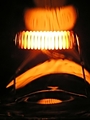
consumptionby yianisnComment: Hello Yianis. Yep, figured this was yours by seeing your post in the Electric scores thread in the forum. Only one with that title. ;^) Generally identifying your entry is a bit taboo until the challenge voting is over.
As for your image it feels like a cross between an abstract and a slightly blurry whoops. Seriously, if this was sharper, without the blur/fuzziness, it would be doing a little better. The abstract part of it makes the viewer slow down enough to look at it to figure out what it is, which is good.
Good luck in the challenge. |
 Photographer found comment helpful. Photographer found comment helpful. |
| 09/21/2006 12:24:28 PM |
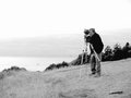
Bear_Music at Ecola Pointby charliebakerComment: If I was Robert, I would like to have a copy of this framed for my studio. This shows the photographer's eye (yours) toward capturing an image rather than a documentary snapshot. A very well put together image!
Smile and keep having fun! ;^) |
| Photographer found comment helpful. |
| 09/21/2006 10:28:40 AM |
|
| Photographer found comment helpful. |
| 09/21/2006 10:26:59 AM |
|
| Photographer found comment helpful. |
| 09/21/2006 08:13:32 AM |
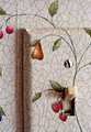
Work No Longer Ends at Sunsetby ElaineComment: I love the simplicity of this - and the message in your title fits the challenge theme (impact of electricity on society). Positioning of the key item in your composition is good. Wish the person cutting your wallpaper had cut the switch opening straight - but that's a different subject. :P Good luck! |
| Photographer found comment helpful. |
| 09/21/2006 08:10:40 AM |
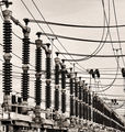
redefining skylinesby tateComment: I really like the way the diagonal lines setup this composition. Very pleasing look at a utilitarian (usually boring) subject. Good luck in the challenge. |
| Photographer found comment helpful. |
| 09/21/2006 05:08:37 AM |
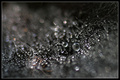
Beyond the reach of education.by glad2badadComment: Originally posted by nova:
Good eye Barry to see that spider! I don't think I would have myself. Wonder if you could isolate the area of the spider and bump the red channel way up to good effect... Cool shot btw :o) |
Thanks Ray. Being a basic editing challenge I was a little limited. I did mess with color saturation some to try and get more emphasis on the spider but there is a fair amount of red (and yellow) already present in other areas (top left). When bumped those other areas became distracting and competed with the theme of the image. I almost kind of like the mystery it adds. ;^) |
| 09/20/2006 03:41:02 PM |
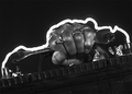
Arcingby graphicfunkComment: Clever piece of painting with light! Fun composition and nice overall tone to this. Good luck in the challenge. |
| Photographer found comment helpful. |
| 09/20/2006 02:10:28 PM |
|
| Photographer found comment helpful. |
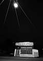
| 09/20/2006 02:00:15 PM |
FRESH FISHby boysetsfireComment: I love the way those lines are illuminated. At first I thought they were very long lens flare streaks from a helicopter mounted light. ;^) Serious. The angle and bold B/W work fine with this. Looks like an old-time image. Good luck in the challenge. |
| Photographer found comment helpful. |
Home -
Challenges -
Community -
League -
Photos -
Cameras -
Lenses -
Learn -
Help -
Terms of Use -
Privacy -
Top ^
DPChallenge, and website content and design, Copyright © 2001-2026 Challenging Technologies, LLC.
All digital photo copyrights belong to the photographers and may not be used without permission.
Current Server Time: 05/10/2026 04:17:03 PM EDT.