| Image |
Comment |
| 10/18/2006 01:01:28 PM |
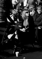
Alone in a Crowdby philupComment: ...in more ways than one. Great image to get the viewer thinking. Why is she alone? Why is she obviously much younger than the others in her seating area? What's she looking at? Who's she waiting for? What event is this? Is she related to the photographer? So many questions...
Compositionally this image is right on, and I really like the tonal range of the B/W processing you've done. Well done! Good luck in the challenge. |
 Photographer found comment helpful. Photographer found comment helpful. |
| 10/18/2006 12:54:38 PM |
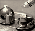
Non-Dairy Creamerby skewsmeComment: First thing I thought when I saw the thumbnail was this image was going to have some distracting reflections, especially on the larger pot. Wrong. Nice job controlling the light here! I'm not sure why, really, that you used paint. Non-dairy creamer by itself is a great oxymoron and you could have used the real thing IMO. Not taking anything away because of your choice, just an observation. Best of luck to you in the challenge. |
| Photographer found comment helpful. |
| 10/18/2006 12:51:23 PM |
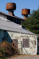
Affordable Housingby bobgaitherComment: It's a cool looking place and I think the oxymoron you selected is a good choice. I dont' think however, that the building you chose does the oxymoron justice as it's an industrial building rather than a house or apartment complex, etc...
Regarding the photo itself, I think it has some nice diagonal lines of interest in it. The lighting is fair, not under/over exposed or anything like that - just a bit harsh. Perhaps an earlier or later time of day?
Maybe I'm being too critical? The image is ok - not bad - not WOW. Connection to the challenge theme is fair. All JMO of course. Best of luck to you in the challenge. |
| Photographer found comment helpful. |
| 10/18/2006 12:03:15 PM |
|
| 10/18/2006 12:01:51 PM |
Half Full & Half Emptyby sunraygpComment: The oxymoron works with the image. Some things to work on regarding the photo. 1) It's not straight. Needs a counter-clockwise rotate of less than 1 degree (.25 to .50). 2) Whites should be white, not blue. Either use custom WB on your camera or adjust in PP. 3) Need more lighting, it's underexposed. 4) Diffuse the lighting to eliminate the harsh reflections. 5) Use a one piece background to eliminate the visible seam, and make sure your background is clean (dirt in lower right). 6) Move the subject away from the background some to blur it out a little.
Attention to details is important. BTW, did you consider using some backlighting with those glasses? The glass looks like it would be wonderful with some light refraction.
All of the above is JMO of course. Best of luck to you in the challenge. |
| Photographer found comment helpful. |
| 10/18/2006 11:17:36 AM |
Nothing Pretty about this Uglyby behindthescenesComment: Funny. Nice humorous approach and subject. Big, big shame about his face not being in focus. Looks like your focus locked in at the neckline of this shirt. This photo has some potential. Background could also use a little work, but it's not the main problem. Best of luck to you in the challenge. |
| Photographer found comment helpful. |
| 10/18/2006 11:15:26 AM |
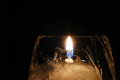
Freezer Burnby 4trtoneComment: Yeah. I never understood that one. :) Interesting photo. Little bit difficult to know what the frozen part is, but hey, the blue in the flame is sweet! Good luck in the challenge. |
| Photographer found comment helpful. |
| 10/18/2006 11:13:42 AM |
Half Nakedby kari1Comment: Is that really an oxymoron? Serious, not trying to be a sour puss or anything. The person is half naked. Hmmm...I'll have to go check out that oxymoron link. :)
As for the image, it's composed ok with nice lines moving from the lower left to the upper right. Lighting could be stronger around the face and shoulders IMO.
Best of luck to you in the challenge. |
| Photographer found comment helpful. |
| 10/18/2006 11:09:31 AM |
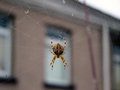
A Beautiful Phobiaby chrisymurphComment: It's fun seeing the small flies caught in the web. :) As for your spider, I think it's not focused quite sharp enough and since that's what your main subject is you could also bring it in substantially closer. The spider has some excellent color in it that would really pop if this was shot as more of a macro image (and exposure moved up a notch or two). The background is distracting. Yes, it's blurred some by the DOF, but it's still identifiable and takes the viewer away from the core subject. Again, a tighter macro type shot would eliminate the unneeded background. JMO of course. Good luck in the challenge. |
| 10/18/2006 10:19:09 AM |
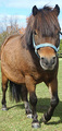
Miniature horseby snafflesComment: Good job of selecting a POV that works (slight distortion) to match the title to the subject in the manner of this challenge theme. It's a pity you didn't use the full 640 for maximum viewing exposure. Also wish that the image was a little better focused. Seems soft. Good luck in the challenge. |
| Photographer found comment helpful. |
Home -
Challenges -
Community -
League -
Photos -
Cameras -
Lenses -
Learn -
Help -
Terms of Use -
Privacy -
Top ^
DPChallenge, and website content and design, Copyright © 2001-2026 Challenging Technologies, LLC.
All digital photo copyrights belong to the photographers and may not be used without permission.
Current Server Time: 05/11/2026 07:36:17 AM EDT.