| Author | Thread |
Comments Made During the Challenge  |
|
|
10/24/2006 09:24:15 PM |
|
Great idea. I feel its a bit poorly executed. the colors seem to bland and dull, and the photo is lacking clarity. |
|
 Photographer found comment helpful. Photographer found comment helpful. |
|
|
10/24/2006 12:53:26 PM |
|
The reflection in the RH glass is distracting and the glasses blend with the b/g too much. A backlight or spot light may separate the b/g from the subject. None the less, a nice effort and sound idea. |
|
| Photographer found comment helpful. |
|
|
10/23/2006 05:34:29 PM |
|
Not an oxymoron. Also, the lack of lighting makes this pretty bland. Due to glare it would be tough to light this... But if you could tape some white LED's behind the glasses to make the liquid 'glow' it could be a cool effect. |
|
| Photographer found comment helpful. |
|
|
10/22/2006 02:03:39 PM |
|
i would have liked to see this picture more sharp.. .the back ground color is not flattering.. you should have gone with something else.. not sure off the top.. but maybe a yellow... also the horizon is crooked... i do like this picture otherwise though.. the idea of the picture.. and even possibly a different angle.. like looking up from the bottom of the glasses... just my idea.. lol |
|
| Photographer found comment helpful. |
|
|
10/20/2006 01:54:16 PM |
|
dont like the baby blue background but interestng concept. |
|
| Photographer found comment helpful. |
|
|
10/19/2006 10:55:37 PM |
Meets Challenge - 2
Lighting/Processing - 1
Composition - 2
Overall Impression - 1
"WOW" factor - 0
Score: 6 |
|
| Photographer found comment helpful. |
|
|
10/19/2006 08:14:05 AM |
|
There are to many reflections in the glass to come off as a finished photograph. Next time try hanging a sheet behind you to reduce them. The horizon of the table also seems to have a bit of a tilt to the right. |
|
| Photographer found comment helpful. |
|
|
10/18/2006 05:20:08 PM |
|
Nice idea. I think the lighting could be improved. Maybe a sheet or something to diffuse the light. The glasses are nice, but the reflections detract. I also think the exposure is a tad too dark, maybe just a little curves or brightness/contrast change in photoshop. |
|
| Photographer found comment helpful. |
|
|
10/18/2006 04:08:14 PM |
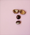
the idea is potentially good but the realization isn't good. in the glass there are too much reflections and I see even a window open :) but you could take advantage of situation. there are 2 reflections into the glasses. in the wine in the lower side and in the milk(I think is milk) in the upper side. perhaps you could take advantage of this and exalt this symmetry.
sorry for my bad english........... |
|
| Photographer found comment helpful. |
|
|
10/18/2006 12:01:51 PM |
The oxymoron works with the image. Some things to work on regarding the photo. 1) It's not straight. Needs a counter-clockwise rotate of less than 1 degree (.25 to .50). 2) Whites should be white, not blue. Either use custom WB on your camera or adjust in PP. 3) Need more lighting, it's underexposed. 4) Diffuse the lighting to eliminate the harsh reflections. 5) Use a one piece background to eliminate the visible seam, and make sure your background is clean (dirt in lower right). 6) Move the subject away from the background some to blur it out a little.
Attention to details is important. BTW, did you consider using some backlighting with those glasses? The glass looks like it would be wonderful with some light refraction.
All of the above is JMO of course. Best of luck to you in the challenge. |
|
| Photographer found comment helpful. |
|
|
10/18/2006 12:41:32 AM |
|
The idea is nice, but the lighting's pretty flat. There also seems to be a blue cast to it. |
|
| Photographer found comment helpful. |
Home -
Challenges -
Community -
League -
Photos -
Cameras -
Lenses -
Learn -
Help -
Terms of Use -
Privacy -
Top ^
DPChallenge, and website content and design, Copyright © 2001-2026 Challenging Technologies, LLC.
All digital photo copyrights belong to the photographers and may not be used without permission.
Current Server Time: 06/29/2026 05:03:27 PM EDT.