| Image |
Comment |
| 11/20/2006 12:00:44 PM |
Alabama Shakespeare Festivalby shadowdoc31Comment: This looks like a pretty scene. Nice reflections in the water. The building seems a little blurred, but not major. Did you consider two minor crops - get the tree branches out of the right edge, and if you need to adjust the ratio then lose a bit off the bottom to remove the tiny piece of shoreline. Another consideration would be to zoom in even closer (at time of image capture) to get more of the front of the building, close enough to read the banners to get a better sense of context for the 'Shakespeare' theme. You could have still included some of the water reflection, which I'm sure was quite enticing. :D May want to move the text up a little to get the 'p' off the bottom border. Text color is subjective to a wide range of opinions. Not sure that I like the color you've chosen. All of the above is JMO of course. Best of luck to you in the challenge. |
| 11/20/2006 11:54:24 AM |
Great Seats Still Availableby jerseyjimComment: You should have used matching chairs. :D Sorry, have to give you a hard time about something! Very nice sunset/sunrise scene with a great sky and calm waters. Relaxing. Ok, one more nitpik - the horizon seems slightly (very) tilted to the left. He-he. Best of luck to you in the challenge. |
 Photographer found comment helpful. Photographer found comment helpful. |
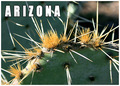
| 11/20/2006 11:51:08 AM |
Arizonaby justineComment: This appears to be a fine depiction of 'Arizona' and it's western climate. Very pleasing photo even if it had to stand by itself. Nicely done. Good luck in the challenge. |
| Photographer found comment helpful. |
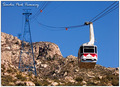
| 11/20/2006 11:49:49 AM |
I Rode the World's Longest Tram!by freakin_hilariousComment: This is a fine illustration of a postcard type image IMO. You've captured the location that shows it in a flattering way. Good placement of the main subjects within your frame and the hillside diagonal line adds to the composition. Well done. Good luck in the challenge. |
| Photographer found comment helpful. |
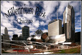
| 11/20/2006 10:35:49 AM |
Postcard IIby MayaMComment: This is a striking image. Wonderful sky to complement this artsy downtown scene. I even kind of like the "frosty" edged framing, it's certainly different. Good luck in the challenge. |
| Photographer found comment helpful. |
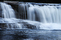
| 11/20/2006 10:34:09 AM |
Brevard, NC - Land of Waterfallsby nards656Comment: This is a pretty scene. Where is it? Oh...I see the location in your title. Guess the text must be on the back of the postcard? :D You did a nice job of getting the flowing water exposed properly. The color temp seems like it could stand just a little warming in this photo (little blue and cold IMO). Best of luck to you in the challenge. |
| Photographer found comment helpful. |
| 11/20/2006 10:30:54 AM |
Charlotte, North Carolinaby magenmarieComment: Nicely done. This brings back some old memories (early 90's). Good choice of text and I like the border used as well. Good luck in the challenge. |
| Photographer found comment helpful. |
| 11/17/2006 03:26:54 PM |
Gold spotsby DianeSComment: This has potential. Lighting doesn't seem quite right to get the look I think you were after. The background didn't come out true white, which would be stronger. Some fill light on the right would help, and nice sharp focus on her eyes is important. JMO of course. Good luck in the challenge. |
| Photographer found comment helpful. |
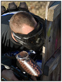
| 11/17/2006 03:23:35 PM |
Spots of Warby liv4him330Comment: Hope you didn't get paint on your camera! :D Interesting subject. I wonder if a polarizer would have knocked the glare off the paintball dispenser some? Good luck in the challenge. |
| Photographer found comment helpful. |
| 11/17/2006 03:22:09 PM |
Spotless Drainageby andy74Comment: Well, not exactly spotless. If this were truly "spotless" (minus the hair) it would score a little higher. Also, the positioning - you might as well have gone and centered it, I think it would have looked a little better that way. JMO of course. As is, I think it's a clever entry and still rises above many. Just came up a bit short on a couple of minor details. Good luck in the challenge. |
Home -
Challenges -
Community -
League -
Photos -
Cameras -
Lenses -
Learn -
Help -
Terms of Use -
Privacy -
Top ^
DPChallenge, and website content and design, Copyright © 2001-2026 Challenging Technologies, LLC.
All digital photo copyrights belong to the photographers and may not be used without permission.
Current Server Time: 05/12/2026 08:05:47 AM EDT.