Concentrateby
cogeroxComment: Greetings from the Critique Club
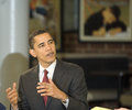
First Impression
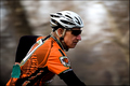
Bright with good details.
Looking Deeper
After having a minute to absorb this photo I find it to be done well overall. The details that jumped out at me when I first opened this are partially due to the bright colors I think. Add a very nice tonal range (white & blank points) with good contrast and my mind is sold.
The area around the rider's face (nose in particular) seem a bit oversharpened?
I think you did a nice job of capturing a true "panning" shot with this. Shutter speed and panning movement combined well to get the right amount of background blurring.
One thing that may have held this down some is that there isn't much room for the biker to move into - the composition is a bit tight IMO. A little more room to the right would have made this stronger.
Hmmm. I just read thru the comments you received during the challenge. Quite a few thought this shot didn't convey enough motion and that the results were accomplished with a shallow DOF.
Maybe 1/60 was too fast after all? :-) 1/30 would have showed more motion, but been trickier to keep the subject in focus.
Still, I'm a little surprised at the score. Had I seen this ahead of time I would have predicted 5.5xxx to 5.8xxx. But then again, I'm not the best at predicting. :-)
I thought you made a nice effort. There's always next time, eh?
Questions? If yes, feel free to send me a PM and let me know. Thanks!