| Author | Thread |
|
|
01/12/2013 07:20:29 PM |
|
 Photographer found comment helpful. Photographer found comment helpful. |
|
|
02/28/2008 07:04:32 PM |
|
| Photographer found comment helpful. |
|
|
02/26/2008 03:57:26 PM |
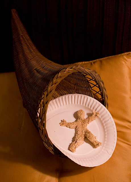
Greetings from the Critique Club
First Impression
Cute! That's the first thing that honestly came to mind. :) Then comes "ta-da!" as it appears the bread man is making a grand entrance.
Looking Deeper
Yes, it's cute, clever, and all that, but there are some positive items here in the method of presentation. The positioning of objects are obviously well thought out. A nice play on angles with the basket coming across from the upper-left (nice leading line also BTW), and the cushioned furniture back coming across from the mid to upper-right. The way these lines intersect brings the viewer right into the main subject area, and quite naturally.
The technicals are all in place with nice DOF, good use of lighting, and a well focused subject. Read your notes...good use of exposure comp to handle it.
Looks like you had fun putting this together, and I certainly enjoyed taking another look at it. :-)
Questions? Let me know. Thanks. |
|
| Photographer found comment helpful. |
|
|
02/20/2008 02:49:33 PM |
|
I really like the lines and colors of the horn of plenty and pillow. I think the paper plate spoils the image, because everything else has such nice warmth and texture. I like the lighting too. |
|
| Photographer found comment helpful. |
|
|
02/20/2008 05:01:58 AM |
|
Very nice work with the bread man! And I see you have the same china pattern I do. I also have the "good china" - the wax coated variety with designs! I use it on special occasions. |
|
| Photographer found comment helpful. |
|
|
02/20/2008 12:35:32 AM |
|
| Photographer found comment helpful. |
Comments Made During the Challenge  |
|
|
02/18/2008 09:15:53 PM |
|
I think the paper plate is what threw me off on this one. |
|
| Photographer found comment helpful. |
|
|
02/14/2008 11:09:46 AM |
|
Well, I bet that took a long time to make him! I think without the paper plate though, it would have scored a point or two higher. |
|
| Photographer found comment helpful. |
|
|
02/13/2008 06:09:59 PM |
|
| Photographer found comment helpful. |
Home -
Challenges -
Community -
League -
Photos -
Cameras -
Lenses -
Learn -
Help -
Terms of Use -
Privacy -
Top ^
DPChallenge, and website content and design, Copyright © 2001-2026 Challenging Technologies, LLC.
All digital photo copyrights belong to the photographers and may not be used without permission.
Current Server Time: 06/28/2026 08:29:54 PM EDT.