| Image |
Comment |
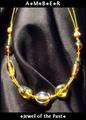
| 04/26/2005 03:51:56 PM |
Amberby DustDevilComment: I like the way you've framed this and have the text in a border area outside of the image. The jewelry has a few hot spots from lighting which makes it seem a bit out of focus in comparison to the backdrop used. Overall a nice photo. Good luck. |
 Photographer found comment helpful. Photographer found comment helpful. |
| 04/26/2005 03:50:10 PM |
A Lifetime Together Deserves The Best...by NobodyComment: Simple composition...it works just fine. Nice sparkle in the diamond. Lighting may be just a shade hot. What is reflecting in the mans ring? Looks like the edge of a table or a persons head? Overall - nice shot. Good luck. |
| Photographer found comment helpful. |
| 04/26/2005 03:23:29 PM |
The Earringby saiphfireComment: Nice idea...let the earring stand out against the darker areas of the image. I would like to see a bit more of the jewelry. Perhaps crop most of the face and some of the shoulder out... Just a thought. Good luck in the challenge. |
| Photographer found comment helpful. |
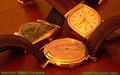
| 04/26/2005 03:19:26 PM |
Hamilton Watch Company circa 1958by bcobleComment: If you were going for a rich warm tone, it worked. If not - the lighting is off a bit. ;^) I like the way you've grouped the watches, it's a unique twist to what I've seen thus far. One problem with the watches laying flat is you're getting some excess reflections on the watch faces. A polarizer would have helped some with that. Regarding the text, another color choice might have been a gold that coordinates with the watches. Of course, this all just my opinion. Hope all goes well for you with the challenge - good luck. |
| Photographer found comment helpful. |
| 04/26/2005 02:55:32 PM |
Lazy Sundayby pgattComment: That's an interesting approach, using nightshot mode. I've never tried it...think I'm going to investigate. Thanks for opening my eyes to this possibility! Smile and keep having fun... ;^) |
| Photographer found comment helpful. |
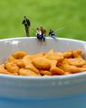
| 04/26/2005 01:32:01 PM |
Gone Fish'in by debitiptonComment: I'm glad I took a peek at your portfolio. This is a fun photo. Very creative. I'm curious, what is the reflection in the top left of the bowl? Looks like a fence or the front of a Jeep? ;^) |
| Photographer found comment helpful. |
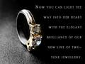
| 04/26/2005 01:06:28 PM |
Round Brilliant Two-Tone Ringby mocabelaComment: Interesting choice of background. Good job on the DOF. I'm thinking you probably should have rotated the ring up a bit to show off the diamond and lose the photographers reflection in the band above the jewels. ;^) |
| Photographer found comment helpful. |
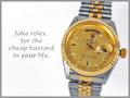
| 04/26/2005 01:04:00 PM |
Fake Rolexby alanfreedComment: That's a fake - really? ;^) Nice composition and lighting overall. I wish the date on the watch wasn't quite so dark. Good luck. |
| Photographer found comment helpful. |
| 04/26/2005 01:01:24 PM |
Diamonds Are A Girl's Best Friendby DeniseBernadetteComment: Cute, but I think your model is a bit young for diamonds - no? I like the composition. The lighting on the girl is ok, although I would like to see some sparkle in her eyes. The rings have lost some impact along the way. A little hot perhaps...just not clear and shiny as you would expect jewelry to be. Fun idea. Good luck in the challenge. |
| Photographer found comment helpful. |
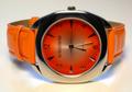
| 04/26/2005 12:59:01 PM |
TIME to buy new jewelryby mischffComment: Wow - that's some bright colors! ;^) I wish your background was pure white instead of yellowish looking. Incandescent lighting? Black might have worked well also. Good luck. |
Home -
Challenges -
Community -
League -
Photos -
Cameras -
Lenses -
Learn -
Help -
Terms of Use -
Privacy -
Top ^
DPChallenge, and website content and design, Copyright © 2001-2026 Challenging Technologies, LLC.
All digital photo copyrights belong to the photographers and may not be used without permission.
Current Server Time: 06/19/2026 06:14:29 AM EDT.