| Image |
Comment |
| 12/08/2004 12:31:29 AM |
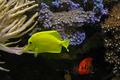
Yellowby hstegComment: Nice idea - I have one of these sitting at my desk, but it is so worn out that I can hardly tell the colors on it!
I am not so sure about the symmetry on this one. If you had rotated the cube slightly ccw, and took a shot from a lower point, i.e. to show more of yellow side, that might have worked better.This way, other colors are too distracting, taking away from the yellow impact.
Another thing that catches my attention in somewhat negative manner are the two white fields that seem to have no border on the outside. Your post processing probably hid those.
I still like it - solid 6 |
 Photographer found comment helpful. Photographer found comment helpful. |
| 12/08/2004 12:25:43 AM |
I'm orange with envy.by jimsappComment: My monitor's calibration probably isn't the best, but the fish leans towards green. I'll pretend it's yellow, though. Very nice photo, indeed. I like the contrast against the purple background. My eyes circle around the image, constantly discovering one interesting spot after another. The only thing that bothers me a little bit is that the yellow fish seems to suck on that corral on the left. I only wish it was a little above or below it. Solid 7. |
| 12/02/2004 05:19:51 PM |
|
| 12/02/2004 02:51:43 PM |
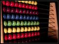
The abacusby JinjitComment: Maybe it would have improved the photo if you had someone move the balls on the abacus as opposed to having them perfectly still and in order? |
| Photographer found comment helpful. |
| 12/02/2004 11:26:13 AM |
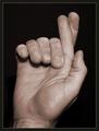
Fingers Crossed- Good Luck!by scalvertComment: Wonderful! It took me a few moments to realize how you have done this! Marvelous idea and perfect execution - I can't see the other hand behind this one! |
| Photographer found comment helpful. |
| 12/02/2004 11:23:38 AM |
7 secondsby smr78Comment: This would have been a 10 if you could have configured the light in such a way to enhance the second hand - or if you'd used a different watch with a more prominent second hand... |
| Photographer found comment helpful. |
| 12/02/2004 03:13:52 AM |
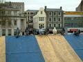
The lucky 7by DmaskezeComment: there's too much below the pigeons. Cropping about half of the blue&yellow stripes would;ve made this much better. only a 7 though. |
| 12/02/2004 02:16:02 AM |
|
| Photographer found comment helpful. |
| 12/02/2004 01:40:40 AM |
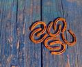
Horseshoesby kennytComment: I would have cropped the top and the bottom a bit more. There is enough color variation in the planks to the left of the group, there was no need to leave the extra vertical space. |
| Photographer found comment helpful. |
| 12/02/2004 01:38:33 AM |
|
| Photographer found comment helpful. |
Home -
Challenges -
Community -
League -
Photos -
Cameras -
Lenses -
Learn -
Help -
Terms of Use -
Privacy -
Top ^
DPChallenge, and website content and design, Copyright © 2001-2026 Challenging Technologies, LLC.
All digital photo copyrights belong to the photographers and may not be used without permission.
Current Server Time: 07/16/2026 08:37:50 PM EDT.