| Image |
Comment |
| 02/18/2005 10:37:29 AM |
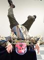
A "long-shot" in Self Portraitureby bellatrixComment: Is that you - those two people taking a picture? Then it is a loong shot. Although it will be scored down for not 'exactly' meeting the challenge theme, I like this shot. I think that the part of the wall at the bottom was unnecessary and that it could have been cropped out. |
 Photographer found comment helpful. Photographer found comment helpful. |
| 02/09/2005 01:21:18 AM |
Dentistby hjolliComment: That tray was in the way... that spoils easily the best pain capture I've seen so far. only a 6. |
| Photographer found comment helpful. |
| 02/09/2005 01:14:01 AM |
To much presure, to little timeby teachme53Comment: Cool idea. You could have spent more time cutting out your head. Or painting the picture background dark blue to better match the cloth before cutting it out. Also, you should have cloned (or cropped for basic editing) out the switches on the wall in the upper right. |
| 02/09/2005 01:09:50 AM |
Yeah, it's hotby LevTComment: well executed and a very good idea. The hand could have been less relaxed in the photo though. Some spasm-like pose perhaps... |
| Photographer found comment helpful. |
| 02/09/2005 12:53:49 AM |
Barbed Wireby goldenhawkofkyComment: Background is a bit too busy, mostly because it is too much in focus. A wider aperture would've been better perhaps? |
| 02/05/2005 12:37:24 AM |
Light; As a Featherby sfaliceComment: Background is too busy. I'd preferred to see the feather in more contrast to the background, though. 6 |
| Photographer found comment helpful. |
| 02/05/2005 12:33:23 AM |
Have a light?by TiberiusComment: Beautiful! I hope this wins you a ribbon... I gave this a 9 because it could have been off center just a bit. |
| Photographer found comment helpful. |
| 02/03/2005 04:54:25 PM |
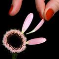
He loves me, he loves me not...by LalliSigComment: I would have preferred to have a different, more standard aspect ratio for this photo. But even this way, the composition is perfect, with my eyes going from lower left to the upper right and back, constantly exploring the image. I just love this one, my pick for a ribbon. |
| Photographer found comment helpful. |
| 01/31/2005 03:31:44 PM |
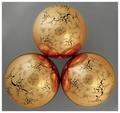
Triple Refractionsby myceliumComment: It does remind me of the lucky 7 challenge entry, but it isn't as impressive. Perhaps it is the gray background that (subjectively) ruins it for me. Still it is in the top half of what I've seen so far. |
| Photographer found comment helpful. |
| 01/28/2005 10:28:01 AM |
On the Marchby drgsoellComment: I like the sky in this one. So unreal... However, the buildings on the right seem a bit overexposed. Composition: excellent, obviously there is a three, good DOF. 7. |
| Photographer found comment helpful. |
Home -
Challenges -
Community -
League -
Photos -
Cameras -
Lenses -
Learn -
Help -
Terms of Use -
Privacy -
Top ^
DPChallenge, and website content and design, Copyright © 2001-2026 Challenging Technologies, LLC.
All digital photo copyrights belong to the photographers and may not be used without permission.
Current Server Time: 07/16/2026 11:20:10 PM EDT.